Video
Slides
Transcript
-
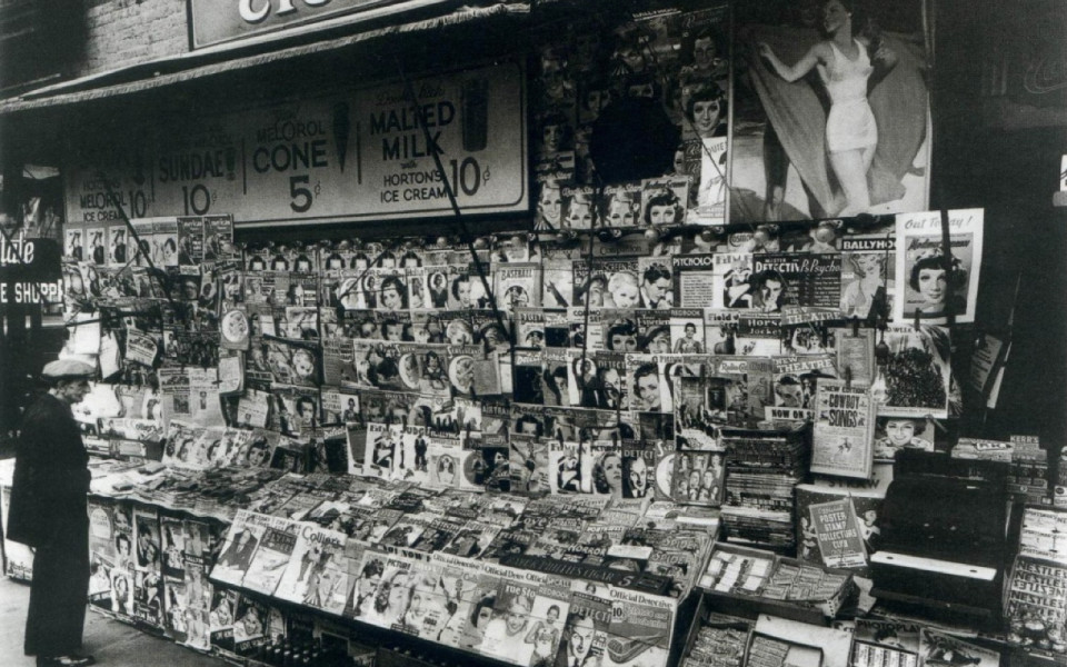
So I do a lot of work with publishers, mainstream publishers. I led the redesign of the New York Times a few years back. I’ve dragged more magazines kicking and screaming onto the Internet that I can count. I’ve done lots of work with Condé Nast. I did the redesigns of the Atlantic and Time Out and National Journal and Fast Company. I’m doing a little bit of work right now with Time-Life. And I really like talking about the challenges that publishers face in relation to broader content strategy challenges that lots of other organizations are going to face. Because I think publishers, they're like the canary in the coal mine: they face some of these content challenges more acutely, they have to adapt to changes in their environment more quickly.
And so today the poison gas that’s causing birds to fall out of the sky in the publishing houses is mobile, and more specifically this crazy multi-device future that we live in, where they’re trying to figure out how do they get all their stuff out onto all of these different new platforms and screen sizes and devices and different resolutions.
And so it’s intriguing to me that a lot of times when we come to events like this and we talk about the challenges in mobile, we talk about them like they're design and development problems. We talk about the design challenges and how do we fit things onto a smaller screen size, or how do we deal with touch targets or new gestural interfaces. Or we talk about the development challenges, how are we going to maintain all these different code bases, or how are we going to develop for all these new platforms.
So my role here is to talk about the challenges that we face through the lens of content, because I really think that’s the core of what we’re trying to do. Honestly, a lot of other smart people are addressing that as well.
-

So this is what I’m going to talk about today. And I’m going to tell you about it by using case studies from two different publishers. The first is NPR which obviously is America’s National Public Radio, and the second is Condé Nast, which is the major magazine publisher that publishes titles you’ve heard of like Vogue, Vanity Fair and The New Yorker.
-
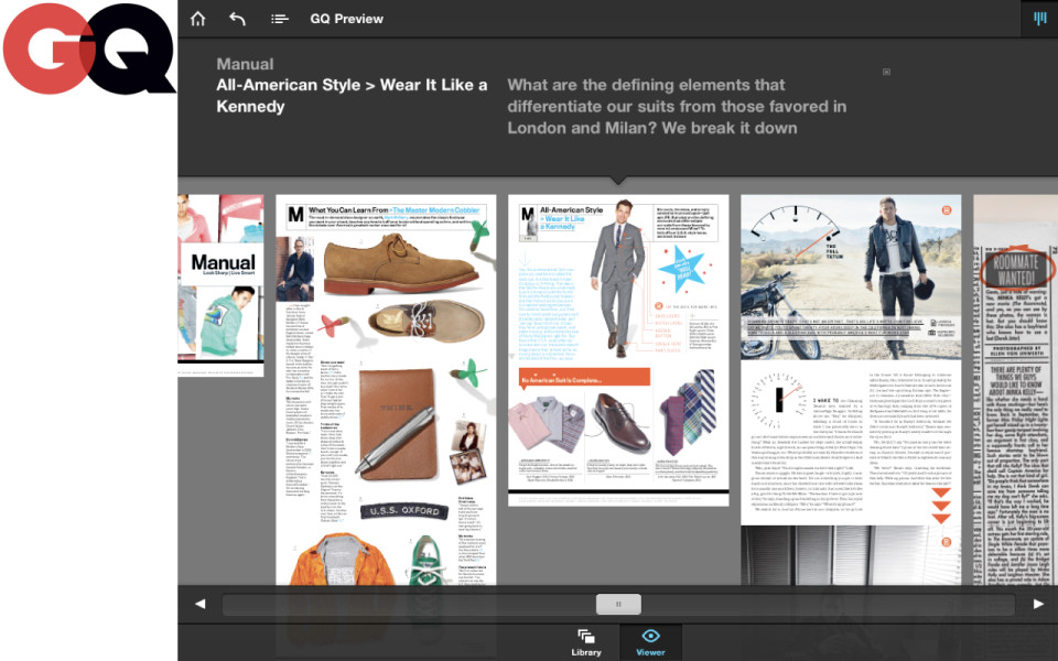
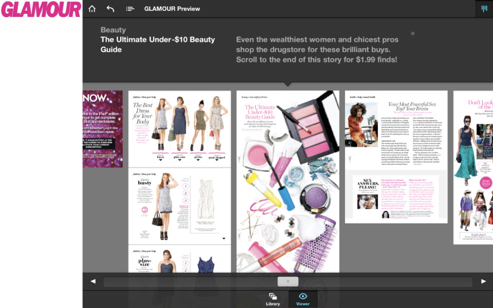
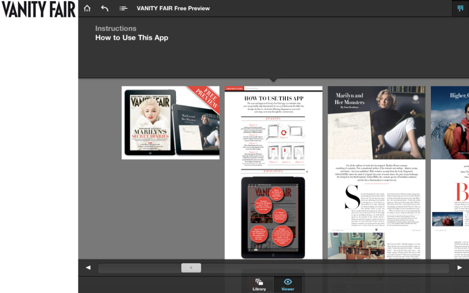
So Condé has been investing really heavily in developing custom iPad editions for many of their titles. A lot of other publishers are following this strategy. Condé has been saying, “OK, let’s go. We’re excited about the iPad, so let’s build custom iPad editions for titles like GQ, and Glamour, Wired and Vanity Fair.”
-
-
-
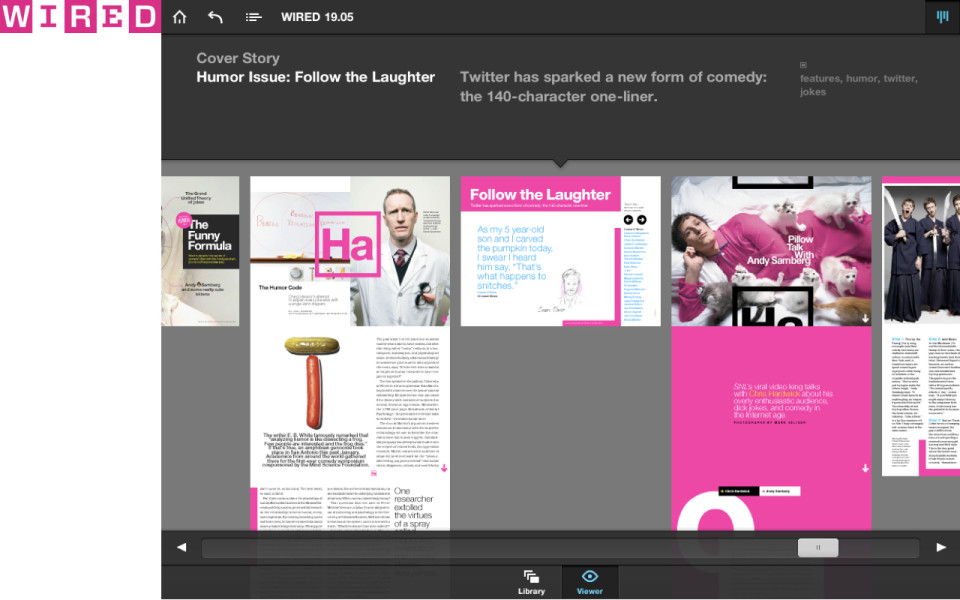
-
I had a conversation with the great Paul Ford. He writes ftrain.com. He used to work for Harper's. He and I talk a lot about the publishing industry. I had a conversation with him when the iPad first came out, and I was like, “Paul, what do you think this is going to mean for the magazine publishers? How are they going to adapt to having the ability to have all of their stuff on this tablet size screen?” And he said, “I think we’re about to usher in a golden age of PDFs on the iPad.”
-
And this is in fact true. This is really the strategy that a lot of these magazine publishers have adopted. You see this. You go into these tablet editions of these sites of these magazines and they are 300 megabytes and you’re swimming around in what’s essentially like a giant picture of a magazine page. The text isn’t searchable. It’s not accessible. You can’t like find anything in it. And it’s because what this organization has said is: "Great! Now, we’ve got our whole digital problem solved. What we can do is just take a picture of the print page and put it on the tablet screen and be like, Wow, great, digital is fixed."
And, you know, honestly, Condé would be lucky if that was all that they were doing. But no, they've gone one better. So what they are doing is they’re having their existing production staffers, existing people working nights and weekends after the magazine goes to bed, they sit up all night and make two different versions of the magazine layout, one for portrait and one for landscape. And this is because apparently for digital, it’s got to be interactive. So you’ve got to be able to change the screen layout and have something happen.
-
And you just have to imagine — I can really see what’s happening in this organization. You can see that they are so tightly clinging to the values that made them great. They are looking at the iPad as the opportunity for them to say: "Great! Digital hasn’t changed anything. Everything is still exactly the way that we expect it to be. We don’t have to adapt any ways of thinking about how people consume content, or how they want to engage with our publication, or what it actually means to be interactive. All we have to do is take the exact same art direction and layouts and designs and content features, and just shove them onto the iPad exactly the way that we intended it for print."
It’s like you see them harkening back to this time when advertising rates were at an all-time high, where the editors had limousines to take them to work every day, when every afternoon the guy with a cart filled with cocaine would push his way through the aisles. It’s like you see them saying, “If only we could just take pictures of our magazines and put them on the iPad, then we can go back to the way it was in the 1980s when everything was great for our industry.” And unfortunately, the ‘80s are gone, guys. Having giant PDFs on the iPad isn’t going to bring them back.
-
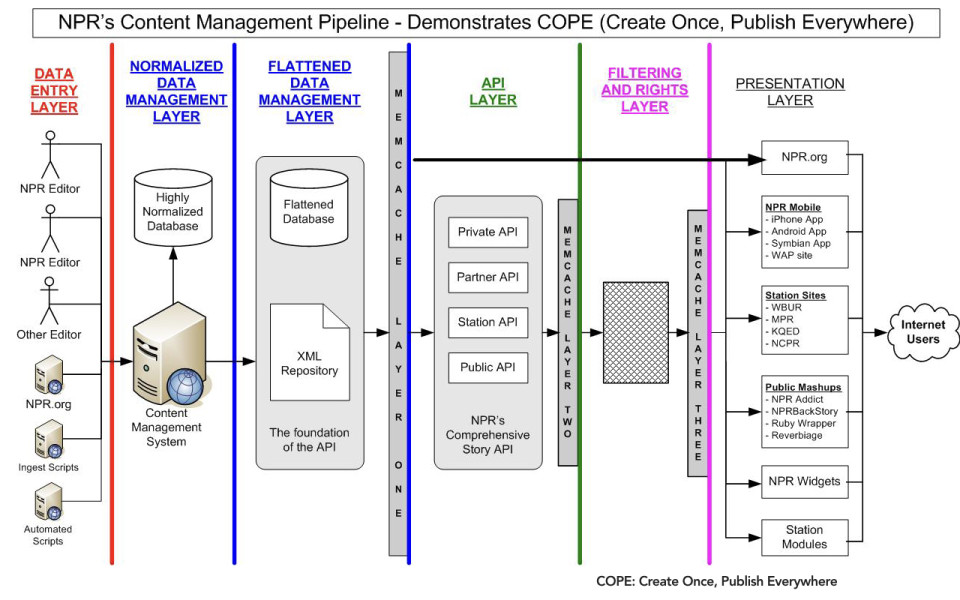
So let’s take a look at how another organization has decided to solve this problem. So it’s considerably less sexy than anything you might see coming out of Condé Nast. This is not going to look anything like the Vanity Fair iPad app.
-
This is NPR’s approach to getting their content out onto a variety of different devices and platforms. They call it COPE – Create Once and Publish Everywhere. So what this means is that they have set up an API that allows them to take content from a variety of different providers.
-
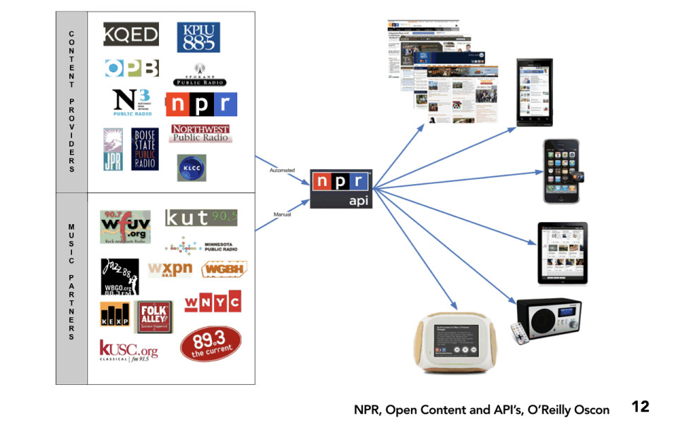
They can take content from content providers; text from a variety of different sources, from all their member stations. They can take music content from a variety of different providers. And what they do is they run that through an API, which allows them to have access to clean, well-structured content that then can be queried by these individual platforms. So what it lets them do is they can get their content out onto a wide variety of different devices and platforms very easily.
-
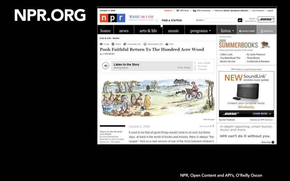
So it means you can see the same story in a content object that includes headline, text, images, audio files. You can see it all in a variety of different locations. So you can get it on npr.org.
-
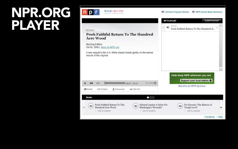
You can see it on the npr.org player.
-
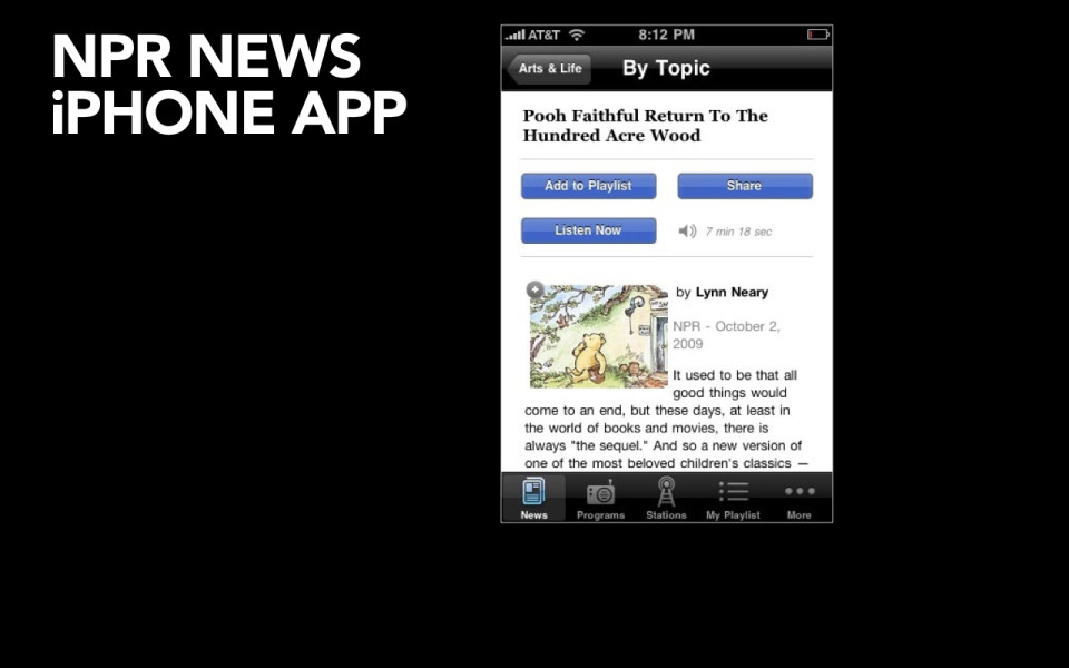
You can see the same story on their iPhone app.
-
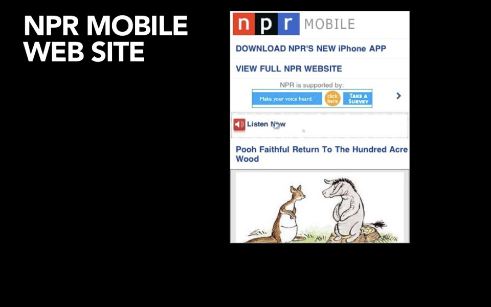
You can see the same story on their mobile website.
-
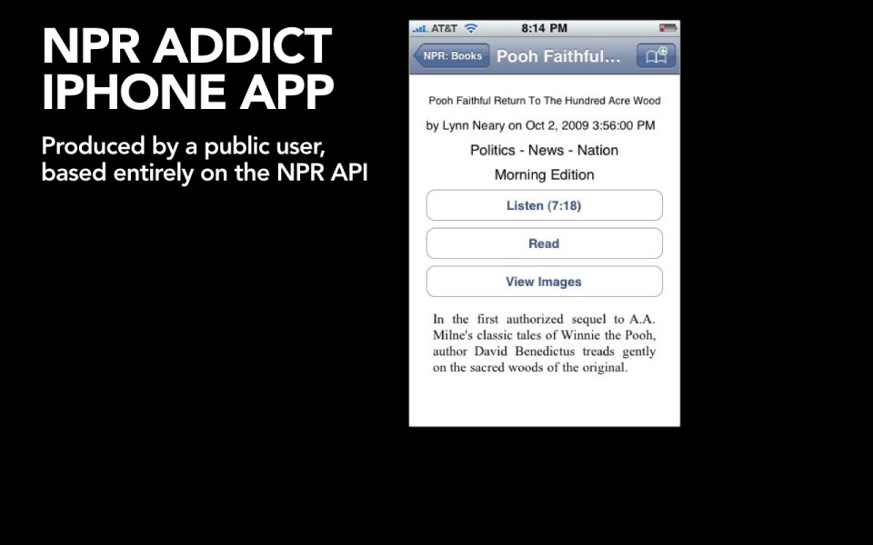
You can see how this story would appear on the NPR Addict iPhone app. Now this isn’t even something that they made. This is a user-generated app that goes out and talks to their API.
-
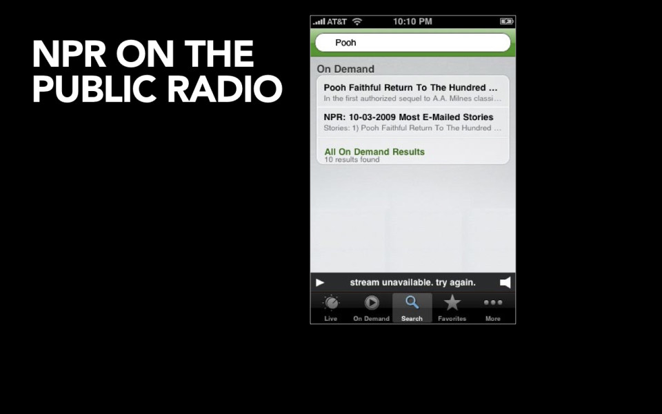
You can see it on the Public Radio Player. This is a player that pulls content from five hundred public radio stations nationwide.
-
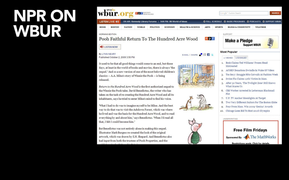
You can see it how it appears here, on member station WBUR in Boston.
-
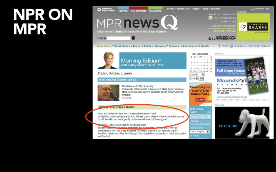
Here it is on MPR in Minneapolis.
-

Here’s how it appears in iGoogle. So you can set this up yourself at home if you want to get a feed from NPR.
-
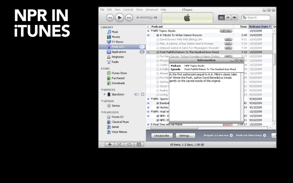
Here’s how it lives on the desktop application of iTunes.
-
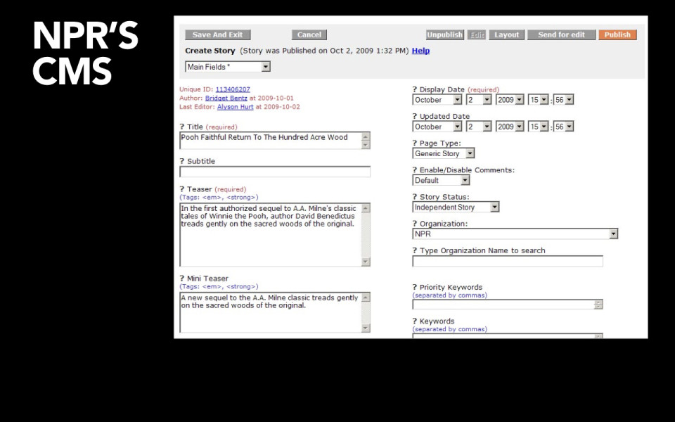
And all of this is made possible by the fact that they have a CMS. They have a Content Management System that provides the appropriate amount of structure. It provides the right fields, the right metadata. Presumably it’s easy to use; presumably their content authors understand why it’s important that they provide all of this data.
-
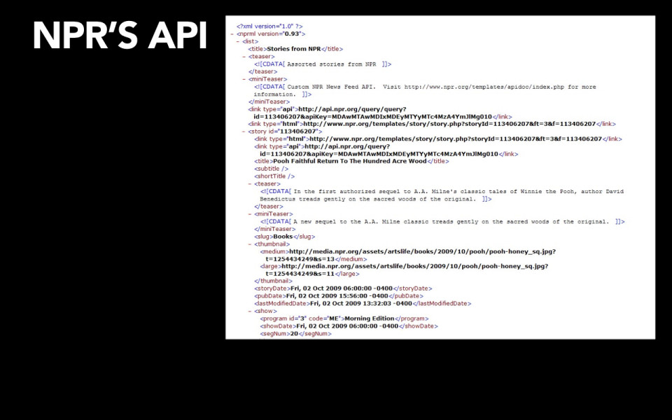
And they have an API that is set up to allow all of these different platforms to easily talk to it, to easily go in and say, okay, show me what you have there. And then I, as the individual platform – I as the iPhone app or the tablet app or the Android website, HTML5 website – I am going to go and figure out which content I’m going to show; how many images I want to show, whether I want to show that audio file, how much text I should show, which summary I show. It means that the choices about how that content is going to look and work can be made to be appropriate for the individual platform, because they have invested in having a clean, well-structured base of content to work from.
-

So, two very different strategies here. Which one of these do you think has paid off most handsomely for the organization?
-
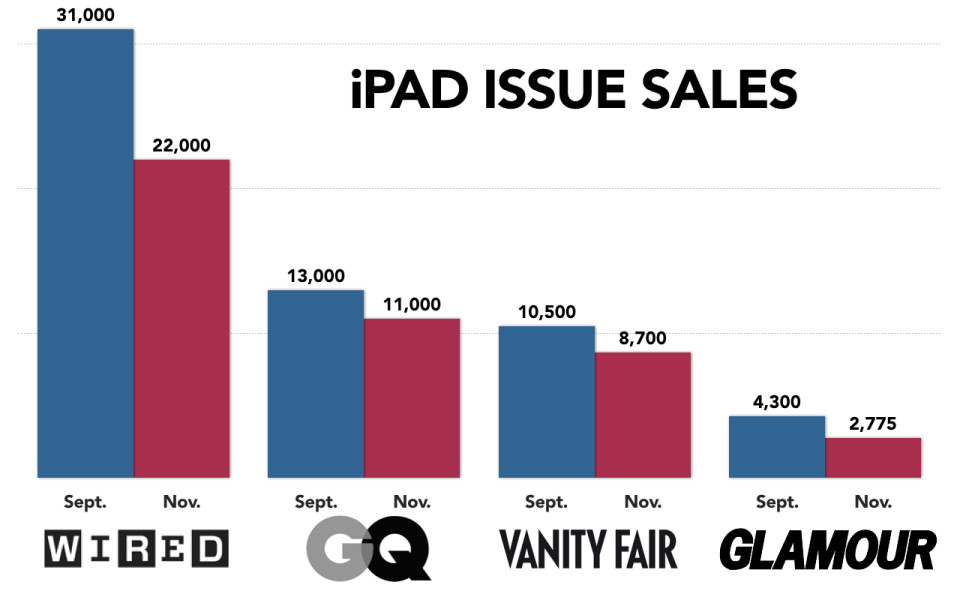
Condé Nast, unfortunately, after a brief flurry of excitement around its strategy, has not actually seen its sales for its iPad editions pay off as much as it would have liked. What you see is that over time, these iPad issues have actually declined in sales; let me show you that again, it’s a great animation. What you see, and I want to show this to you again because I want to point this out, Glamour is known as being Conde’s most lucrative title. They sell two million annual subscriptions, they sell 500,000 copies every month on the newsstand. Can you imagine being the beleaguered Glamour staffers who have to sit up nights and weekends making two different versions of the Glamour magazine app so that you can sell fewer than 3000 copies? This just isn’t, you know, it’s not a good investment in time and resources for their organization. They’re not seeing the business results that they expected to get from the amount of effort that they’re putting into this.
-
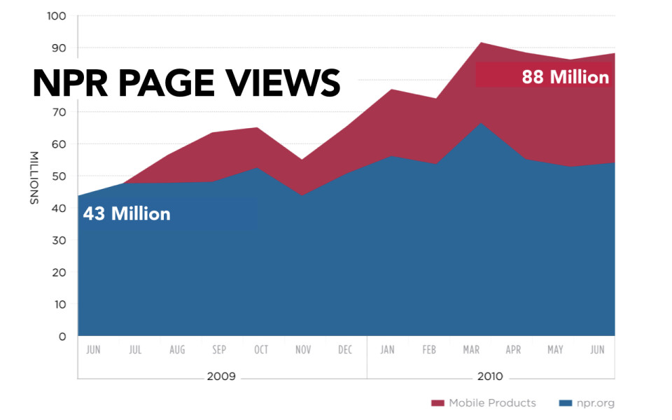
Now, NPR on the other hand, has seen a fantastic return on its investment. Their page views have gone up dramatically in both their desktop products and most clearly in their mobile products. In fact, their page views have gone up eighty percent. Eighty percent! And they directly attribute eighty percent page growth to having an API.
Could you imagine if Condé Nast’s strategy had resulted in eighty percent increase in business value for their organization? The guy with the cocaine cart would be back!
-
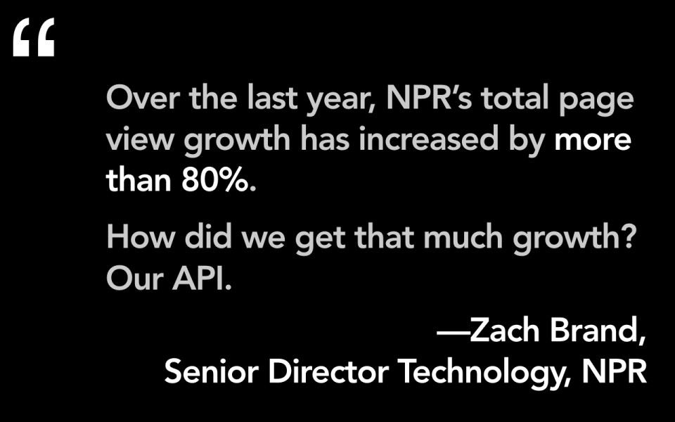
So, Zack Brand here is the Director of Technology for NPR, he is justifiably proud of his strategy.
-
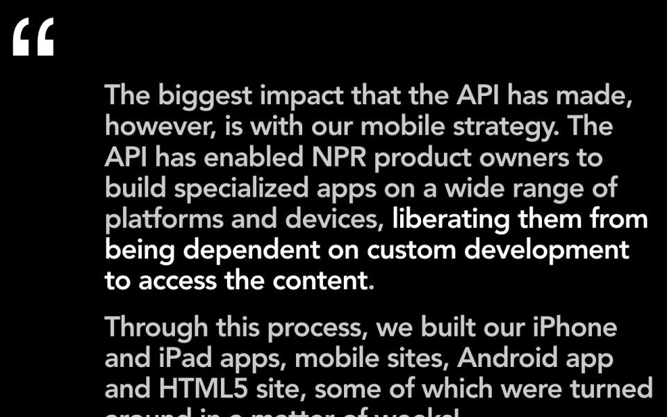
The real reason that they believe that this organization, that they’ve gotten value from having an API, is directly in the fact that it’s impacted their mobile strategy. What it means is that now they are not dependent on custom development to go and get access to that content. So anytime they want to release a new application, anytime they want to get their content out onto a new platform, whether that’s an iPhone app, iPad, a mobile website, an Android app, they want to build a new HTML5 site, they can do that quickly, sometimes in a matter of weeks, because they have put the effort into having a clean, well-structured base of content to work from.
-
So, what is this future of adaptive content?
-

The first thing I want to let you know about this is that all of the stuff that we’re talking about here, in terms of how you support multi-channel publishing, is just not new. People, especially in the technical communications space, and we are lucky for this, have been talking about this for a decade. Ann Rockley has an approach that she calls "intelligent content." My friend, Rachel Lovinger published a report for Razorfish a few years back where she called it "nimble content." The idea that you want to take flexible bits of content and get them out to a variety of places is not something that’s new. What I believe, is that the challenges of mobile are going to make all of this stuff ever more important to organizations. A lot of work that people have done in the tech comm space has been figuring out, you know, how to do you make publishing software manuals more effective, and that just hasn’t really gotten the attention of the CEO. But this mobile thing is, I really believe, going to make a lot of organizations sit up and take notice, because there’s no way that they will be able to support getting their stuff out onto all of these different devices and platforms unless they start investing and thinking about their content this way.
-

So what I mean is that we need to start thinking about how you have a clean base of content that’s well-structured, it’s designed for re-use. You think about that content and then you think about how you can get it out onto all of these different platforms, whether that’s the desktop web or mobile web, whether that’s mobile apps or tablet apps. You might think about how it’s going to appear in social media or on your microsites or even in your email campaigns and my god, even print.
-
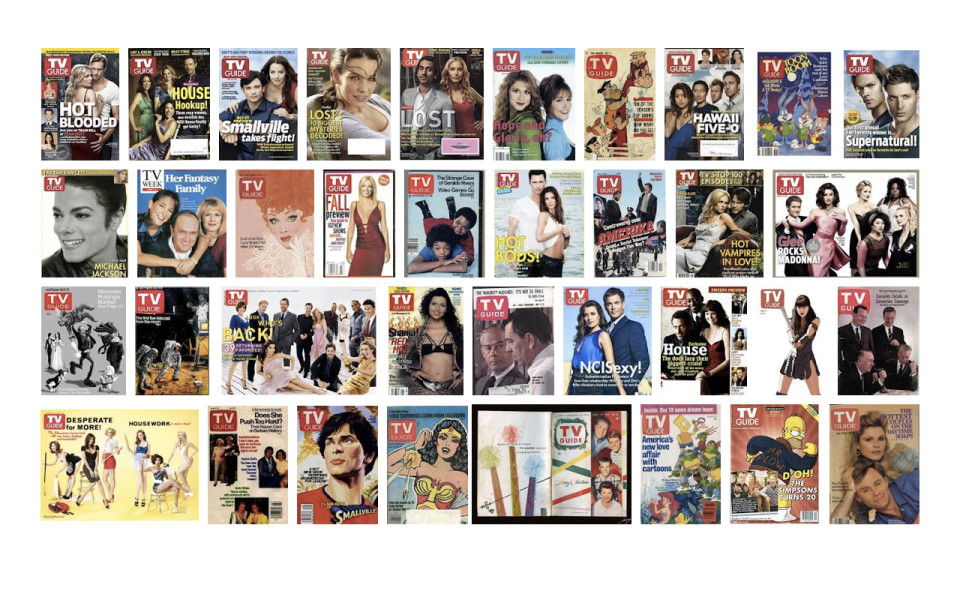
So, as an example of how somebody has done this in the past, I want you to harken back again to the halcyon days of the 1980s where America had a most popular magazine, gracing coffee tables around the country. What was it? Was it the Atlantic...The New Yorker...you know, maybe one of the popular news weeklies like Newsweek or Time? No...no; better than that. America's most popular magazine was… yes indeed, the TV Guide.
And so, the TV Guide, they might have sat there from their lofty perch, the most popular magazine in America, and said, "Well, you know, we've really got it made. We're a great magazine business." But, what they realized is that if they were to have all of their content say, locked up in Quark files or InDesign files, that wouldn't really actually provide them much value.
-
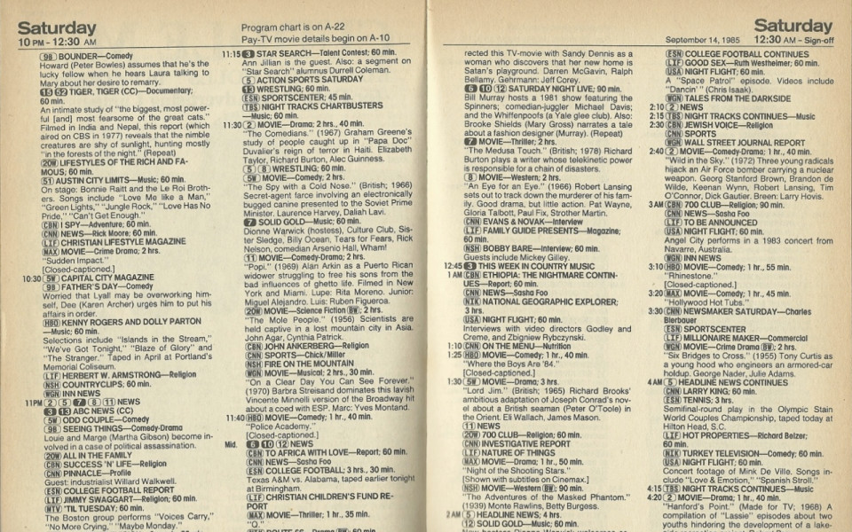
And so, what they did is they asked all of their writers to start using this green screen mainframe application — like way back in the 1980s.
-
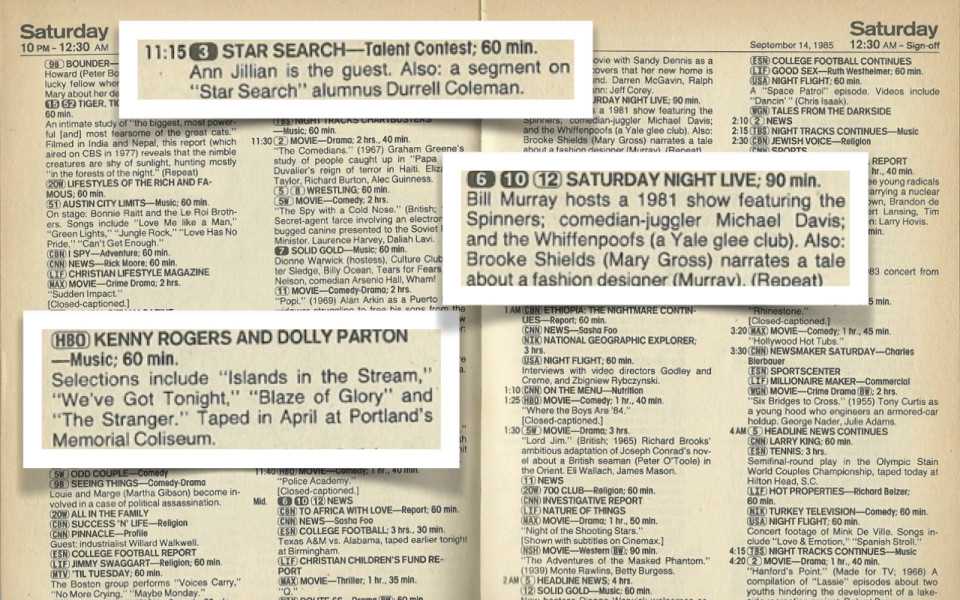
They told them, "Now, for every program description that you write, you are not just going to write one version, you are going to write three different versions. You are going to write a short version, you're going to write a medium-length version and you're going to write a long version." You can imagine how their writers responded to this. It was like, "Oh, you just tripled my workload here." But, the truth is that TV Guide recognized that they were not in the magazine publishing business. They were in the content business. They realized that they were going to get more value from what they were creating if they had this in a clean base of content that they would be able to re-use in the future. The thing is they didn't even actually know how it might get re-used in the future.
-
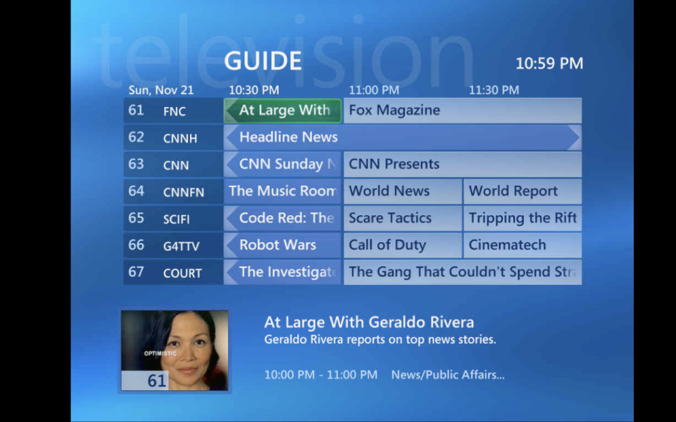
They didn't know that your cable company was going to give you a digital program guide that you could access, and that maybe that cable company would want to show the short description of the show.
-
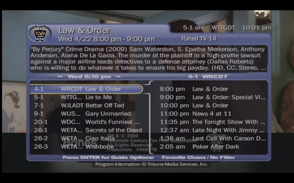
They didn't know that there would be a TIVO that would allow you to control what you watched on TV in advance and that maybe they would want to use the medium description.
-
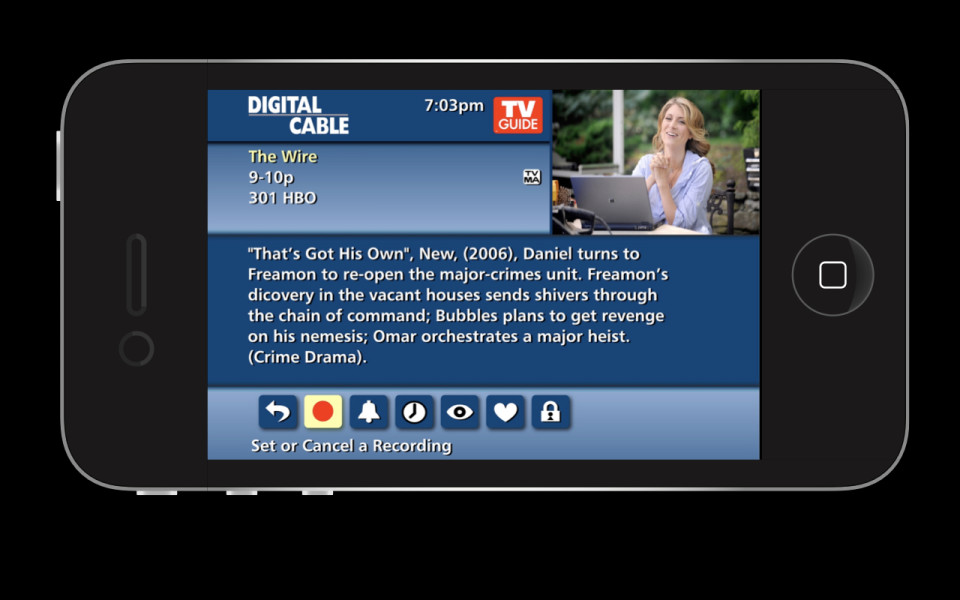
They didn't know that, you know, by god! you could have an iPhone app that would allow you to talk to your television set from wherever you were and that, from that, they might want to show even the long description of the show. They had no idea where that content was going to go in the future. But what they did know is if they planned it effectively, if they thought, "How might we set this content up so that it can be flexible and be free and be reused in the future?" then, by god! we're going to get more value out of it. That has turned out in fact to be the case. The assets of the magazine publishing company for TV Guide was sold for $1.00 — less than the cost of a single issue — to buy all of the assets of the entire magazine publishing brand. Because there's no value in publishing a magazine. All of the value, all of the assets were in this content; it was in the data. So now, they have a data service they use to sell all of these program descriptions — and that's where all the money is. And so, for a lot of organizations, I think that's how they're going to have to be thinking about their content.
-
The idea that you are not in the magazine publishing business, you are not in the web publishing business, you are in the content publishing business, and thinking about how to set up your content so that it can go someplace in the future, means thinking flexibly about reuse. What it means is that you have to create multiple sizes of your content. There has to be meaningful metadata attached to it so that in the future different platforms can query it, and the content has to be written with an eye to reuse.
-
So, it's an interesting question to me, when you look across this space and look at who is doing interesting stuff. Why is it that the Boston Globe can launch with this innovative, responsively designed website? Why is it the Guardian can announce that they're going to go Digital First? Why is it NPR, 5 years ago, they had the presence of mind to say, "Hey, you know what we really need to do is launch an API so that devices we haven't even thought of yet can hopefully get access to our content?" It's like, why is it that all of the organizations that are doing really innovative stuff are news organizations?
-
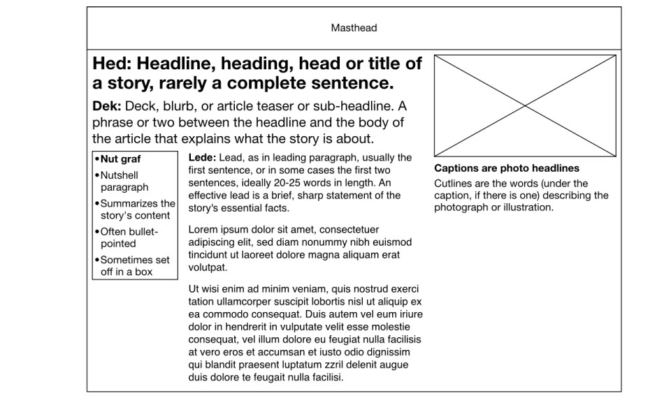
And so, the answer to that is that you go way, way back to journalism school, is that news organizations already have structured content. They are taught from day one that they need to think about their content that way. That they are creating in terms of things like: you have to write a hed, a headline — something that captures the essence of the story. Presumably, they even understand that you might have to write multiple versions of the headlines that might appear in different places, you may not know where. They know that you have to write a dek, which is a short summary that sort of explains what's going on in the story — it's like a sub-head. They have this whole concept called "the lede" which means the first paragraph. Everybody's heard the expression "don't bury the lede" or "this is burying the lede." What that means is put the most important ideas in the very first sentences because no one's gonna read further if you don't. They have, not one, but two, different words for photo captions. Captions are kind of like the headline, and the cut line is a brief description or longer description that explains what’s going on in the photo. They have my favorite term for a bit of content which is: the nut graf, which means a bullet pointed list that might be set out in a box that highlights the main points of the story. You can look at this and you see that you have an organization of journalists that are all taught and trained to think and write this way, presumably if they are confronted with a content management system that asks them to structure their content, they know how to write that way and they understand why it’s important.
-
Now, you contrast that with lots of other publications, lots of other magazine publishers for example. Where the connection that they make between the words that they publish or the content that they publish and the way that it looks and the way that it’s styled is so tightly woven that it’s very hard for them to imagine separating what they are creating from the way that it’s going to look on the page.
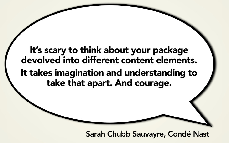
I had a great conversation with Sarah Chubb, who is the former head of Condé Nast Digital, talking about some of these magazine publishers like Vanity Fair. She said it’s really scary for an organization for whom the connection between what they publish and how it looks and how it’s structured is so tightly connected, it’s scary for those people to think about all of their different content elements de-evolved into different pieces. For them to get to this place, it’s going to take a lot of imagination, it’s going to take a lot of insight and understanding, and, frankly, for a lot of organizations it’s going to take a lot of courage to get there. What this means is that we are getting down into this bedrock connections that I think we make in terms of what content and design mean.
-

Which is that we have a really hard time separating content from form. We have a really hard time imagining what something says, what its words are, might be disconnected from how it looks — or more important that if you are thinking about multi-channel publishing, how it looks might need to be different for every platform.
I sometimes get flack for saying this. I am not saying that design is not important; I am not saying that it is necessarily possible for you to completely take content away from how it looks or its style. I think that design is every bit as important. Frankly, I think it is even more important as we think about how do you adapt your publishing processes and your brand and your identity to this multi-channel space.
But, what I am saying is that if you believe that design is important, if you want to provide a great experience across platforms, if you want to provide the ideal experience for whatever platform or device you are creating an experience for, you need a clean, well-structured base of content to work from. You cannot go into it thinking that you are going to have content that has already been styled, already been designed, already had all of the decisions made about how it looks and works made for another platform.
The problem here for our space is that these issues, the real root of the problem goes way, way down into the bowels of the system — way down into the content management system. So, what we have today are publishing tools, we have content management systems that force us to think about content management + authoring and content publishing + display as the same thing. Every web content management system out there pretty much forces us to bind those two things together.
What that means then, is that we are always thinking about recycling content. We are always thinking about taking content that was designed for one platform, that was intended to be published on one platform and then trying to figure out how we can retrofit it, how we can recycle it, how we can shove it onto some other platform.
In the future, what I believe is that we are going to have better content management and content publishing tools. We are going to have ways to take well-structured content, well-designed chunks of content that we can then figure out how we want to restructure and publish and display in a way that’s going to be right for the appropriate platform.
Just the way that NPR does it. They say "We are going to have a whole bunch of chunks and then each individual platform can go query that content and say you know what, I want to show the short summary or I want to show images here because, give me all the images, I have a great image experience, or I don’t want the audio file because it would be ridiculous for me to have an audio file in this experience."
It means that what we are going to be able to do is have all the issues about how it gets displayed, how it looks, how it feels, be made for the platform because we said, "You know what, let’s start by thinking of the content as something that can be used anywhere." That means that content authoring is not the same thing as content management and content management is not the same thing as content publishing. Right now, most of the tools that we have force us to think about all three of these together. They don’t allow us to break them apart. But, in the future, we are going to have to break them apart if we are ever going to support this crazy multi-channel world.
-
And so, more than this tight marriage of content and form, what we are really getting at for us in the digital space is something that goes much deeper, and it’s the idea that there is a primary platform for which we are creating something. Shockingly so, given that we are 20 years into this, for so many organizations that platform is still print.
-
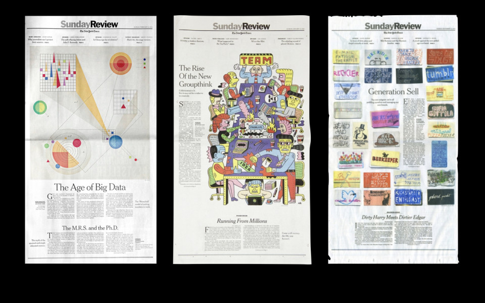
If you don’t believe me, I will tell you a story. The New York Times recently launched a new section. They replaced their Week In Review section with the new Sunday Review. How do you think they came about coming up with these fabulous new designs? Well, the print people went off and they sat in a room and they brainstormed all kinds of things and they are like: "Yeah, you know, on the section front we are going to have like a giant image…
-
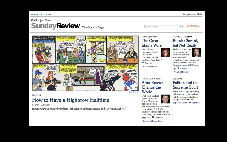
…and then on the inside we are going to lead with a big comic strip and, you know, here’s how all these pages are going to be laid out, here’s all of our content features and the layout of them within the section are going to be really closely intertwined."
They mock this up and they brainstorm and they get approval. They finally got to a place where they're happy with it. Then they took it to the digital people and they said: "Here. Put this on the Internet." So, what you see is an experience that is entirely created for content consumption in print. All of their values, all of their hopes and dreams for the section were all geared around "How do we make the print experience possible."
-
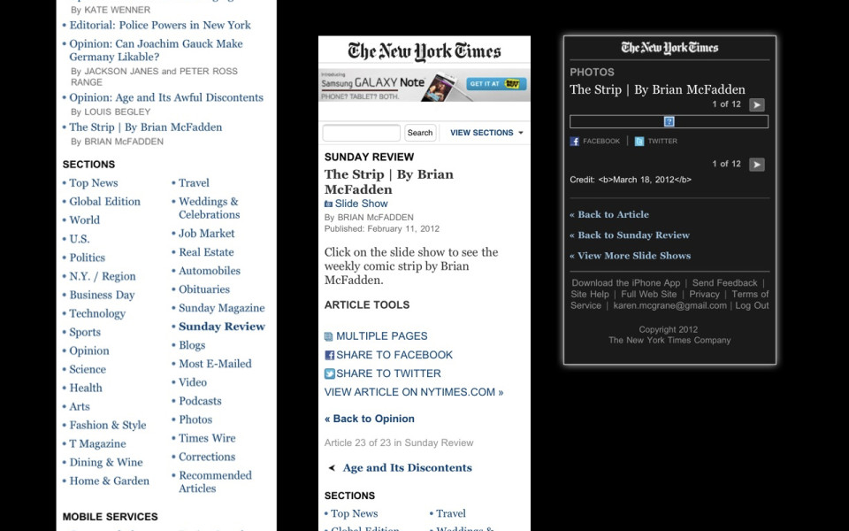
Then it was: "Okay, well, you know, you guys, why don’t you figure out what to do with all of our content now that you’ve got it for the web." And it’s like: "Oh, I don’t know, that giant image you’ve got on the section top, we’ll kinda lose that experience. I guess the comic strip is really important to you so I guess we could lead with that on the section top on the desktop web."
Then you get to mobile and it’s like Wow! Nobody really thought about this, did they? This isn’t really a mobile experience. It’s like: "Okay, yeah, I am super interested in that comic strip, where is it? There it is way down at the bottom. Wow! This is an entire page of navigation chrome for no actual content at all. I don’t even know where to click. Oh! I have to click on that tiny little link in the middle of the metadata for the slideshow. Okay, let’s check it out. Awww! It’s broken."
This isn’t a mobile experience. This isn’t an organization that was thinking about their content holistically and trying to figure out what would be a good experience for consuming that content across any platform. That was an organization that was sitting there thinking: "How can we create content for print and then shove it onto the desktop, and then take the content, once we’ve got it shoved onto the desktop, shove that on the mobile site."
-
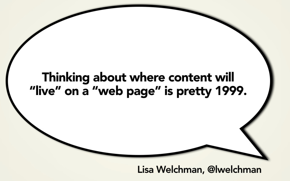
It’s so easy to make fun of these print dinosaurs. We all can sit here looking at this and think, oh, like five years out, ten years out, print is not going to win this war, right? It’s so fun to just look at them and point fingers and say "Man, you guys are making really stupid decisions here. We would never make stupid decisions like that. Right? Right?"
Well, no, of course we are! We are making the exact same stupid decisions. And you know what? We don’t even have several hundred years of history and values and culture and process to draw on. You know what we have? Like 10 or 15 years of using really bad content management tools. Forcing us to think, forcing us into ways of thinking about our content that just aren’t going to adapt.
What we are doing is we are letting people think that what they are creating is content that lives on a web page. We are letting them preview their content on the desktop website and imagine that is the one and only one place that content is going to live. We are making the exact same mistakes that these print dinosaurs are making. Unfortunately, we are doing at a time when we should be a lot more flexible and a lot more adaptable.
Just the same way that TV Guide is not in the magazine publishing business and the New York Times is not in the print newspaper publishing business, we are not in the web page publishing business. We are in the content publishing business.
-

So, when I say you have to start from basic content, I do not mean that you start with print and then figure out how you are going to shove that content out onto other platforms.
-
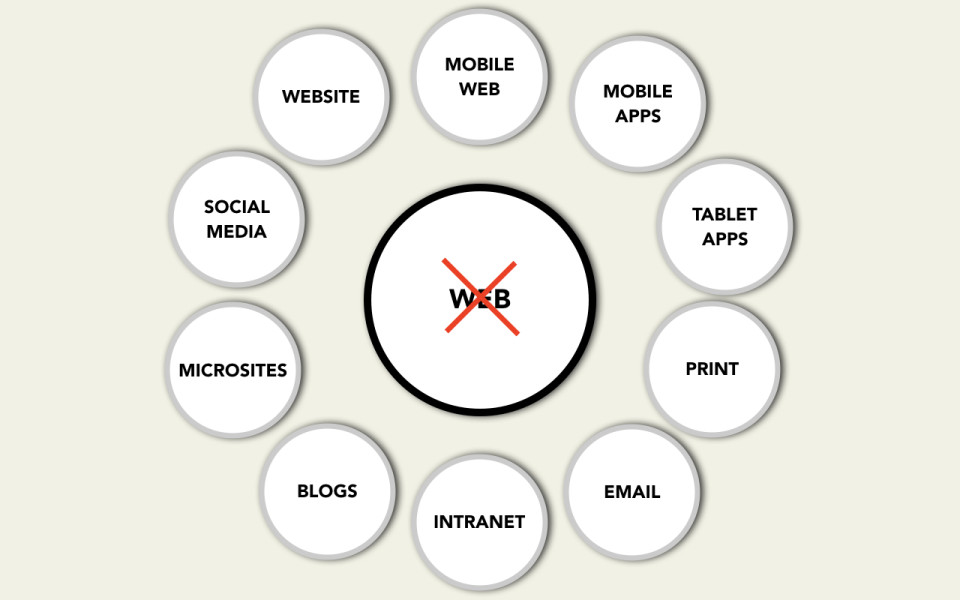
I do not mean that you are starting with your desktop website and figuring out how do I shove that content that I wrote for the desktop web out onto my mobile site.
-
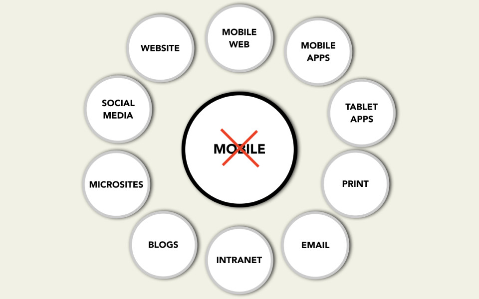
I don’t even mean that you start with mobile and say let’s take the mobile content and then figure out how we progressively enhance it for other platforms.
-
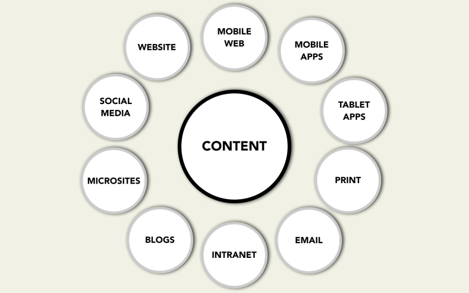
No, what I mean is you start with content. Clean, flexible, reusable content that is designed from the start, is written from the start, with a mindset and a values system that says "I don’t necessarily where this content is going to live. I don’t know how it’s going to be used in the future. But, I do know that I have to create lots of flexible content that has metadata attached to it because I know it’s going to be reused in different places."
-
So, what does that mean? How do we get there? I said earlier that to create adaptive content you need to create multiple sizes, you need to have meaningful metadata attached to it, and it needs to be written for reuse.
-
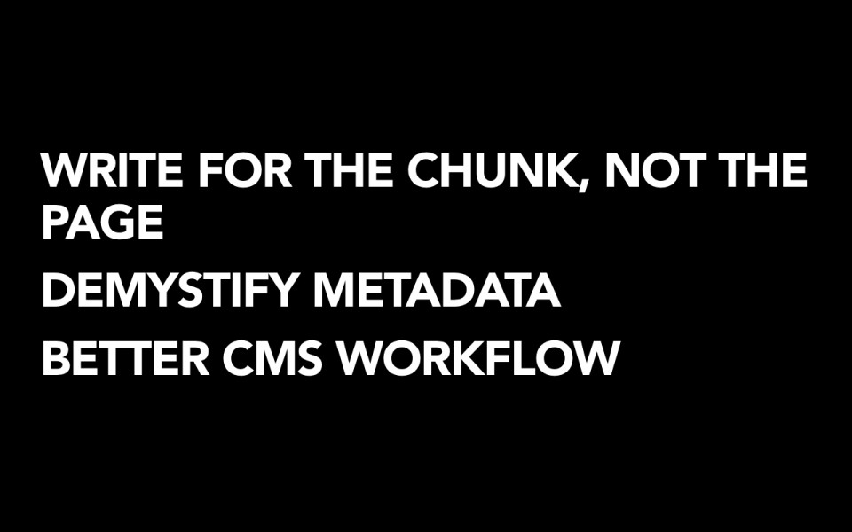
I want to talk about three things that in turn have to change in the way that we think about our content. So the first thing is that we've got to teach people that they have to start writing for the chunk and not for the page. So this means getting away from some of our really deeply held beliefs about content and form and starting to say, "You know what. I have to write flexible chunks for reuse." It means that we have to demystify metadata for people. We have to start teaching people what metadata means, this is why it's important. You have to figure out ways to add more value, more description to your content. And then, finally, if we are ever going to support multi-channel publishing, we have to have the tools to do it. We have to have content management systems, content management workflows, that treat content authors like they are users of an enterprise platform. We have to give them the right interfaces, the right workflows, the right experience of managing their content. Otherwise, there's no way that they're going to be able to write things the right way or assign the right metadata.
-
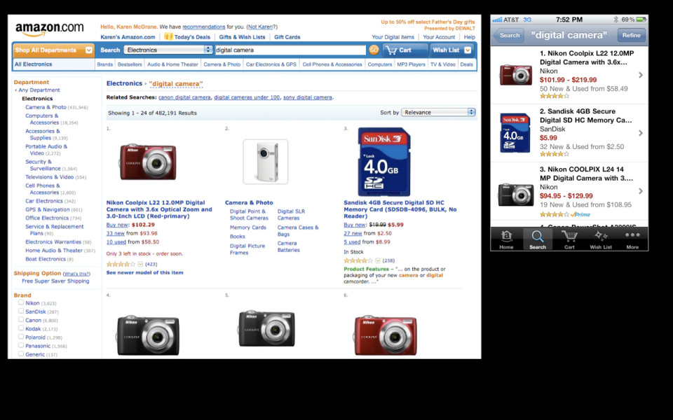
So let me talk about each one of these things in turn. So this first one: writing for the chunk and not the page. I'm going to give you an example here of Amazon.com, maybe you've heard of it. So Amazon. This is Amazon's landing page that you might get to if you were looking for a digital camera. A lot of people tell me, "Amazon is really doing a great job in handling mobile." And I would agree that they are, at the first couple of layers of the experience. So here's a fairly dense landing page for digital cameras and I think they did a fantastic job of coalescing that information, crunching it down, making it navigable on a small screen.
-
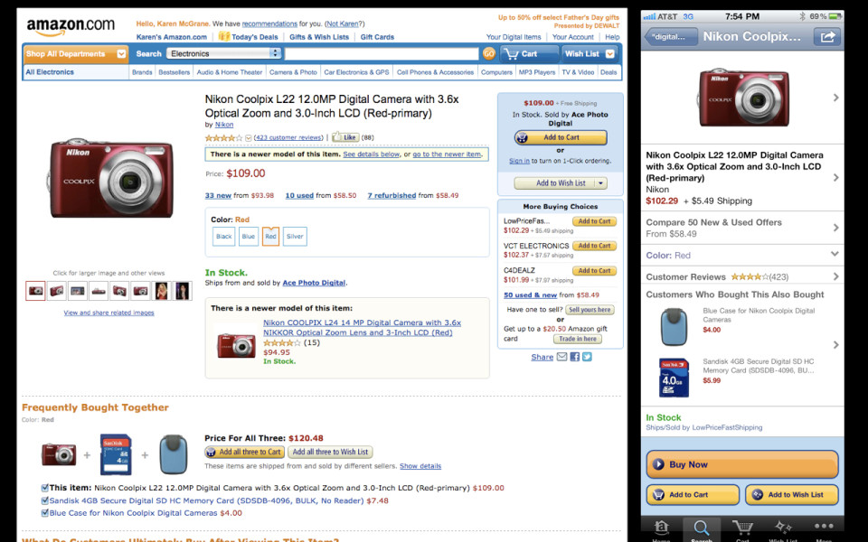
So if you tap into one of these cameras, you go to Amazon's product page. Now, I'm sure you guys have all seen this before, but it's like, damn. Amazon's product page has a lot of stuff on it.
-
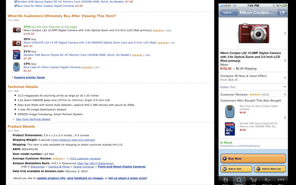
I mean, they've got all the product descriptions.
-
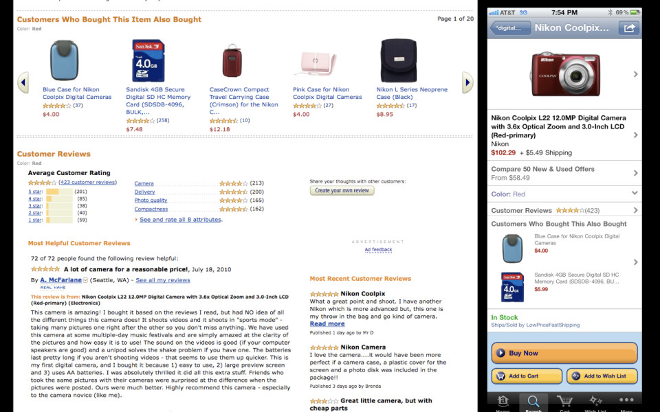
They've got other products you can buy. What other customers buy.
-
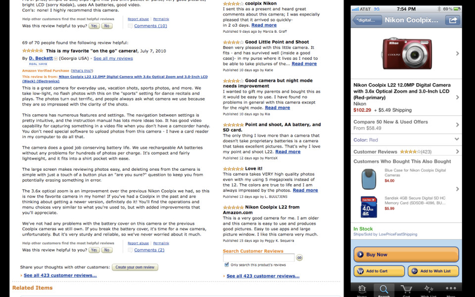
They've got technical details and product details and all the stuff from the manufacturer and other related products and customer reviews. It's like it goes on and on and it's like "How are they going to get all of this content onto this teeny little screen?" And they do an excellent job here, I think, of taking the top level sections and making them navigable, tappable, regions on a small screen. And that's because they already have structured content. All of these fields are sort of already structured so that you can get at them easily. So when you click into this, I'm going to spend some time going through this.
-
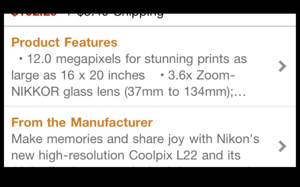
This is Amazon's product page on mobile. So first screen here. Okay, first section is product features. I don't really think that's how you're supposed to use a bulleted list. Next section, from the manufacturer. "Make memories and share joy." Could you imagine if you walked into a Best Buy and you were like, "Hey, salesguy. What camera should I buy?" And he was like, "Make memories and share joy."
-
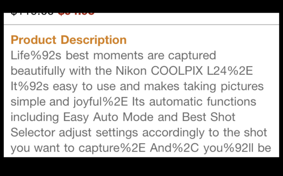
Third section, product description. They're just repeating the name of product over again. There are 73 words on this screen. I have counted them. 23 of them are repeating the exact same words that you can get in the product description. Five of them are "Make memories and share joy." Next screen here, let's go into the product description. Yes, it's that tricky punctuation problem we've been trying to solve on the internet for the last 15 years. We're going to get it right one of these days, guys.
-
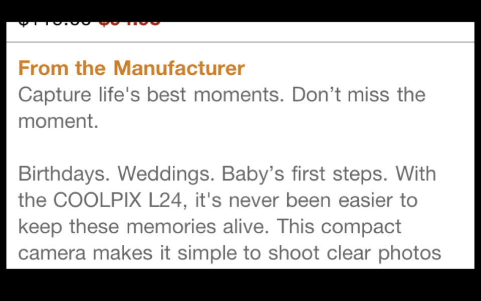
Let's look at what the manufacturer has to say, "Capture life's best moments. Don't miss the moment. Birthdays, weddings, baby's first steps." That's like, "Nikon, I need you to sell me a camera. Not on the concept of photography."
-
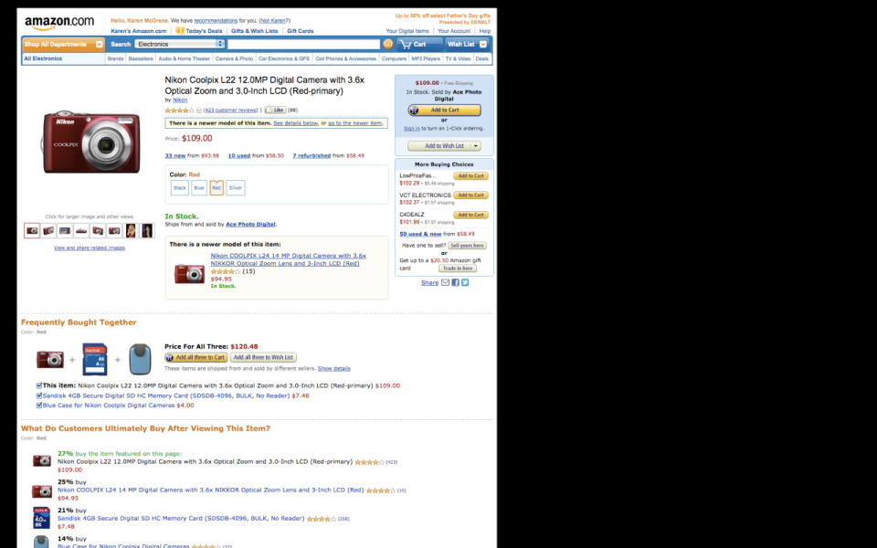
So I'm going to take you back into this screen here. It's an important point and I want to beat you over the head with it a little bit. This is Amazon's product page. This is one of the most intensely designed and researched and analyzed and tested pages on the internet. They have AB tested the shit out of this thing.
-
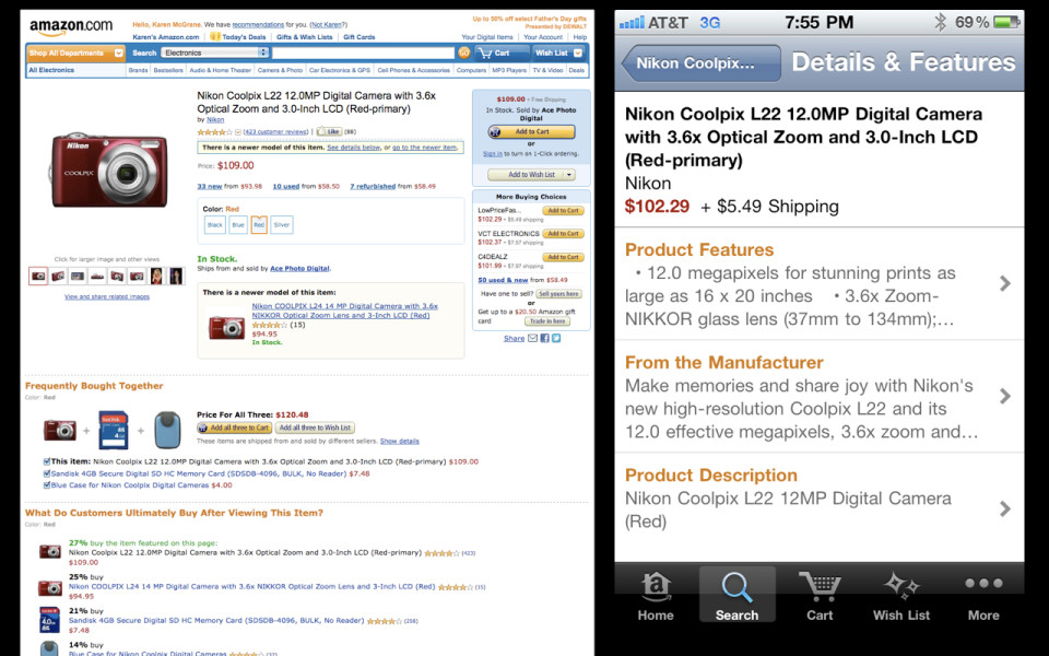
And when they got to mobile, what they did is they told the robots to go into the database and to shovel whatever content they found in there until they ran out of room. What this says is that it's perfectly okay to just take whatever you find on the desktop and just shove it onto mobile, and then when you run of out of room, you can just drop an ellipsis in there, because that's going to be more than enough information for someone to make a decision. And the truth is, that no, you have to write content differently. You have to think about writing. It's like the journalists in the audience would say, don't bury the lede. Like what Nikon was doing there in their product description is the definition of burying the lede. It's like, put the most important stuff up front. Think about how you are writing chunks of content, different sized chunks of content. Say you know what, we're probably going to need a 60 word version of our product description. And we don't necessarily know where it's going to go, but at least we know if we've got that much space on a mobile app, we're going to have something that's going to fit there that isn't going to be a bulleted list — that isn't going to be random marketing speak that doesn't actually tell me anything about the product.
-
And the root of where this comes from is that we have content management tools that allow people to think about creating giant blobs of text without any fields or structure around them. We have CMSes that allow people to say, "I want it to work just like Microsoft Word." I want to be able to embed tables and fonts and images, and I want to be able to style and design my content so it's perfect for the way that I'm imagining it's going to look and work. I want to have a tool that works just like Microsoft Word so that I can imagine how my content is going to look and work in the one and only one context that I'm imagining it, and that is the desktop website. And so you have people who have the ability to create these giant unstructured blobs of content with formatting and images and whatever else embedded. And that means that they're not writing chunks.
-
So I really believe, guys, that we are in a war of Blobs versus Chunks. We are in a war between giant, unstructured blobs of content, and clean, well-structured fields of content that have metadata attached. We are in a war of Blobs versus Chunks. You all are on Team Chunk. We cannot let the blobs win.
-

So what this means is that you have to have a content management system that has an appropriate number of fields to be entered, and that the workflow for creating those fields makes sense to people. So you look at something like this and presumably everyone from NPR can look at this and say: I know what all of these different headlines are. I know what all these fields are. I know what these teasers are. I know what this metadata is.
-
So, next thing we've got to do is we have to find a way to really demystify the concept of metadata for people. I think the information architecture community has been kind of banging on this problem for 10 or 15 years now, but truthfully, this is the time. It's one thing to say, "Oh, I don't really need to worry about that much because I'm only thinking about my content in one context, and that's the desktop." But when you start thinking of your content living in dozens of different places, dozens of different platforms, you have to have more description attached to it, because it’s the only way that you are going to be able to answer those questions. Have those platforms be able to go back and query the content and say "What do you have and what can you show me?"
-
It means explaining to people the idea that what metadata does, is it allows you to programmatically build pages.
I do a lot of content management system work and one of the hardest things to explain to people is the idea that you are going away from handcrafting a landing page, handcrafting a page of content. Instead of manually going in and saying "I want this image to appear here and I want this headline and I want this short description," getting them to say now, instead you are going to be thinking about creating content objects.
You might be writing three different versions of that headline; you might be writing two different short summaries and you are attaching a couple of different images to it, different cut sizes, and then you may not be the person who is in charge of deciding what image or what headline gets displayed on that particular platform. That decision will be made by the metadata. It will be made by the business rules.
-
This quote, "Metadata is the new art direction." It’s one of my favorite ones because I think it reflects a real mindset shift and what it means to design a page, what it means to have control over how something looks or works. It means that we are moving away from this very print-centric mindset where you are going in and you are placing every dot and every image and every piece of typography on that page. That means also that we are moving away from a desktop-centered concept. Where you might say I am going to have some stuff appear here on my article page and I am going to handcraft the landing page to show exactly what I want to show. You don’t have the power to do that anymore or you don’t have the resources to do it.
I go in and I look at some people’s CMSes these days and it’s like okay, yeah, yeah, we go in and write multiple headlines, so, we have the article headline and the SEO headline and the Facebook headline and the Twitter headline. You can see where this is going, right? The iPhone headline and the Android headline. It’s like "Whoa! Guys! Stop! This is a zero sum game here."
Where you need to be thinking instead, is think about that as a system. Think about that as "How can I create a limited number of pieces of content to work with, and then use business rules to decide what content is going to appear where." It means that the people who are going to be making the decisions about how something looks or how something works are going to be the people who know how to manipulate that metadata. They are going to be the people who know how to construct those business rules.
It’s not going to be an Art Director saying "I want this to look exactly the way I intended it." But, rather someone saying "I know how to set up the right rules, the right instructions, the right boundaries, so that the robots will be able to construct a really great looking page even though I may not have control of the way every single element appears."
-
The second thing is that we have to explain to people is how metadata can be used to prioritize information. I had a conversation with Ethan Marcotte this summer where he said one of the challenges that they had on the Boston Globe site was figuring out how do you take all of the insight that goes into a layout on the desktop and figure out how you reprioritize that information for a smaller screen. The truth is you are not going to be doing that manually for every single platform. What you have to do is have that metadata already attached to those content objects so that you can then go in and say "Okay, how is that going to work?"
-
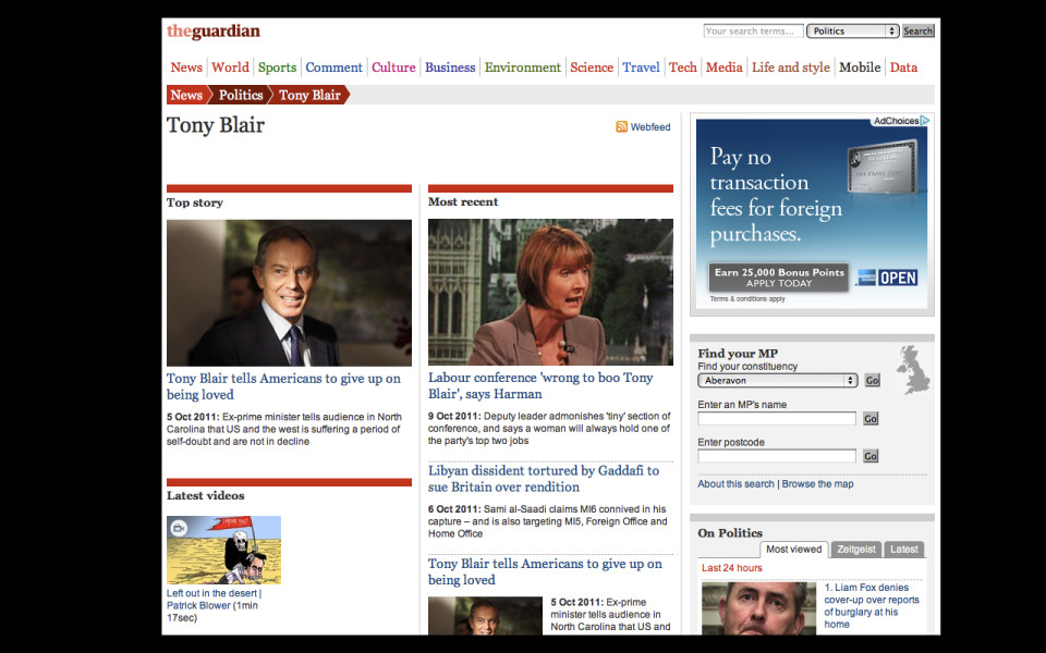
A couple of examples of this from The Guardian. What they have is these automatically generated topic pages. So, they can go out and the robots will pull all the information they can find about Tony Blair. What they found was that when they first launched these, the "Top Story" was not actually the top story. What it was, was the most recent story. So, what you would find is that there would be a lot of information just sitting there, a story sitting there that wouldn’t actually be all that relevant and it would sit there for a few days because nothing more important had come along to knock it off the page. They realized they probably need to start assigning some editorial priority in the metadata on the backend. So that when stories get reused like this there’s a little more subtlety to it.
-

I find myself thinking, I work with publishers all the time, where they go in and they say okay, we are going to assign this story to our home page or to our section top, and we are going to go in and we say I want this story to appear first, and this story to appear second, and this story to appear third. When they change that, later in the afternoon, they go in and they rearrange their stories, all of that metadata is lost. All of that information about what those editors thought was important on that particular day gets lost. Because they were thinking about it as a display issue. Here’s how I want these stories to appear on this page. They weren't thinking about it as a metadata issue, meaning "What information is my editorial judgment telling you about how important this story is? And how can I save that for later?"
Instead of saying, "Okay. Show the story first, second, or third." It's like apply some metadata that says, "Okay. This story is more important than that story." And then, by god, save that information, because you might want to use it again in the future.
-
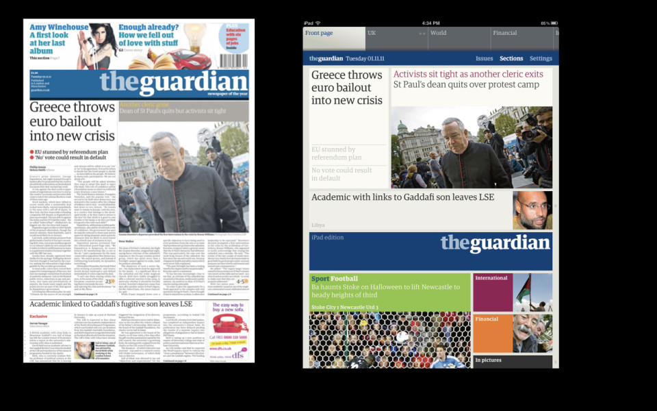
So the Guardian had to solve the same problem again for the iPad and they said, "Great, we've got a lot of editorial judgement going into our print edition. Let's find an algorithm that we can use to suck out that data and use that to drive the layout of the display." There's a lot of interesting insight that we're making that learn about how important things are. What we want to share or say about that story that gets lost if we think of it as purely a display issue and not as a metadata issue.
-
And so, finally, the only way that we actually are able to do that is if we really start investing in content management technology. We today do not have the tools to support what we need to do. We have clunky interfaces.
-
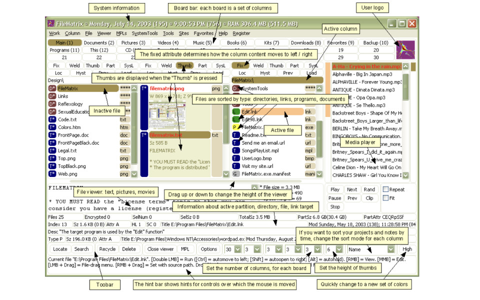
We have CMSes that look like a database got drunk and vomited all over the screen. What that means is that people don't want to use these tools. They find workarounds that allow them to get away with creating a big blob of content, with not assigning the right metadata, with not writing all of the versions of the content that they need.
-
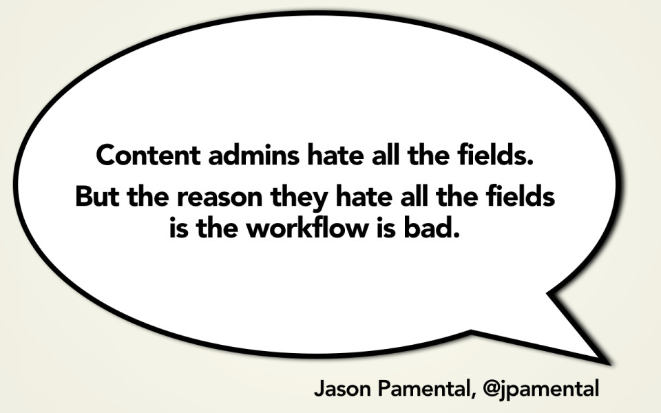
And the truth is you look at a lot of these tools and it's like, "I can see why you hate this interface. I can see why you don't want to assign all these fields. I can see why you don't want to edit all of this metadata." It's because the workflow is terrible. The interface looks like crap. It's like your eyes are bouncing around from field to field and it's like, "oh, enter something over here and then go down here and like enter something else and then take this code and remember to copy and paste it into this other field that's in this completely not intuitive screen way down in the left-hand nav." You look at these tools and everything seems so fixable.
-
It's like this is an enterprise software problem. I know lots of people out there doing UX in the enterprise software space, who could very easily go in and say, "Why yes, we know how to fix these types of problems. You just follow a basic UX practice and treat people like they're users of the system. Figure out how to redesign those screens and take all the crap off that somebody doesn't need and the experience will be better for them."
-
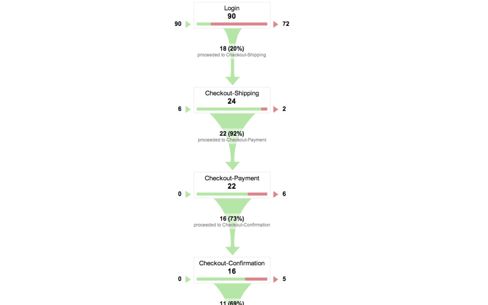
When I talk to people about this at lot of organizations, it's like they look at me like this is a luxury. Like I'm doing this just like out of the goodness of my heart. The thing is, if you were running an e-commerce website, you would know everything there was to know about that e-commerce funnel. Every drop off. Every error. Every time somebody made a mistake. Every time you saw friction in that system, you would go in and you'd be looking at all these places where there was red in your funnel and you would go in and you would optimize that. You would figure out: Why are people having problems? How can I fix this form? How can I make this easier for somebody to fill out? Because you would know that every place that there was red in this funnel, every place someone found friction, is lost business value for you. The truth is, for any organization that is in the business of creating content—and in this day and age what organization isn't in the business of creating content?—if your business is to create content, then your CMS workflow is every bit as important to your business as your e-commerce funnel.
-

I don't know anybody out there that has any analytics data at all on how their CMS works. I don't know anybody out there who is analyzing where people are finding problems, delays, where they’re making mistakes, where there’s friction in the process. Because they’re not treating their employees’ time as if it was valuable. And what that means is that they’re losing money. You are having people who are wasting time fighting with the system, as opposed to taking that time and using it to write better content, to write for the chunk, to assign more metadata, to do a better job of creating more flexible content. You are wasting energy on a bad system, as opposed to harnessing that energy for good.
And so that means that we have got to stop treating CMS decisions as if they’re purely technology decisions. I talk to organizations all the time, major corporations, that are like, "Oh yeah, we’re re-platforming our CMS." Entirely all the decisions are being made by IT. They are not getting the content creators involved in this process at all. It’s like, this is UX 101, guys. The decisions about a CMS are not entirely based on things like the system requirements and security requirements and support requirements. The system things are important, but you know what else is important? Whether somebody can actually use it.
-
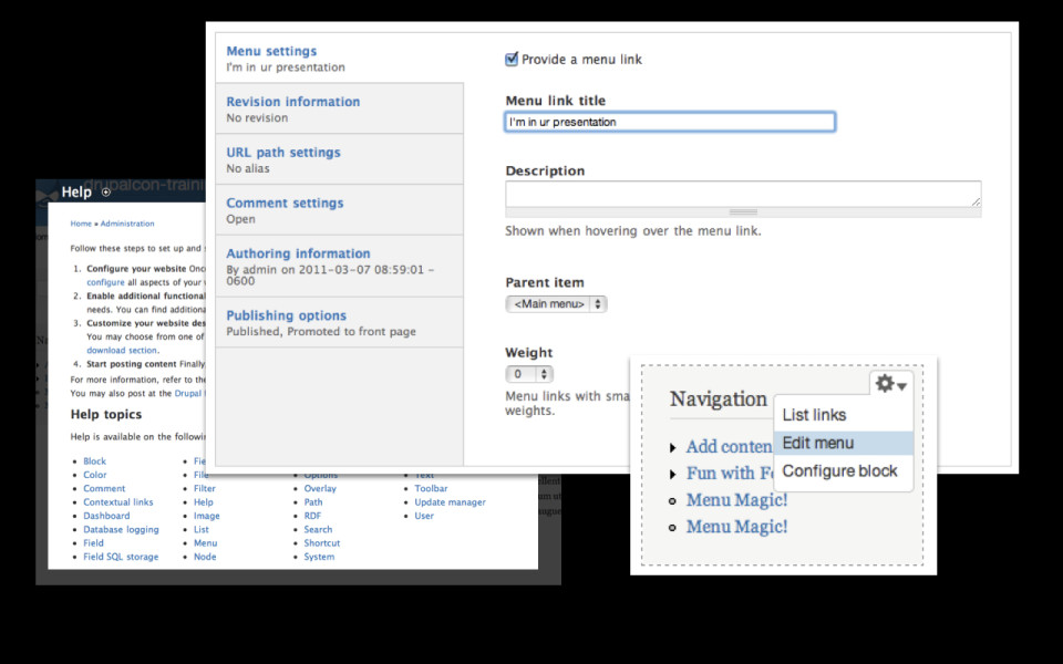
What it means is that we can’t be thinking of usability in the CMS as having nice interface widgets or a pretty font or a WYSIWYG toolbar. That’s not usability. Usability comes from whether the workflow is actually effective for somebody. Do they have the right fields? Are they prioritized in the right way? Does the sequence of screens that somebody flows through make sense to them?
-
Start small; prototype; use open source tools; and make it so that you can actually observe someone using it, figure out where the friction is, and then continually invest in your CMS. It’s not a one-off project where you can be like. "Great, now we’ve got that CMS problem solved! We never need to think about it again." It’s a process. Because you have to think about it as a product. Successful organizations like the Huffington Post, that are really happy with their CMS, are working on it around the clock, 24 hours a day. They are committing eight to ten to twelve different code changes every single day to their Content Management System. And that’s because they’re treating it like it’s core to their business.
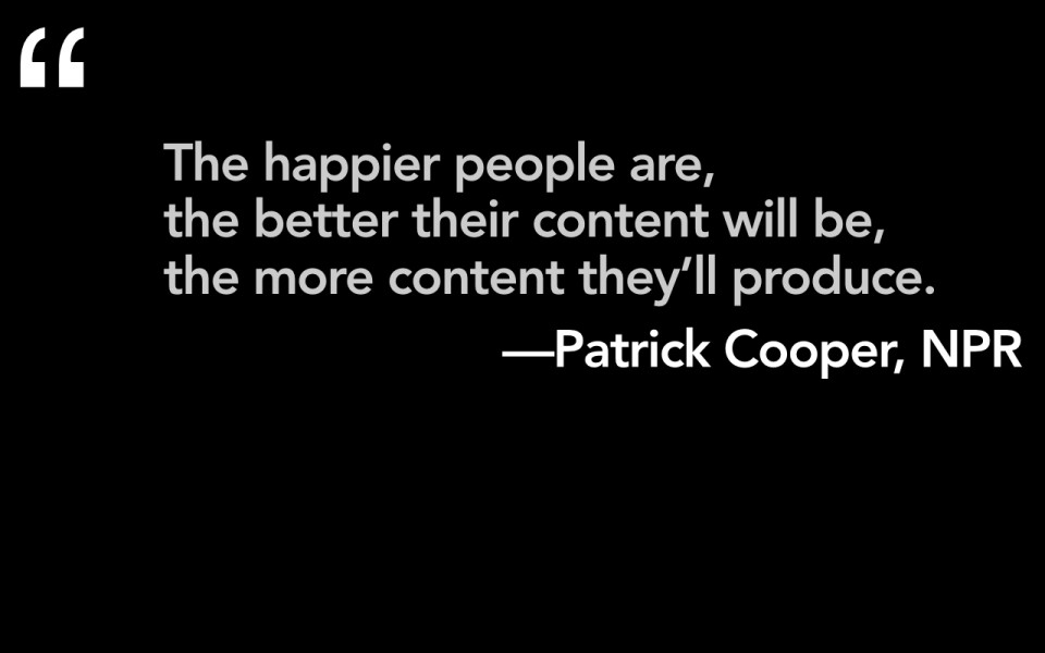
And I say this as a user experience person – I want people to be happy. I want there to be happy content creators who have a tool that they like to use. But I don’t say that just because I want happy users. I say that because having happier users means they’re going to create better content and they’re going to create more content. They’re going to have more ability to do all the things I’ve been talking about, where they have to write chunks of content, where they have to think about how content is going to be reused, where they have to assign better metadata.
-
And what that means is that, frankly, it is not a luxury to think about having a great application for content creators. In fact, it is a requirement. And that’s because if we have better content management tools, we’re going to get better content. That is the only way that we are ever going to be able to support multi-channel publishing. If we ever want to figure out how we’re going to spray our content out onto all of these different devices and platforms, it’s going to require that we have the right tools and the right interfaces and the right workflows to support it.
-
So, mobile. You are not creating a mobile content strategy. This is not about saying "I am going to figure out now how to publish to mobile channels," as if it’s this different thing from publishing to desktop or publishing even to print. What I mean when I talk about mobile content strategy is that mobile is a wedge; it’s a catalyst within an organization. It’s going to be the thing that makes people wake up and go, "Oh crap! There’s no way we’re going to be able to support getting our content out on all of these different platforms unless we start planning ahead in advance."
So what this means is that for all of the fear that organizations have where they freak out, like, "Oh my God, the new devices and platforms, they’re never going to stop!" It’s also an opportunity. It’s also a chance to sweep away bad, outdated desktop content. It’s an opportunity to really wipe away a lot of really bad, clunky, kludgy CMS tools. Let’s start again, guys, and let’s figure out how to do it right this time. Because that’s the only way we’re going to support having flexible content.
-
And it’s because the more structure – if we have these better tools, we’re going to be able to put more structure into the content. And then by having more structure – paradoxically, it doesn’t mean that we’re going to be more constrained at how we use our content. It actually means we’re going to be freer in the future. It means that if we have this metadata, if we have the right fields, if we have the right chunks of content, then, like NPR found, when you want to be able to go out and get your content onto a variety of new platforms, you’ve already put the time into having your content clean and well-structured and a service. Now you can put all of your energy into creating a right experience for that platform. It’s what TV Guide discovered when they said, “You know what? We’re not in the magazine publishing business. We’re in the content and the data business.” And so paradoxically, having more structure, having multiple sizes of our content, is going to mean that we’re going to have more flexibility in the future to get that content onto places and platforms and devices that we didn’t even know would exist when we decided to do this ten years ago.
-
And the second thing is, it’s really time, guys, that we start thinking about what it means to separate content from form. It’s time to say: "Hey, we can’t be imagining how our content is going to live in one platform, in one context." We can’t be saying, "Oh, here’s a WYISWG toolbar; why don’t you just go in there and style it however you want. Make it look great for your desktop website." We can’t be telling people, "Hey, here’s your preview button, I’m going to let you see how that content is going to look on your desktop website." What if it’s not showing on your desktop website? This is the time where we have to say: what does it mean, not just in our tools, but also in our minds, to separate what we write and what we create from how it looks.
-
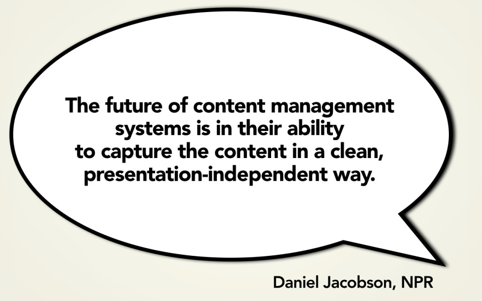
And that’s because, really, if we’re going to have content management tools to support this, we have to make sure that they can capture the content in a clean, presentation-independent way. We’ve got to get all that formatting cruft out of our content. More important — this is a really complicated issue — we have to figure out what’s the right level of semantic markup or semantic encoding that we have. How much of it lives in the CMS? How much of it lives in the HTML? What are the right decisions that we make there in terms of how something looks and works and gets styled?
I’m not saying that this is going to be easy. I think it’s going to be freakishly hard. But if we do it right, it’s going to create a much better system for the future. We’re going to have much better ways to reuse our content more flexibly.
-

And then finally, I think for all of us, it’s a question of saying "How does this change the way that we work? How does this change our processes?" It’s not enough to say, "Oh great, I’m the designer and I’m going to make all the decisions about what I want to show here and why." You may have some constraints. You may say, "Hey, you know it would be perfect if I had 75 by 75 image crop here." And they’re going to come back and say, "You know what? You’ve only got a 90 by 90 image crop and you’re going to have to figure out how to make that work." You’re going to have more structure and some limitations. But it’s also going to give you more freedom, because you’re going to be able to say, "Okay, great. I know the pieces that I have to work with and now I’m going to make the right decisions for my particular platform."
-
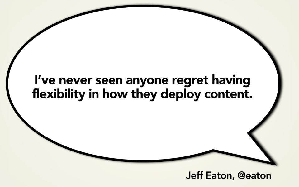
And so the truth is, for organizations that have invested in doing this, nobody has ever regretted it. No one has ever regretted saying I want to plan for the future. I want to plan for flexible reuse. I want to imagine ways that I can use my content again in the future. I want to start now in thinking about what I have to do so that I can make my content free for whatever platform or device it needs to go onto.
-
