Video
Slides
Transcript
-
I’m kind of a high-minded idealist about the web. I think that the web is its own medium. It’s not print, it’s not television. And I believe that the values that define this medium, the values that make this medium great are its fluidity, its flexibility, its availability. The web can be accessed by people using screen readers, or alternate input mechanisms. The web can be accessed by people on slow or fast connections. The web can be accessed using every type of device with a browser. And the web naturally works this way; we don’t need to splinter and fragment the web to get it to do this, it naturally wants to do this—well, as long as we don’t break it.
-
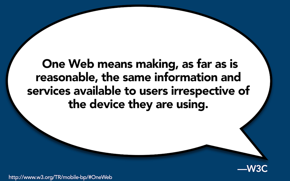
The W3C sort of sums up this high-minded philosophy by calling it One Web. The W3C says that, “One Web means making, as far as is reasonable, the same information and services available to users irrespective of the device that they’re using.” Now, when you read this, it sounds a little bit like responsive web design, doesn’t it? So, I believe that today responsive web design is really just the latest skirmish in the battle for One Web. It’s sort of the latest take on: How do we make the web available to everyone?
-
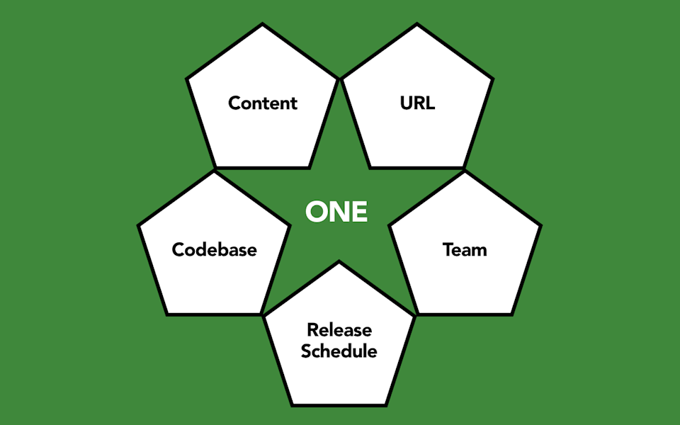
With responsive design, you have a single set of content that you serve up against a single URL. To do so means that instead of fragmenting your efforts across a variety of different platforms and screen sizes, you maintain a single codebase. That means that your entire team can be working together, pulling in the same direction against the same release cycle. And frankly, from my perspective, as a result, you get more value from your initiatives. This sounds amazing, doesn’t it? I mean, why would you ever want to do anything else?
Well, sadly, if there’s one thing that I’ve learned from my twenty years of web consulting, it’s that nothing’s ever this simple.
-
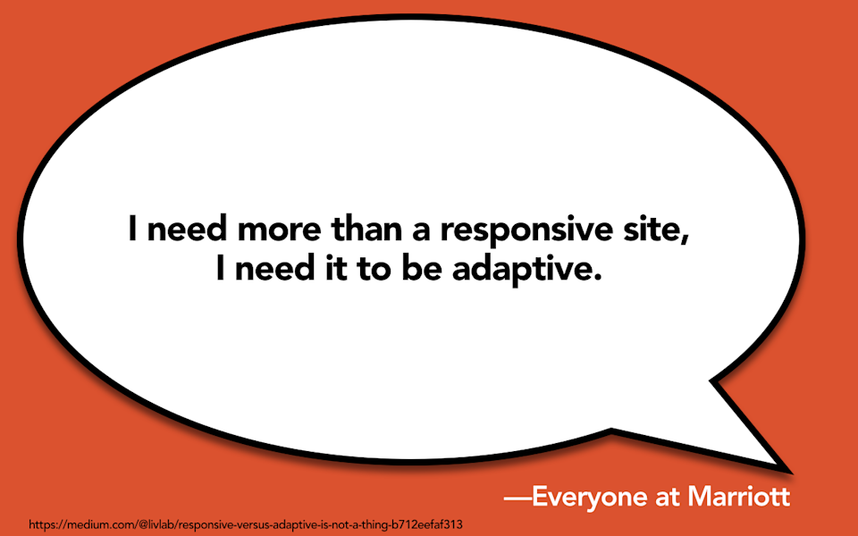
So, Lívia Labate, who was the former head of user experience for Marriott, she led a large-scale responsive replatforming of Marriott.com, said that she would often go into meetings with stakeholders and people would tell her, “I need more than a responsive site. I need it to be adaptive.” And the problem is that nobody knows what that means.
-
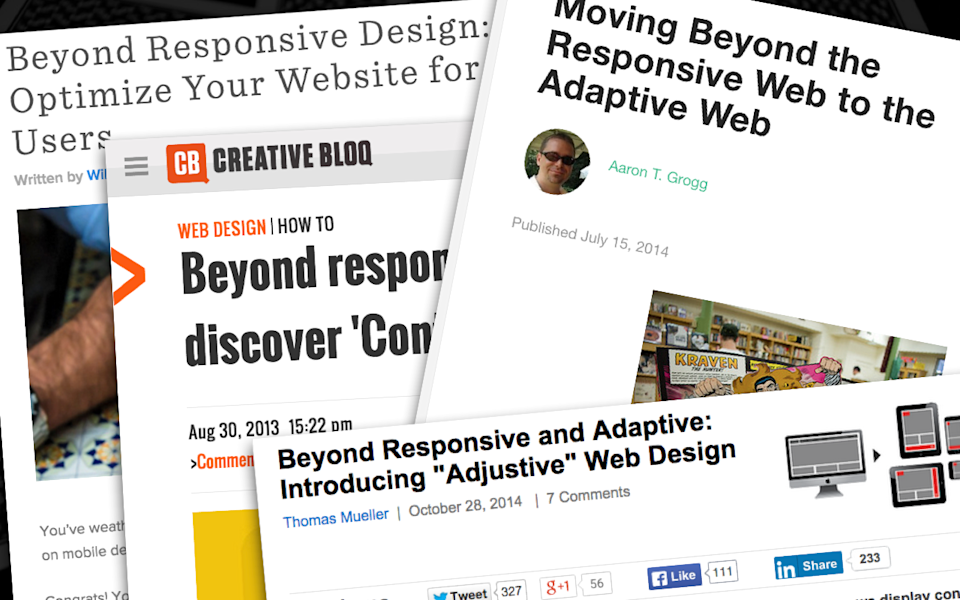
And yet today, when you go around the web, there’s all kinds of people telling us that we need to “move beyond responsive design.” “We need to go beyond the responsive web and optimize our website for mobile users.” “We should go beyond responsive design and discover context first.” “We should go beyond responsive to the adaptive web.” This guy says that we should move beyond responsive and adaptive, to something he calls “adjustive web design.” I don’t know what this guy’s talking about.
-

And when you read these articles, what you’ll basically glean is that adaptive is something akin to magic. You will wave your magic wand over your auto-magically created website and it will magically do exactly whatever it is that your users want at that moment in time on that device.
-
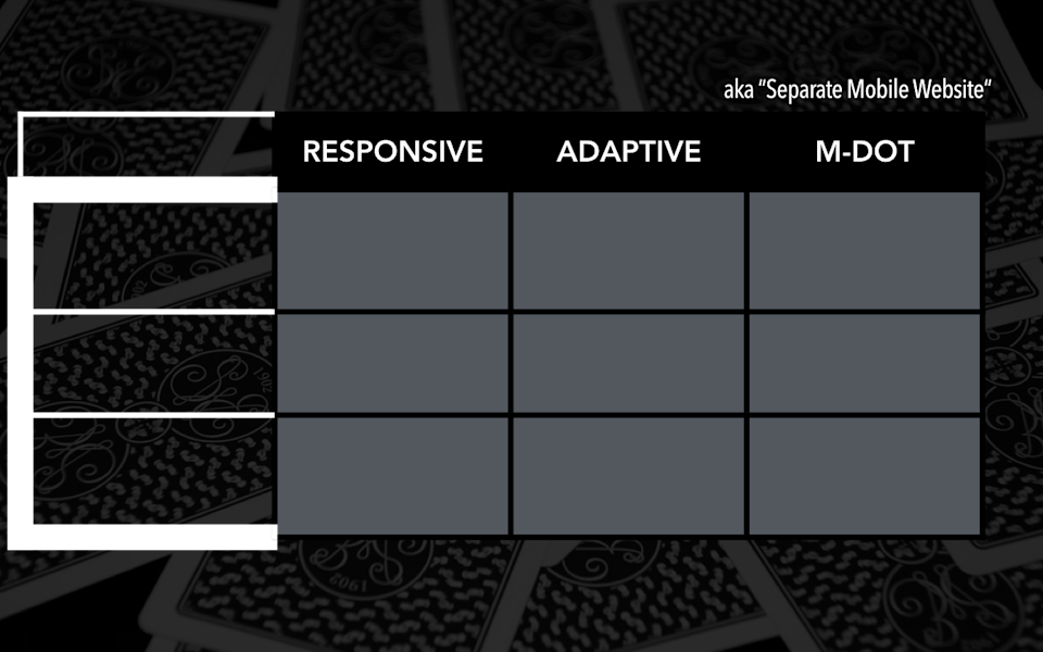
In this talk today, I’d like to outline three different perspectives on how we approach publishing on the mobile web: responsive design (perhaps you’ve heard of it); adaptive solutions (let’s try to figure out what those are); and in contrast, let’s look at our old favorite, the m-dot, or separate mobile website.
So in the course of this talk today, I’m going to outline a little bit of a model of different perspectives of what all this means, but just to get started, let me outline a few definitions so that everybody’s on the same page.
-
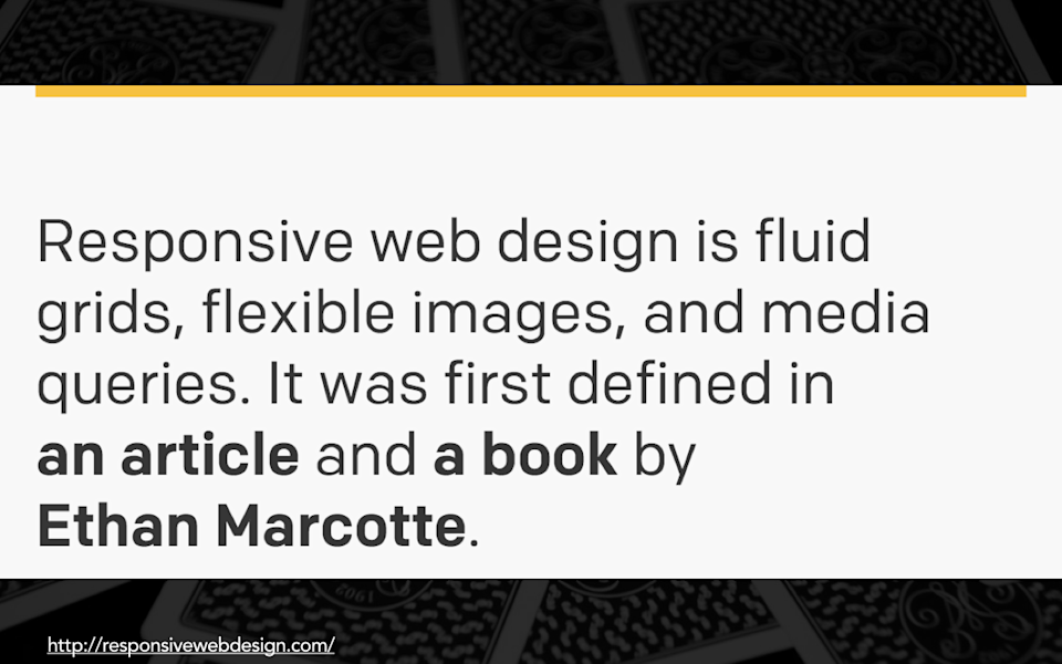
Now, I know y’all are here because you know what responsive web design is. Responsive web design is fluid grids, flexible images, and media queries. It enables you to maintain a single fluid website that will adapt to different devices.
-
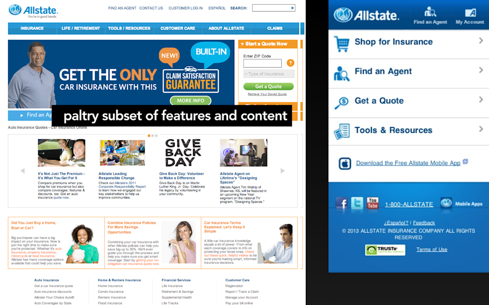
An m-dot site, in contrast, as you realize, is a completely separate website usually served up against its own subdomain, often, “m.URL.com,” hence the moniker “m-dot.” And the trouble with an m-dot is that—well, one problem—is that in most cases you’re serving up only a paltry subset of the features or content that you imagine a “mobile user” is going to want. And by guessing what it is a “mobile user” is going to want, we have to make choices about which website we are serving to which devices. And so another challenge that you run into with m-dots is that it is far too likely that in the great guessing of which website goes to which device, that we will send the wrong information, the wrong services, the wrong layouts, to the wrong type of device.
-
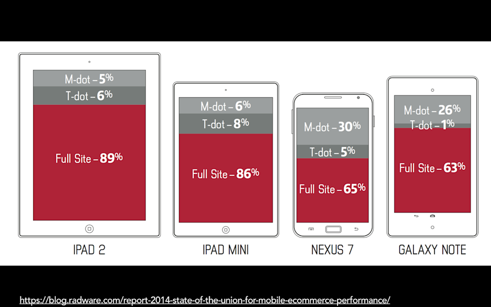
A study last year by Radware looked at which types of sites were being served to large Android devices, and they found that about thirty percent of the time a larger format Android device was served the m-dot version of the website, even though those devices, like the Nexus 6 and the Galaxy Note, had a very similar form factor to the iPad Mini, which only six percent of the devices were served. So, trying to guess which device we should send which website to is always going to be problematic.
-
Okay, so we’re all here, we know what responsive is. You can wrap your head around what an m-dot is. What the heck is adaptive?
-
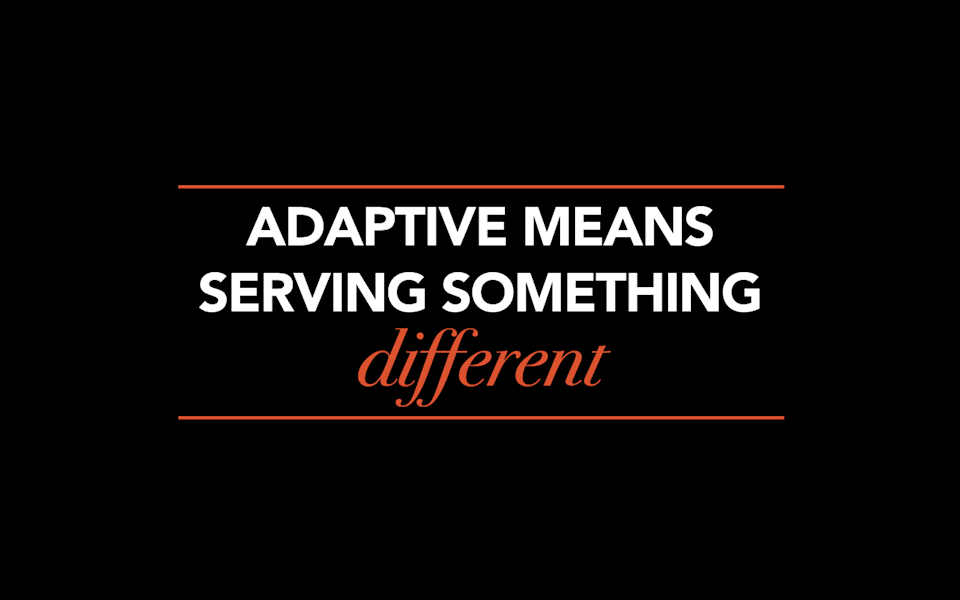
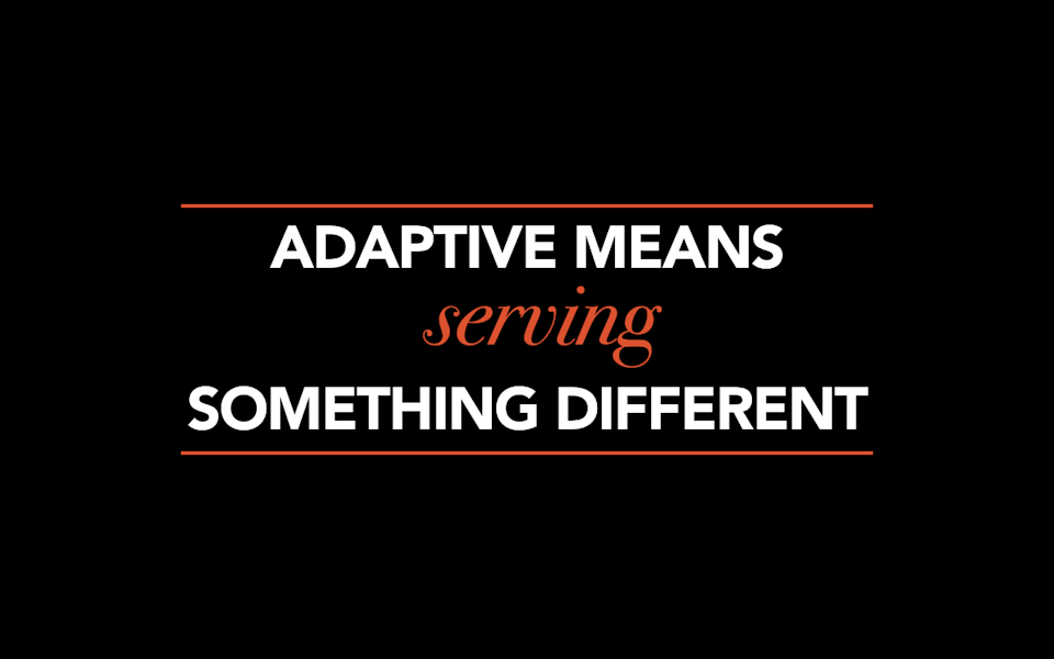
I would like to offer a loose definition of adaptive, which means that it means that you are serving something different, serving up something different to the user or to the device based on a set of characteristics.
-
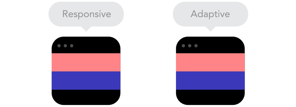
Now, I couldn’t stand up here today talking about adaptive without expressing what I think is probably one of the most common definitions of adaptive, and it is that in a responsive framework, the site is completely fluid across all breakpoints, whereas adaptive is often used to mean a site that snaps into place at particular device-specific sizes.
-

In a responsive framework, as you look at these boxes here, you’ll notice that they are completely fluid. The boxes fluidly expand across every screen size in between the breakpoints. In a responsive framework, as you look at these boxes here, you’ll notice that they are completely fluid. The boxes fluidly expand across every screen size in between the breakpoints.
-
If you look at this example of adaptive, it looks really choppy, and the reason that it looks so choppy is that those boxes stay at a fixed size and they snap into place.
-

Often when designers are thinking about adaptive design, it’s because they are imagining they are designing around device-specific sizes. Here is a hypothetical layout tool, an adaptive layout tool, that contains pre-loaded canvases for iPhone 5, iPhone 6, iPhone 6+ in portrait and landscape. Now, this might be a fantastic solution if you are designing native apps only for the iOS infrastructure.
-

But it is a terrible solution if you are trying to deal with the sheer diversity of screen sizes, form factors, orientation, in-app browser windows that you will encounter on the real web.
-
Now, I have to confess, this definition of adaptive, the idea of creating fixed-width sizes that snap into place at particular breakpoints is my least favorite definition of adaptive. If I could fiat one thing into place on the web today, it would be to stamp out that use of the term adaptive. We have burdened the word adaptive with far too many definitions, and this one I might just replace by calling it “Badly Implemented Responsive Design,” or, “Not Completely Fluid Responsive Design.”
And the reason that I have trouble with this is I’d like to call your attention back to what I think my definition of adaptive is, which is that it means you are serving something different to the user.
-
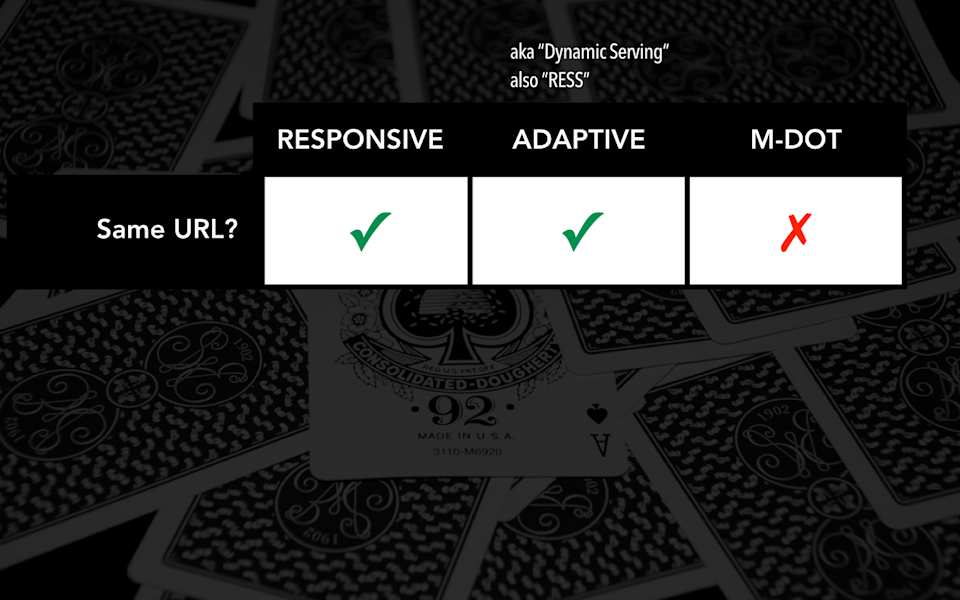
Let’s look at the first characteristic that we want to keep in mind if you’re serving something different, and that is are you serving information into the same URL?
So, with a responsive obviously you’ve got one website, one domain, easy to maintain. With an adaptive site, you do as well, which means that an adaptive solution, you are sidestepping some of the more problematic issues with an m-dot site. Rather than maintaining a completely separate subdomain to solve for some of the thornier problems with design or layout or content. In an adaptive solution, you can dynamically serve information into the same URL. Google even sometimes refers to this as “dynamic serving.” Luke Wroblewski coined the term RESS, which stands for Responsive and Server Something. I think that also is probably another term for adaptive.
-
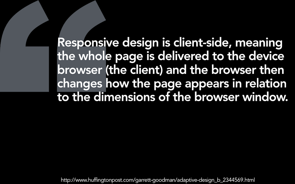
Responsive design is client-side, which means that the whole page is delivered to the device browser, to the client, and the browser then changes how the page appears in relation to the dimensions of the browser window.
-
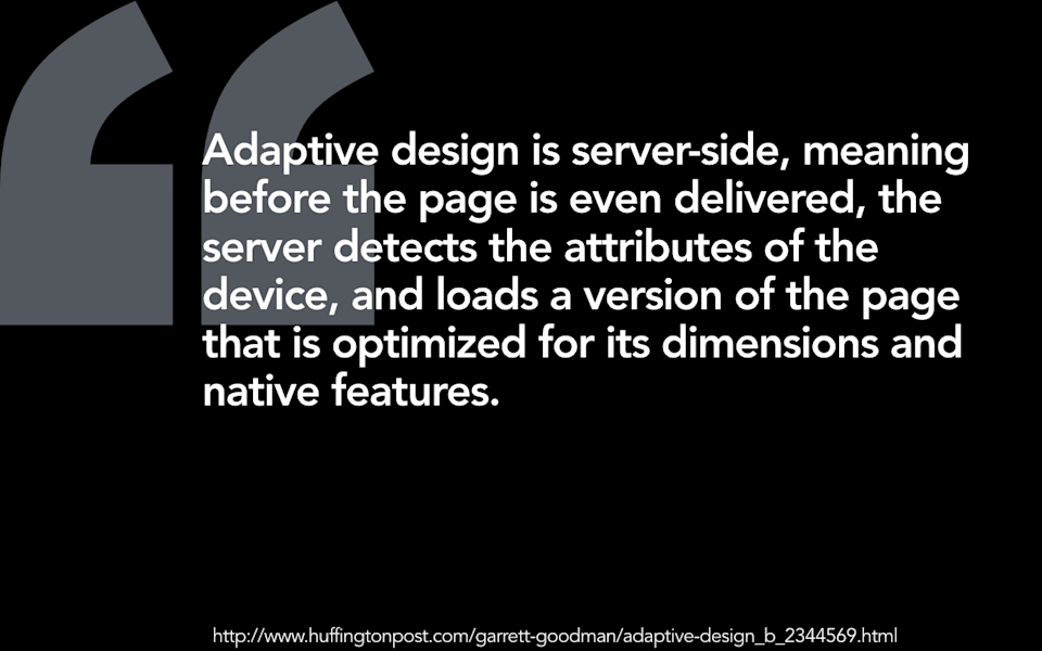
Adaptive design is server-side, which means that before the page is even delivered, the server detects the attributes of the device and loads a version of the page that is optimized for its dimensions and native features.” I got this definition from The Huffington Post, which is my most trusted source of news and information about the web. Ethan loves it when I use this definition, because honestly, who’s got a better source to cite than The Huffington Post, right?
-
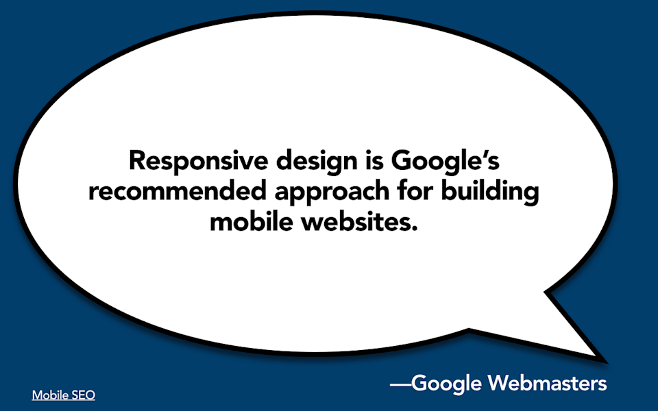
I think it’s important to know when we’re talking about, whether we’re serving information into the same URL, that responsive design is Google’s recommended approach for building mobile websites. Now, I want to be clear, Google is not going to penalize you if you have a properly managed m-dot site or if you use adaptive solutions or dynamic serving. Heck, Google uses dynamic serving themselves for many of their products. And I would say if you have the time and the money and the developer resources of a Google, then I say go to town on adaptive solutions. But for the rest of us mere mortals that are concerned with SEO, I think it’s really important to note that there is probably no organization on the planet that is more invested in the idea that you will serve up a single website with a single set of content against a single domain than Google is. It makes their job of searching and indexing the web that much easier if you use responsive design.
-
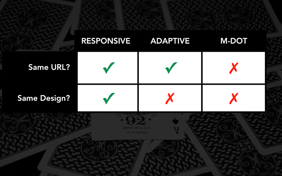
It’s pretty clear: we’re serving up information into the same URL with an adaptive solution. What might be different, then, when I say we’re serving something different? Well, the first thing might be that you want to serve different design. With a responsive solution, obviously you’ve got a single set of code, a single design. With an adaptive solution, you don’t have to. And obviously with an m-dot solution, you aren’t serving the same design as well.
-

So, under what circumstances might it make sense to use an adaptive solution to serve different information, serve a different design than you would with a responsive solution? Well, one example might be in scenarios in which you wish to serve a different page.
-

Last year I worked with a client, a large university client, and they had just done a full-scale, bottom-up, soup-to-nuts, “burn it to the ground and start from scratch,” desktop-only redesign of their website, and they hired me to come in and consult with them about what they should do now on mobile. And I did a little audit of their website and I came back and I said, “You should build a time machine and go back in time and not have done that.” This proved infeasible.
-

So, I did a little review of the site and I came back and I recommended that they should do a responsive retrofit of the front-end. I said, “Why don’t you go in, recode the front-end, you can drop in some media queries, drop in some breakpoints. It’s not going to be 100% perfect, but given that you just did all of this work, it’s probably going to be the most efficient solution for you in the immediate term.” And when I made this recommendation in the meeting, it was like this chill came over the room. I mean, you could just see people’s body language get all hostile, and they’re like, “Mm, no, no. Mm, that’s never going to work.” And I’m sitting there, I’m dragging the browser window closed, going, “No, you could totally do this.”
-
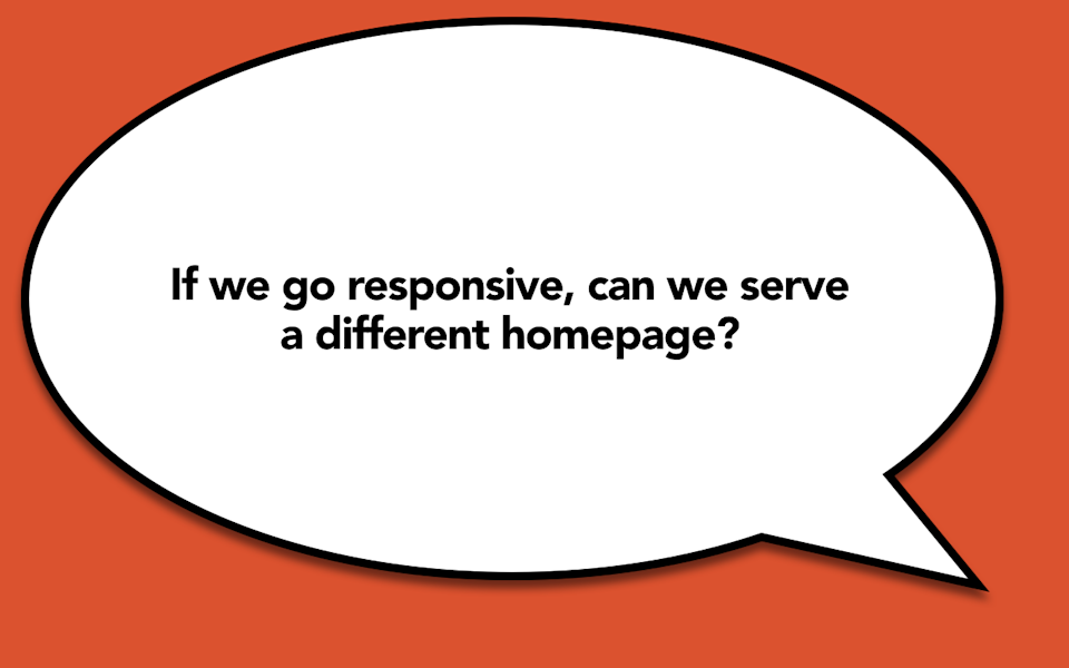
And so finally, after some time, one of their executives speaks up and he’s like, “Karen, you obviously don’t understand how political a university home page is.” I started laughing. I’m like, “Try me.” He says, “Well, if we go responsive, can we serve a different home page?” and I’m like, “Of course you can.” What, do you think Ethan Marcotte comes over to your house in the middle of the night and yells at you for being a traitor to the cause? I mean, if literally the only thing stopping you from making the other eleventy bajillion pages on your website responsive is that you don’t want to deal with the stakeholder battles that you would have to have in squishing down and rearranging your home page, then by all means, cut a different version of your home page and we will all go out for an early lunch. This is like the easiest consulting job I’ve had all year!
-
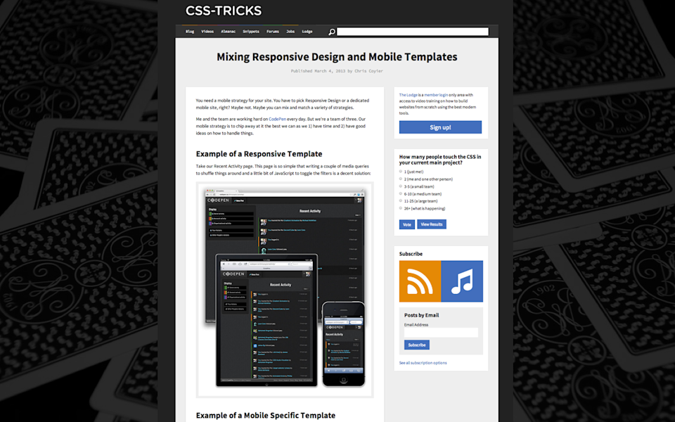
And I don’t want to even make this sound like it’s a total copout. So, no less than Chris Coyier, Chris Coyier of CSS-Tricks, Chris Coyier, he of CodePen, talks about how they decided to mix responsive templates with separate mobile templates, with adaptive templates for their own product, CodePen. And Chris was on Ethan and I’s podcast recently, and they talked a little bit about how they ran into some challenges particularly with some of the more complex flows that they found in their editor. So, he said that there were some pages where it just made perfect sense, literally no question at all that they would handle those pages responsively.
-
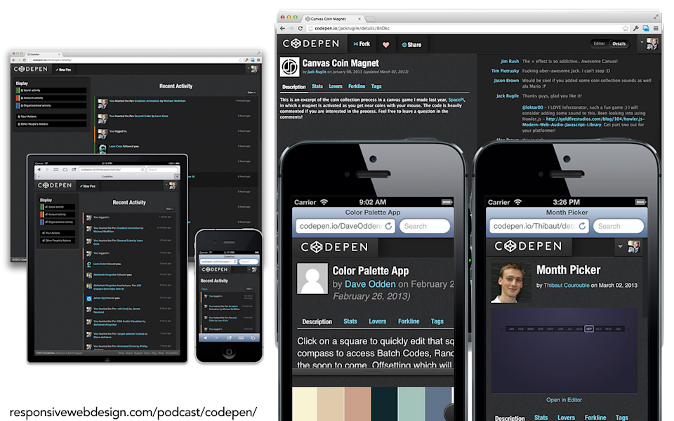
But he said that they ran into particular screens, particular types of pages, particularly in the editor, in which he said, “We just didn’t feel like we could provide the best experience to people on small screens and large screens using the exact same design.” And let’s face it, if there’s anybody out there who could ninja his way through a responsive solution to this problem, it’s probably Chris Coyier. They just decided that it would be better to incur the higher maintenance burden of having two different versions of those particular pages than it would be to try to handle those responsively.
-
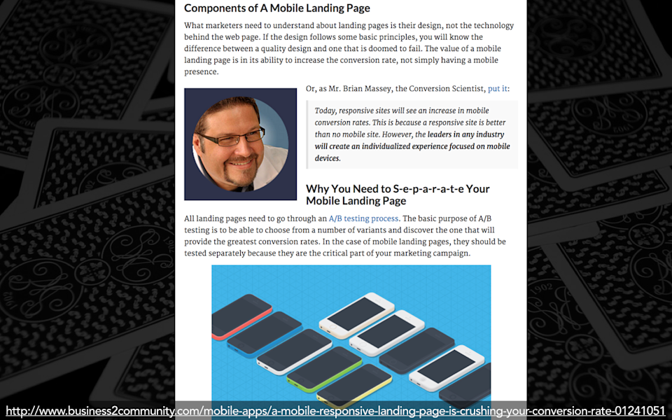
I’ve seen other people describe the value of handling particular templates adaptively. I recently got into a fight on the internet with this guy, Brian Massey, the “Conversion Scientist.” So, he wrote a post that I believe was shortsighted and ill-informed about the value of adaptive design over responsive, that frankly didn’t take into account any of the things that responsive design can actually do, and made an argument that “you should use adaptive solutions” without also fully understanding what was involved in using adaptive solutions. And after I unpacked his argument and took out all of the little bits that I thought were completely irrelevant because he didn’t know what he was talking about, we managed to settle on the conclusion that if you are doing a campaign that is aimed at mobile users, or you want to segment your campaign into mobile and desktop users, and you wish to A/B test this campaign in order to test out different versions of your landing pageHe said that in those scenarios, the amount of code that you’d have to have on the page to both handle the responsive aspects and also handle the A/B tests to serve up different messages is simply too complex, and so as a result, in those scenarios you are better off serving a separate mobile landing page rather than trying to deal with it adaptively. I am not a conversion scientist, I don’t know that this is true, but I can imagine that there are other scenarios out there in which a principled and reasonable discussion amongst your team and your developers and everybody who’s involved in the process might conclude that, in particular scenarios, it would make sense to handle a particular page adaptively.
-

But in many cases, the problems that you’re trying to solve don’t even encompass the entire page, so there may be scenarios that, instead, you just want to serve a little bit of the page, a little feature, just a little object on the page differently.
-
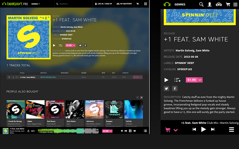
Beatport is like a combination of Spotify and the Billboard charts, but for electronic dance music. So, it is one of the leading sites out there that’s aimed at DJs. They recently responsively replatformed their entire app, so the entire music experience, the entire purchasing experience is all responsive. But they said they decided for one particular feature, one crucial feature for them, which was the player, that they decided to handle just that little bit adaptively. They said they really just struggled with the idea that the player wanted to be different, it wanted to be a different experience on small screens and large screens. So, they cut two versions of just that player, they do a little bit of testing to figure out what size screen they’re sending it to, and that’s the only thing they handle adaptively.
-
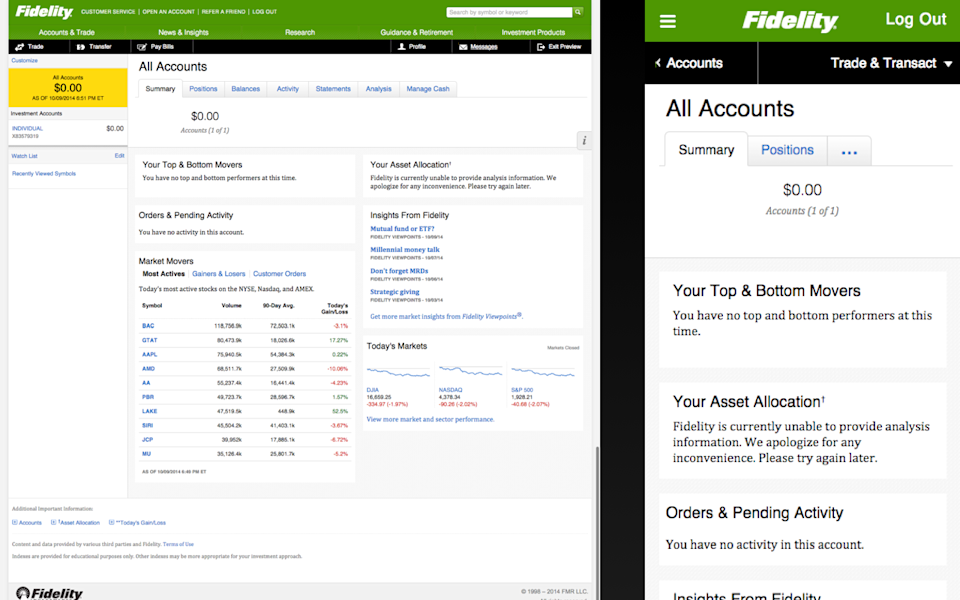
Fidelity is an investment bank in the United States. They ran into a similar problem with… Can you guess what it is? Oh, it’s tables. Yeah, so tables are a big problem, especially when you’re trying to serve the same information to large and small-sized screens. Fidelity said that they ran into a particular problem with one table that, it’s kind of like this industry standard table, and it has an industry standard sort order to the columns. They said they ran into problems because when they wanted to handle that table responsively, they couldn’t just squish it down, or they couldn’t just cut off some of the columns that were on the left, because some of those columns were really important. So, they made the choice to rearrange the column order so that people on small screens would see the most important columns. But when they did that, then people on larger screens complained because the columns were out of order. And so as they scratched their heads about how they would solve that problem, they said, “We decided to handle that adaptively. We cut a small version of the table and a large version of the table, and we dynamically serve those up to people so that we feel more confident that everybody is getting the right experience.”
-
I’m going to tell you a little secret, though. Fidelity came back to me later and said, “Oh, no, no, no. Turns out that was not the right way to handle it. We were better off instead doing conditional loading to try to load everything, and then make some determination on the client-side, based on the size of the browser window, which columns for that table we were going to show.” So, it is possible to do this kind of conditional loading without necessarily having to fall back to a server-side adaptive solution.
-
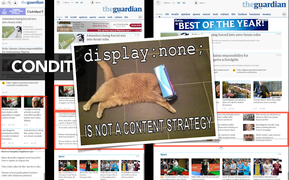
And I want to be clear: when Fidelity is talking about this, what they do not mean is that they are hiding that information from mobile users. They are not setting those particular columns to “display: none;”—that is not a content strategy—but rather they are testing to see how large that browser window is so that they can serve up only the information that is needed for that particular screen size, and they can do that all completely client-side.
-

So, my advice for you is, in general, if you have a problem that is completely about the size of someone’s screen, if the problem that you are trying to solve is literally a problem about the layout of the design in relation to the size of the browser window, then you are always better off handling that problem client-side, handling that problem completely fluidly, handling that problem with responsive design. Or, another way to put that would probably be if you don’t need to get the server involved to solve your problem, don’t get the server involved to solve your problem.
-
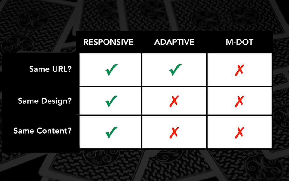
So, when do you need to get the server involved to solve your problems? Well, it’s when you want to serve different content. So, in a responsive solution, for better or for worse, you are serving the same content to everyone. Adaptive content is what has been touted as a solution for providing a different experience, for tailoring the content to the device, or the characteristics of the device, or to the context of use. So in an adaptive content solution, you are serving up different information, and presumably with an m-dot you also are serving up different content.
-
Now, I am an advocate for One Web. I am advocate for responsive web design. I believe that in most scenarios, people are better off embracing the flexible, fluid nature of the web rather than trying to target content based on device-specific variables. And when I really explore my reservations around the idea that adaptive content should be used to target different information or different content to devices, I realize that I have literally only myself to blame for this problem. I popularized the term “adaptive content,” I have been speaking about it for four or five years now. It is the centerpiece of my book, Content Strategy for Mobile. And as I have seen, as many people see, you put your ideas out there in the world and then you see what people do with them, and I start to have some concerns about where we are taking this.
-
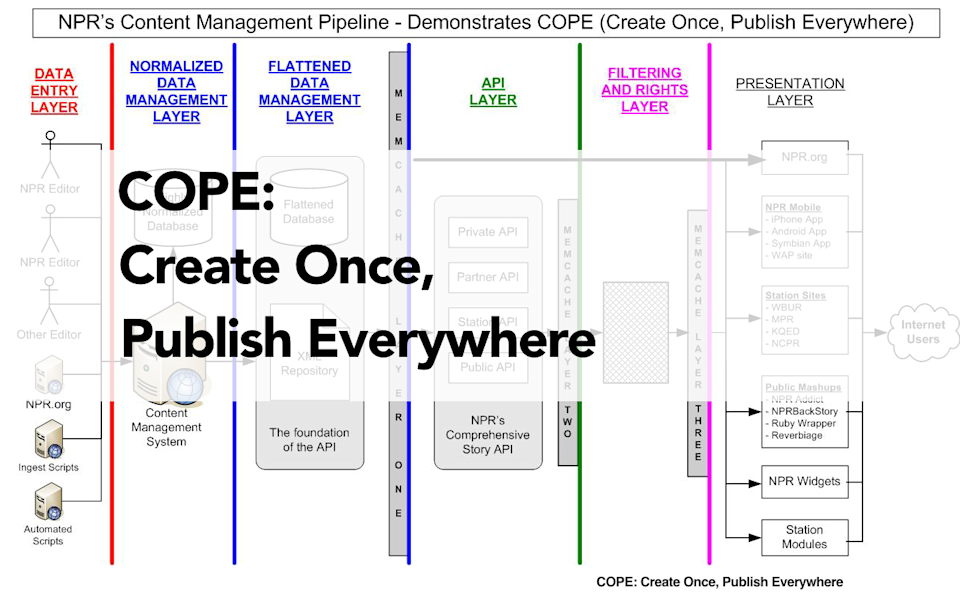
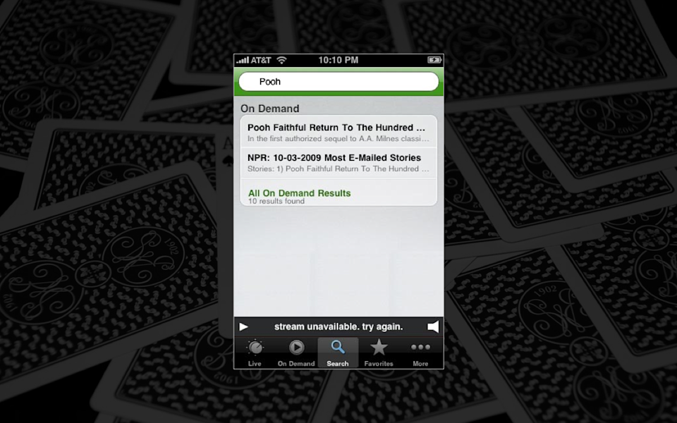
So when I talk about adaptive content, I popularized a case study from NPR in which they outlined their catchily-named approach to publishing web content, which they called COPE. It stands for Create Once, Publish Everywhere. And in NPR’s model, they maintain a single content model for their article form. So in this content structure, they would have for an article a title, a short title, a teaser, a short teaser, several images attached to the article, an audio file, the body text, whatever metadata was attached to the article, and they could serve up a different combination of that more granular content based on the type of device someone was using.
-
So, their desktop website could have one version.
-
Their audio player could say, Oh, you know what? No, no, no, don’t give me all of that stuff. Just give me the title and the teaser and the audio file. That’s all I need.
-
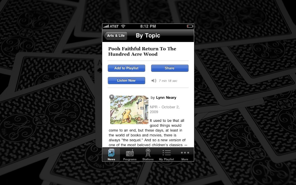
Their mobile website could ask for a completely different combination of objects.
-
Native apps could query their API and also choose a different set of objects to display.
-
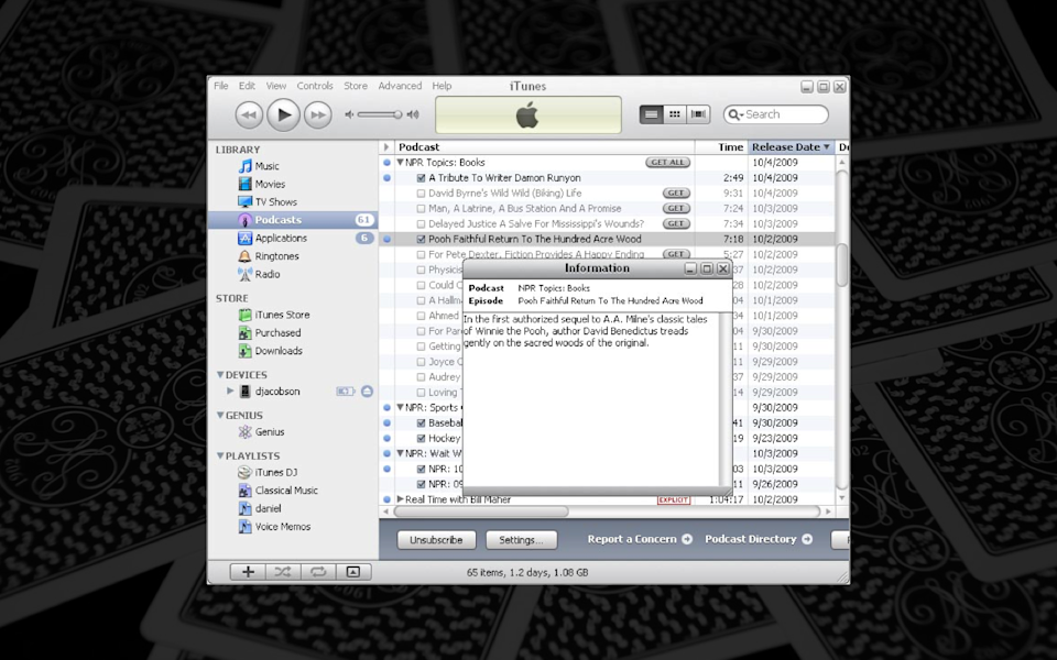
They could even do this to desktop applications like iTunes, which, frankly, at this point, is just showing off.
-

And it’s pretty easy, I think, when you look at this case study, when you look at this example, to see how it has become the poster child for device-specific content targeting.
-
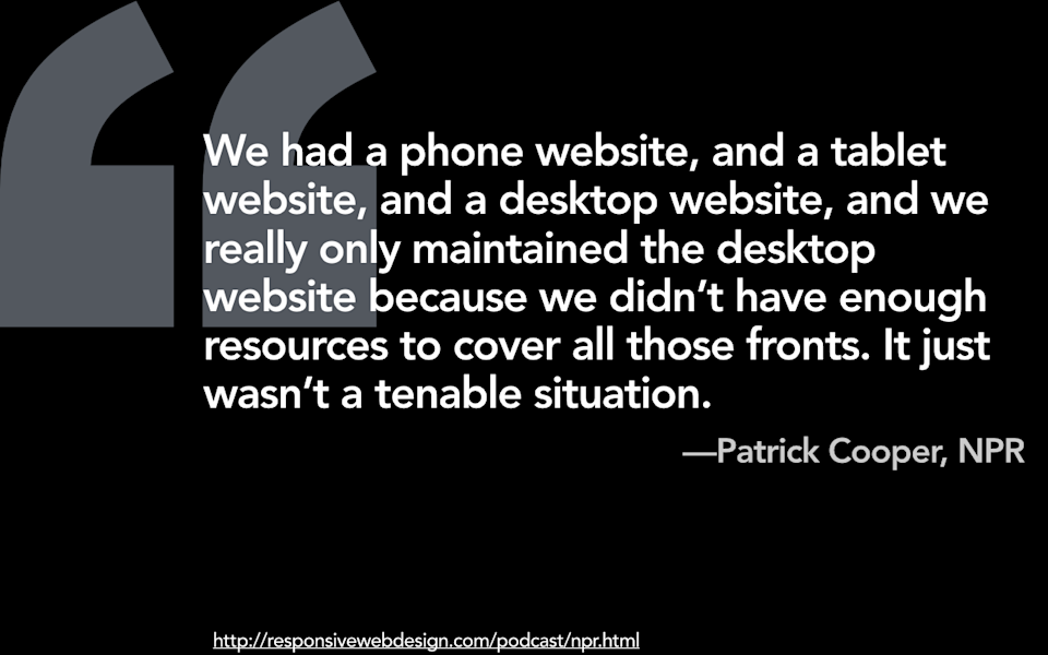
And I have some concerns about this approach, not least of which is, hey, guess who just went responsive? Oh, it’s NPR. Patrick Cooper, who’s their head of digital said, “Yeah, we had a phone website, and a tablet website, and a desktop website, and we really only maintained the desktop website because we just didn’t have enough resources to cover all of those fronts. It just wasn’t a tenable situation.”
-

Now, lest you think that I am standing up here and recanting my position that the Earth goes around the sun, I believe that there is huge value on the web for having more structured, more granular, more modular content. We must, as John Allsopp told us more than fifteen years ago, move away from using the examples based on print in which our content is locked up in a presentation format, inextricably tied to one particular layout or one particular form factor, and rather think of our content as flexible, fluid, presentation-independent chunks of content.
Ted Nelson says that, “Imitating paper on a computer screen is like tearing the wings off a 747 and using it as a bus on the highway.” In order for us to truly live up to the values that make the web, as a medium, great, we must embrace flexibility and fluidity and accessibility in our content.
-

And so, I will argue until the end of my days about the value of storing content in more granular ways. Rather than treating content as if it is like a brochure, as if it is like a web page, as if a web page is a giant wiki field or a big WordPress blob, instead having that content be semantically rich, stored in more granular ways, stored in presentation-independent ways, allows us to do more with that content, and there is huge value that organizations can get simply by choosing to store and manage their content, or their web pages, or their website, in this way.
-

But it is very easy, I think, for people, when they start talking about what it means to create granular content, to make a leap to saying, “Oh, wait, that means that I can then target that content. If I have content that is stored in more granular chunks, I can create alternate forms of that content and then dynamically target them to people based on device, or based on other characteristics.”
-
So, I have to make a confession here: basically literally everything I know about publishing on the web, everything that I know about adaptive content, comes from the fact that I was the only person at my job in the early 90s who knew how to do a mail merge. And I had to do it using WordPerfect for DOS, so you kids and your graphical user interfaces can suck it. So, I think that when you talk about this kind of adaptive content, when you talk about the idea that we can get the server involved to dynamically target chunks of content to people based on a certain set of characteristics, it is nothing more, literally, than a glorified mail merge. It’s just that we are taking little different fields of content and targeting them based on a set of characteristics.
-

So, one characteristic that people often want to target content on is the device. So, we should be able to know something about that device, whether it is the operating system, whether it is desktop or mobile, whether there are some other devices in mind, or the capabilities of that device, and we should be able to tailor the experience to that device. I think there’s some limitations to using device in this way, and that people might wish to move beyond thinking about device-specific content targeting and, instead, think about what is often called contextual targeting.
-
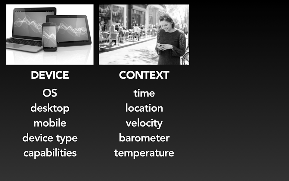
Now, I have, for the industry, I believe a very, very specific and limited definition of what I mean by context, and it’s this: it is information that can be gleaned from the device sensors in order to tell you something about what the user is doing or where he or she is. So, that may be things like time or location. It could be other things that you could get from the device sensors, like how fast it’s going, or you can use the barometer to tell you the altitude of the device, you can get the temperature from the device; there’s other things that you can get from the device sensor that may give you some idea about where the user is or the environment that the user is operating in, and from that you can make assumptions about context.
-
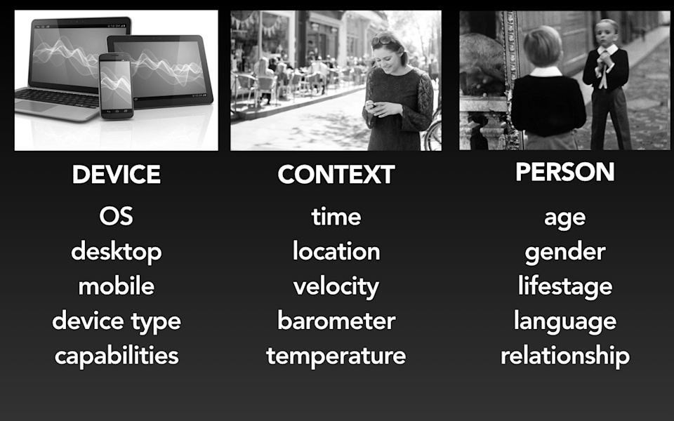
But those assumptions that you will make based on device sensors are almost always going to be a somewhat inadequate definition of who that user is or what they want. And so a third way that people talk about targeting or tailoring the experience to the user is based on the person, him or herself; personalization. So, that may mean things like trying to figure out the person’s age, or their gender, or their life stage, or what languages they speak, or do they have kids, are they married, and using that to personalize the experience to them. There are many people who talk about the value of personalization, particularly for marketers. I would like to sidestep that particular conversation and focus really just on the first two to clarify what we mean when we talk about context or what we mean about tailoring things to the device.
-

So, when might you wish to try to tailor the context, tailor the experience to the user based on the type of device that he or she has? In the world that I operate in, if you look back over the history of the last twenty years or so, operating system is actually something that people have used to tailor the experience, even beyond the idea of having desktop or mobile or the capabilities of the device. So, if you’ve ever looked at support content that was provided for both Windows and for Mac computers, and kind of gotten the sense that they were doing glorified mail merge work to try to explain how a different task could be completed on Windows or Mac, you’ve gotten a sense of how that might be used.
-
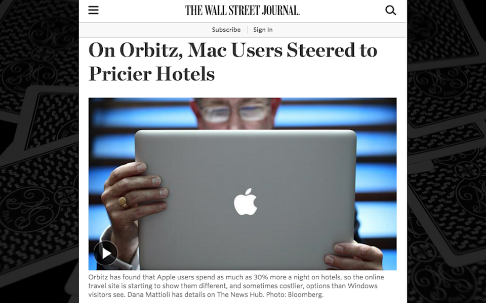
On the web today, we also have the ability to tailor the experience to the operating system. Orbitz, a travel company, discovered that Macintosh users were more likely to purchase more expensive hotels. And so just as a favor to them, just really to be convenient, obviously they were going to want the more expensive hotel, they decided to make those higher up in search results. So, this type of tailoring, this personalization can be done for good or for ill.
-
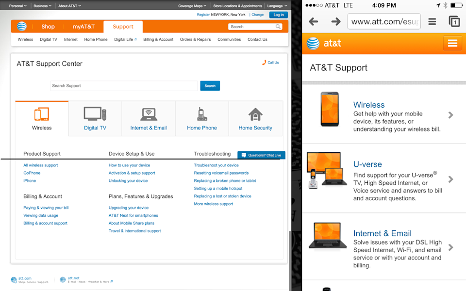
When people talk about tailoring information to the device, they may also mean the idea that we want to deliver different information based on the type of device that someone has in their hand. And I want to make it clear that this is something that can be done even in a responsive framework. So, AT&T, phone company in the US, discovered that they might be running into a problem with maintaining a whole suite of different native apps. Their customer service reps found it difficult to provide people with help when they called in for help on their account, because with a handful of different native apps out there, customer service reps were never quite sure what the customer was actually looking at. And so in a scenario like that, AT&T might choose to responsively replatform their account servicing. So, rather than maintain their desktop website, a mobile website, and a suite of native apps, they might decide to serve the entire account servicing function up responsively.
In a scenario like that though, it doesn’t necessarily mean that they have to deliver identical content to every user. They can still serve up adaptive content to people targeted to the device. Why? Because the content is literally targeted to the device. If you are coming in, looking for support content on your particular phone model, the last thing in the world that you want AT&T to ask you is what kind of phone do you have. So instead, they might serve adaptive content, they might know what type of device it is, and then dynamically serve up the support content to you that is most relevant to your device. But I want to be clear about that: that is a measure of personalization, not a measure of filtering out content. I wouldn’t necessarily want them to not show me content for Android phones on my iOS device, because there are plenty of scenarios in which I might have a friend whose Android device is borked and I want to be able to look up some support content for them on my phone. But the idea that we could target content, personalize content, tailor content to the device, if it’s actually device-specific, seems pretty reasonable to me.
-
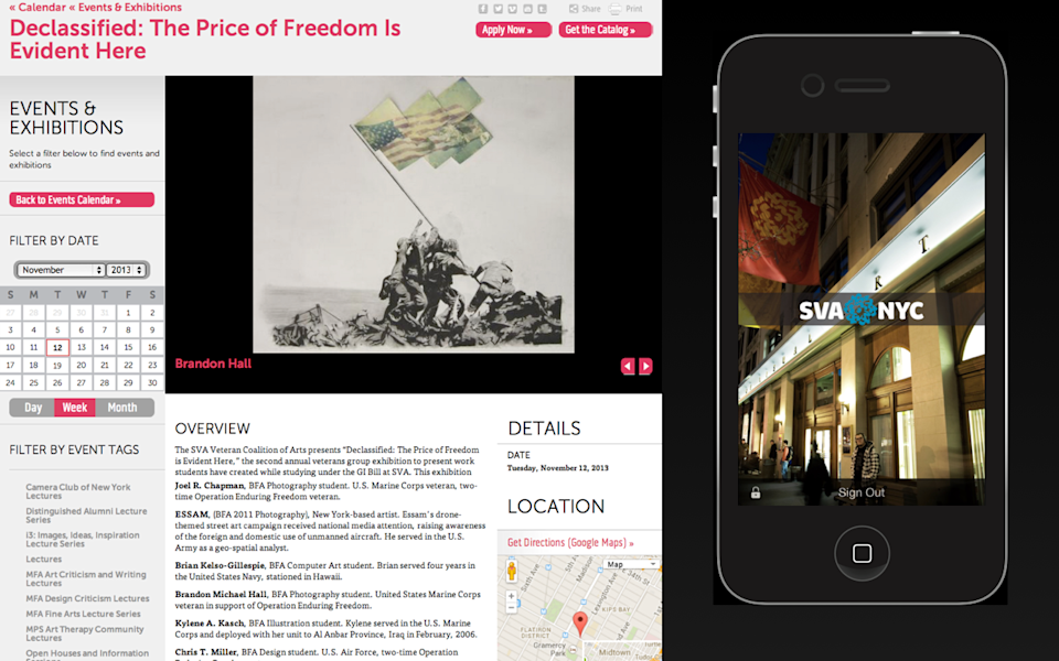
I also think there are scenarios in which we do need to tailor different information to different device types that may go beyond the web or mobile devices. I teach at the School of Visual Arts in Manhattan, and they have a responsive website, they have a native app, and they just bought all these digital signs that they want to put up all over campus.
-
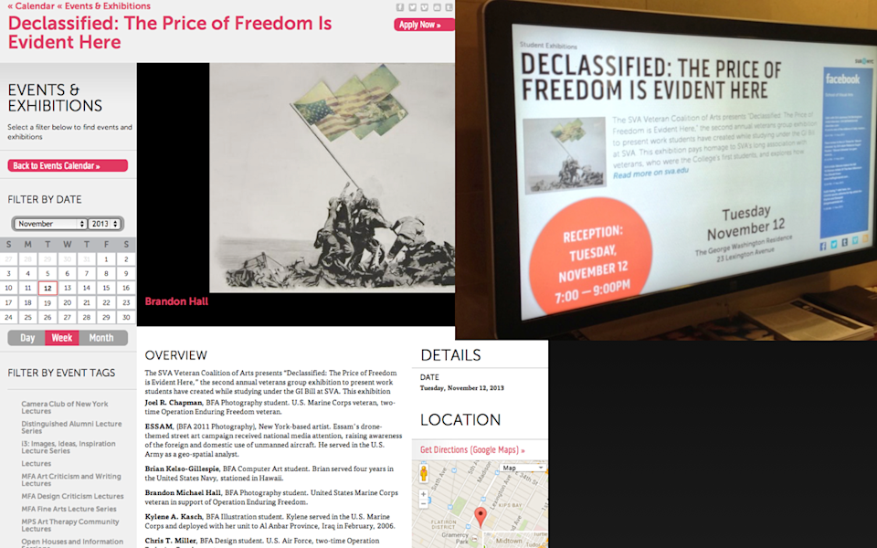
And so when I look at an example like this, to me this is a perfect case study of the value of storing more granular content in order to support device-specific targeting. To support these digital signs, you don’t just want to take the responsive website and squish it down or rearrange it in order to have it appear on a digital sign. The experience for someone looking at a digital sign from a twenty-foot view needs to be different. It is the same information, but it has to be presented with a different layout, a different priority, a different hierarchy to have it work in a context in which it is a sign that is not interactive.
And so when I look at an example of a page like this, I can totally see that if this was all just one giant WordPress blob, they would not be able to target the content in a granular enough way to be able to pull out the title of the event, a short teaser of the event, the time and date, the location of the event, the information that needs to be stored in a more granular-fielded way. Because the information was stored that way, they were able to pull it out and present it with a different design, in a different context that would be appropriate for a larger-sized screen.
-
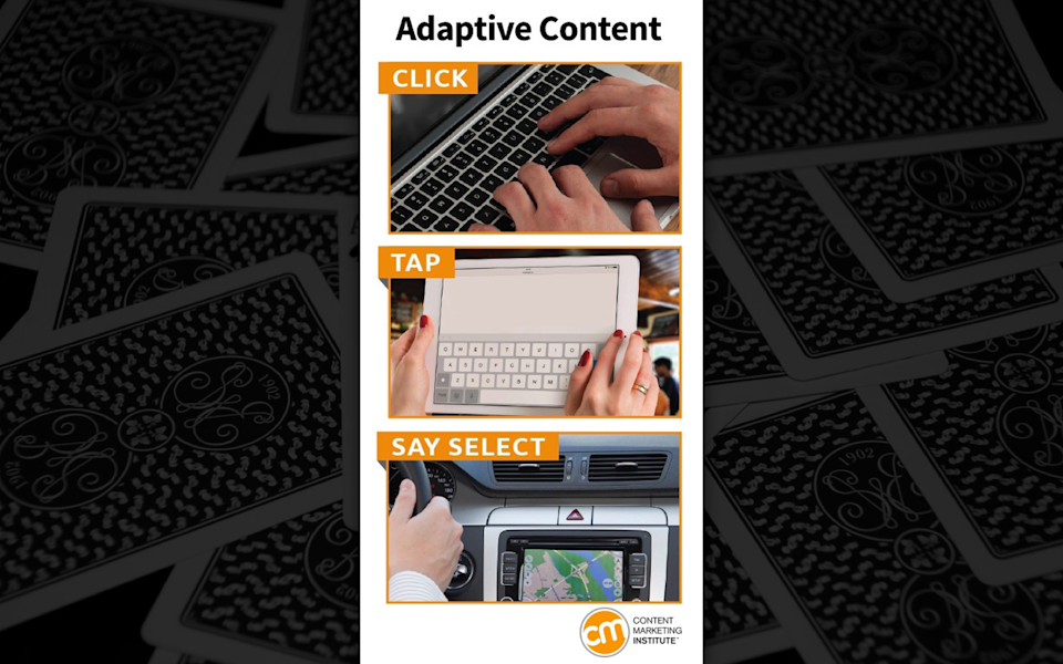
But when people talk about adaptive content, this was an article written recently by the Content Marketing Institute in which they touted the value of adaptive content for “being able to tailor the language that we use to communicate with people what they should be doing in an interface.” So they said with adaptive content, you will be able to know if a user is on a laptop and you could change the verb that you are using to say “click.” If they are on a touch screen, you could say “tap.” If they are driving in a car, perhaps the action you want to take is “select.” And so, this sort of tailoring of the verb to the experience… As a writer, I am very sympathetic to the desire to really provide people the right language and explain things to them in terms that make sense.
-

But as a web designer, I have grave concerns about adaptive content being touted this way, because we’ve got no reliable way to detect what sort of input mode is using. We can’t possibly know whether someone is on a laptop, or whether they are using a keyboard, or whether someone has a touch screen or not, or, frankly, we can’t possibly know if someone has a device that does all of those things, and thus we have to account for every input mode available. Designers and developers that wrestle with this problem settle on the idea that, yes, you are better off just assuming all possible input modes and designing for the broadest possible scenario. The same is true for writers. Even though it’s frustrating to not know whether someone should tap or click, we can’t assume that we can dynamically target that kind of language.
-

Device type is never going to be an effective way to tell you what it is that the user wants, and the guesswork that we try to do to understand what type of device someone is using… Is it mobile? Is it a tablet? Does it have these capabilities? We want to personalize the experience so that people are getting the exact right thing for them; usually turns out to be a fool’s errand. It’s not worth putting the level of effort in to try to customize the experience to the device when, frankly, you are likely to guess wrong, and the guesswork that you are going to do isn’t going to provide that much value to the user anyway.
-
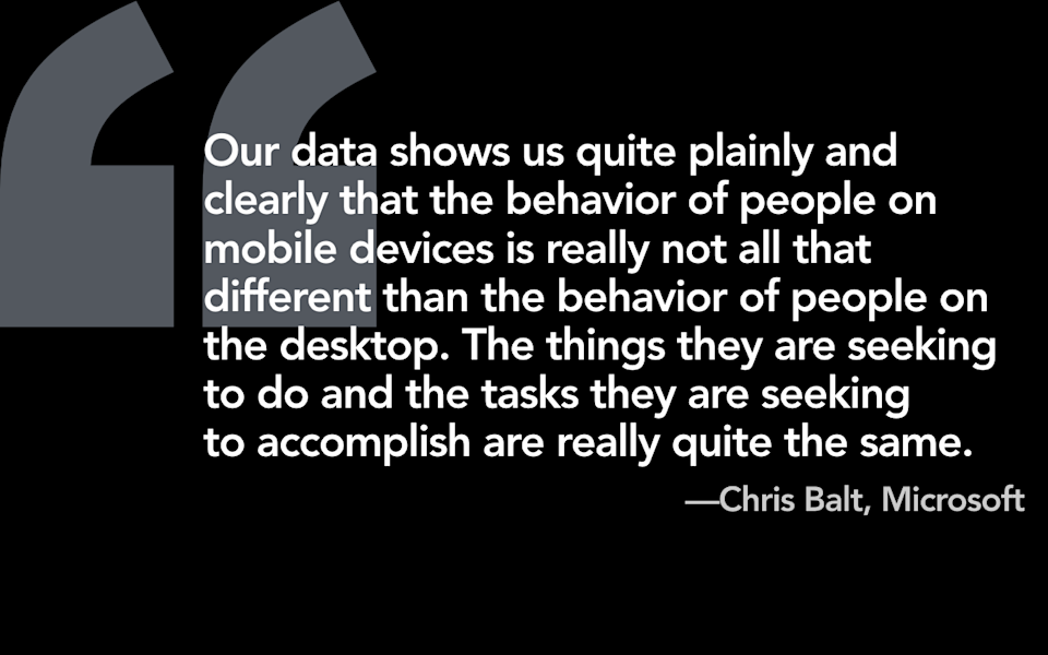
Chris Balt, who is the program manager who led the responsive redesign of Microsoft.com said, “Our data shows us quite plainly and clearly that the behavior of people on mobile devices is really not all that different from the behavior of people on desktop. The things they are seeking to do and the tasks they are seeking to accomplish are really quite the same.” I think this is one of the most unintuitive aspects about designing for our crazy multi-device future, about why responsive design is the right approach. Sometimes I will post this up on the internet. Benedict Evans, the mobile guy, retweeted a post that had a screenshot of this slide and people got angry, and there’s this sense that this just can’t possibly be true. But, in fact, when you actually sit down and you look at the data, it turns out that trying to tailor the information to the device is rarely going to provide an experience that someone is going to prefer.
-

So, if device isn’t the right way to do it, what about trying to tailor information to the context of someone’s use? Now, I want to remind you, I have a very specific definition of context, and it means things like time of day, location, velocity of the device, the altitude of the device, the temperature of the device, things that can be literally gleaned from the device sensors. I gave this talk awhile back and someone came up to me afterwards and she said, “Karen, why is this context? Isn’t context something like waiting in line?” And of course it is. But here’s the thing: we’ve got no way of knowing whether somebody’s waiting in line or not.
-

I will give you an example of this. So, I have worn hearing aids for the past, I don’t know, thirty-five years or so, and if you know anything about digital hearing aids today, they come preprogrammed with these different soundscapes.
-

So, I have a restaurant program, I have an auditorium program, and these particular hearing aids come with a car program. Now, what’s interesting about this particular program is that it will automatically switch over to the car program when it detects that I’m in a car. How do my hearing aids know when I’m in a car?
-
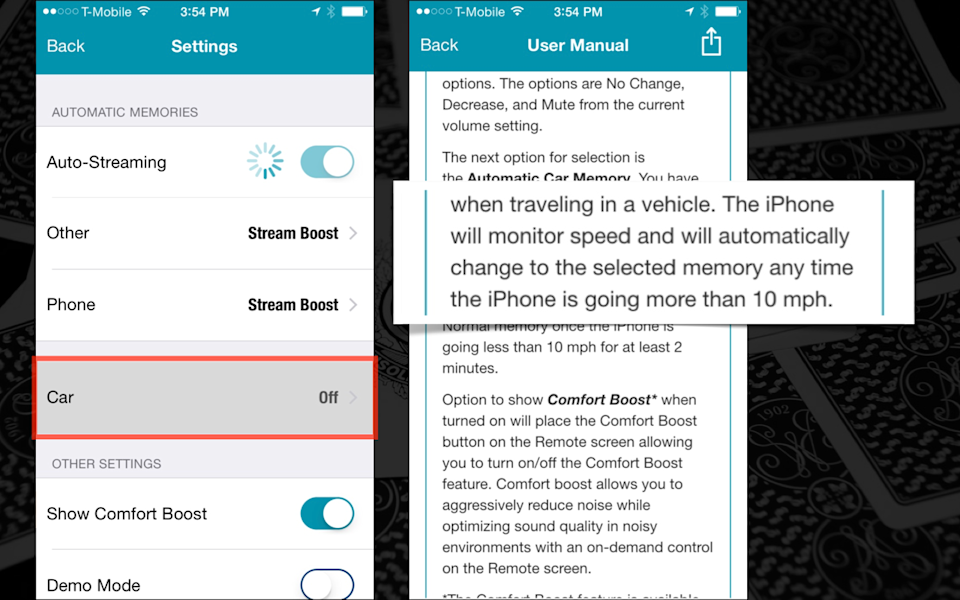
Well, the iPhone will monitor speed and will automatically change to the selected program when the iPhone is going faster than ten miles per hour. Now, that’s an interesting decision on the parts of the device designers to assume that going faster than ten miles an hour must mean that I’m in a car. I could be running faster than ten miles an hour. I could be bicycling. I could be a human cannonball. Of those options, the human cannonball, by far the most likely. But you can see that making assumptions based on the information that you can glean from the device sensors is always going to be a somewhat inadequate proxy for what the user is actually doing, or what the user actually wants.
-
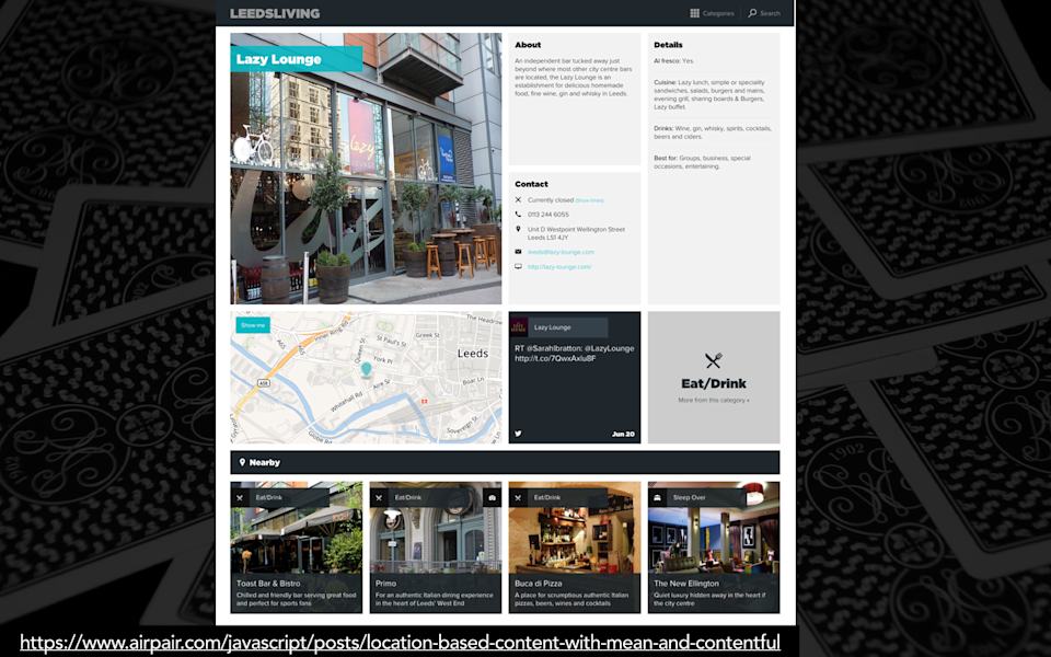
So, there are some scenarios in which using contextual cues from the device makes perfect sense. Here is an example of a city guide from Leeds in which when they’re looking to do restaurant recommendations, they made the choice to pull information in from the device sensors. So, if you’re looking at a restaurant and they want to show you a list of other restaurants that you might look at, there’s a lot of different ways that you could pull that information. You could show other similar restaurants—so if it’s a pizza place, you could show another pizza place. You could show editors’ picks—so, “I’m going to tell you which restaurants I think you should go to.” Or, you could dynamically pull the location of that device and show people nearby restaurants, and that may be actually a contextual cue that provides a lot of value to the user. Like, if they’re standing there on the street corner and they’re looking for some place that they want to go eat, and this particular restaurant is closed, they might not necessarily want to know what the other pizza restaurants are. They may want to know just tell me some place nearby so I can go eat there.
-
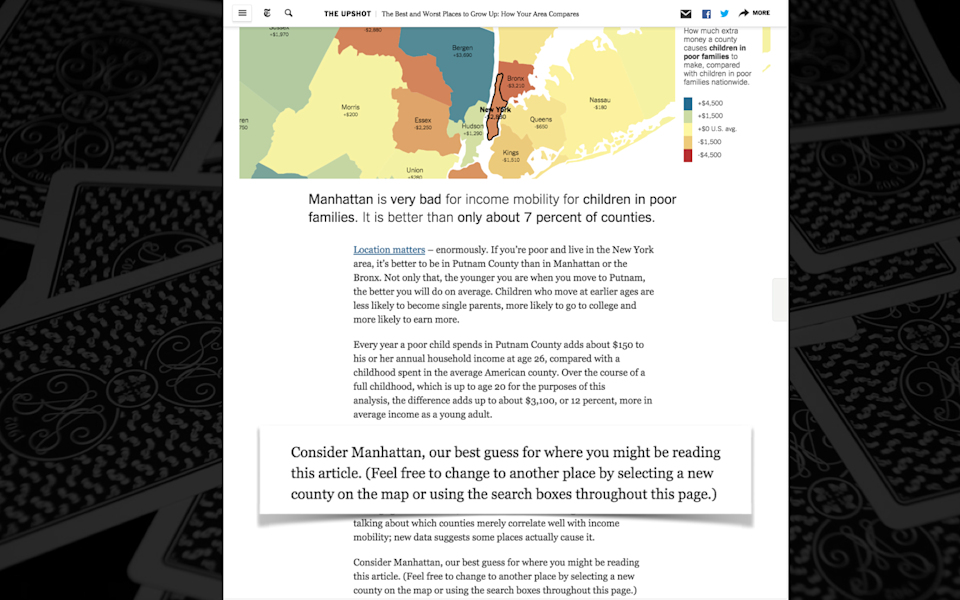
But I want to make it clear that when I talk about this as a contextual cue—and this is something people get real confused by—location does not mean mobile. Location information is something that can be gleaned on every type of device, or many types of devices. Here’s an example of an article from The New York Times in which they talk about income inequality in the US. And they do some dynamic information based on location, a little glorified mail merge here in The New York Times, in which they say, “Consider Manhattan, our best guess for where you might be reading this article.” So, I’m sitting in my home in Manhattan and I’ve got my laptop here and I’m reading this article, and so they sort of dynamically personalized this based on the location information from my device. But, this is coming from my desktop. And so, you don’t necessarily have to assume that location information, or that if you want to do something that’s based on location, that that is something that is a “mobile scenario.” It’s not. It is a location-based contextual cue.
-

There are limits, however, to what you can do with location. Google, at this point, knows everything about me. I have my mail through Google, I have my calendar, they have my search history—frankly, at this point, Google knows me better than anybody. They know me better than I know myself.
-
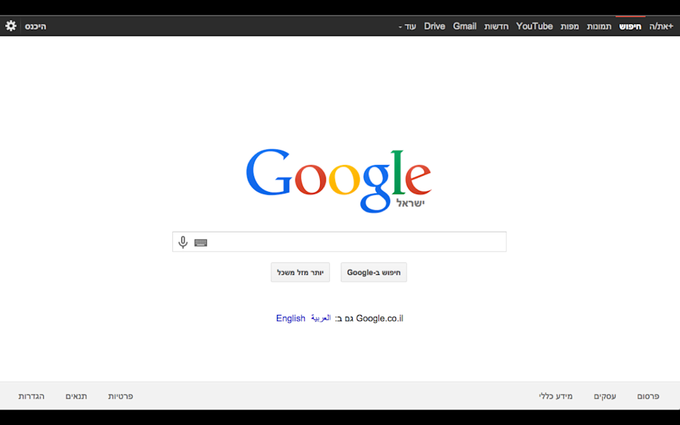
So this past year I went to Israel. What do you think the first thing that Google asks me when I open up my laptop in Tel Aviv is? They say, “Do you want to switch to the Hebrew version of our interface?” Now, I’m just going to put this out there for you, Google: based on all of the information that you’ve been able to glean about me in our fifteen-year history, have I ever shown the slightest indication that I can speak Hebrew?
-
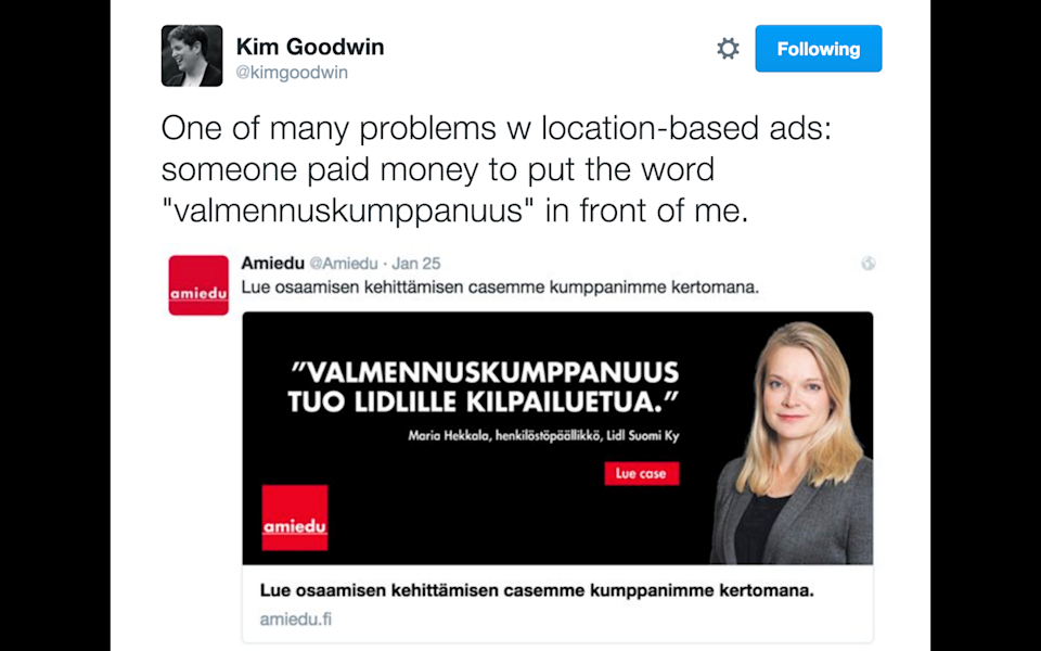
And yet, I think we waste a lot of money and time trying to target information to people based on their location. And yet, just because someone happens to be in a particular location, like my friend Kim Goodwin just found herself in Finland, doesn’t necessarily mean that that location-based targeting is going to provide something of value.
-

I think when I start hearing people talk about the ability to tailor the experience based on contextual cues, what it starts to sound to me when I sit in some of these meetings with people, is it starts to sound to me a little bit like personalization fan fic. They’re like, “Yeah, you know what would be really cool? Is if we could scrape people’s LinkedIn profiles, and then based on that, we’re going to be able to know where they went to college, what type of relationship they’re in, and then we’re going to be able to dynamically target messages and services to them based on what we know!” Yeah, no possible way that could go wrong.
-
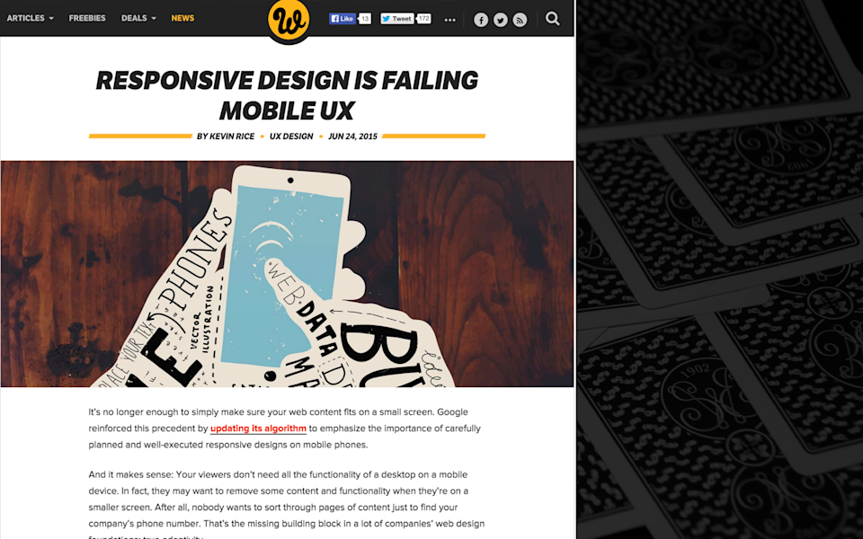
In an article that I think was basically created in a lab with the sole purpose of annoying me, called “Responsive Design is Failing Mobile UX,” the author outlines a scenario for people working in the consumer packaged goods industry that want to capture attention from people across the buying life cycle.
-
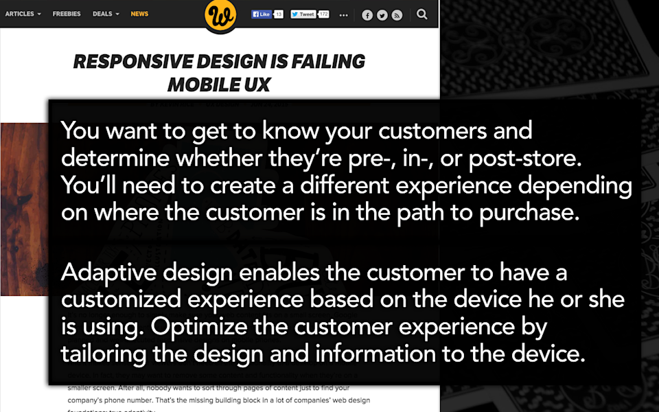
He says, “You want to get to know your customers and determine whether they’re pre-store, in-store, or post-store. You’ll need to create a different experience based on where the customer is on the path to purchase.” Now, I have a lot of concerns with a scenario like this because you just can’t possibly know where someone is on the path to purchase, right? But if I want to take this in the most conservative way possible, you can certainly use contextual cues, like location-based cues, in order to know whether someone is in-store or out of store, and tailor the experience to them a little bit differently if they’re physically in the store. And that should be based on location, right?
No, wrong, not according to this guy. He says, “Adaptive design enables the customer to have a customized experience based on the device he or she is using. Optimize the customer experience by tailoring the design and information to the device.” No, don’t do this! Do the exact opposite of this! This is the exact wrong way to think about it. If you are hoping to capture customer attention because they are physically in the store, that’s not the same as tailoring information and services to the device. It’s always going to be risky, less accurate to use device as a variable when you could be using location-based targeting to know when someone is physically in the store.
-
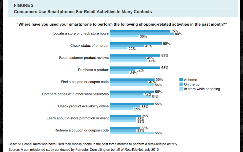
But even if you want to do that, I’m going to put a little damper on your enthusiasm here, and tell you people don’t even want this. So, a study by Forrester recently talked to people about where they are likely to use their mobile device, in what context they will complete particular tasks on particular devices. What they found is that essentially there is no difference, there is no distinction in the types of tasks that people will perform on their smartphone. People will use their smartphone in every context, if you make it easy enough for them. Really, the only places where there’s any variation in what someone will use their phone for is that people are less likely to check the hours of the store on their mobile device while they are physically in the store. But other than that, most people today, when they unpacked the data about the types of tasks that people perform on different devices, they find that there really isn’t a lot of variation on the types of tasks that people will perform based on type of device.
-
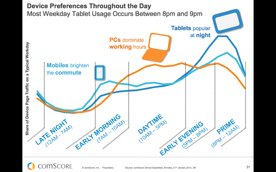
So, similarly people also hypothesize that people may want different experiences based on time of day. I do a lot of work with the publishing industry, and my gosh have I seen this slide a million times. There’s this idea that, well, people use their smartphones while they’re on their commute and then they use their PCs during the day, but then at night they use their tablets! So, we should provide a completely different experience for people on tablet devices so we can capture that valuable, lean-back evening time that people obviously want from us!
-
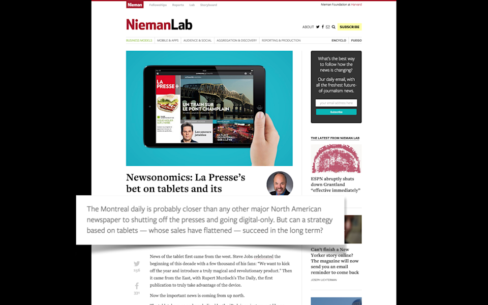
Strangely enough, the entire country of Canada has decided to participate in a large-scale A/B test of this approach. So, the first one, La Presse, has innovated by basically saying they are going to stop their print editions and go all-in on a tablet-only strategy—with some concerns, however, that this may not work out so well given that people don’t buy tablets very often and tablets are most certainly everybody’s third-favorite device.
-
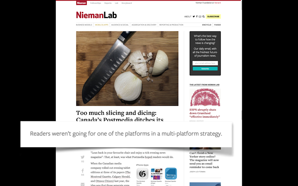
Similarly, Postmedia—so, Postmedia is a large newspaper chain and they have titles in most of the large Canadian cities—they found that after they released a variety of device-specific editions, that the tablet edition wound up being the least popular edition.
-
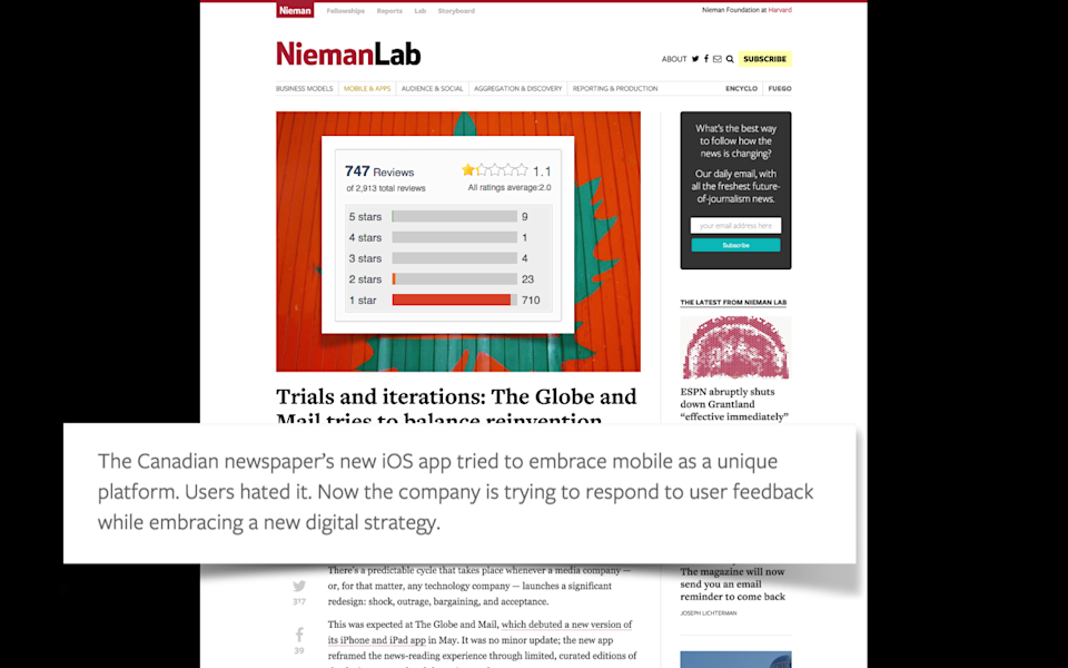
And most interestingly, The Globe and Mail went all-in on a mobile-only, tablet-only strategy. Turns out, users hated it. You want to know how you find out that users hate your tablet-only strategy? It looks like this in the app store.
-
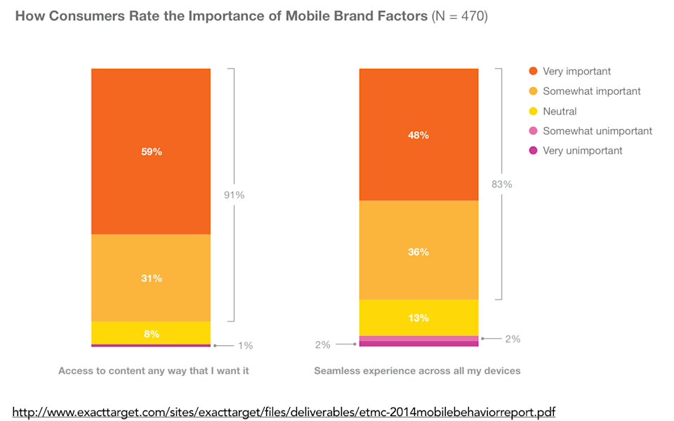
It turns out, again, people don’t want you to decide what information they want on which type of device. A study by ExactTarget found that ninety-one percent of people said access to content any way I want it is the most important criteria for them in evaluating whether a mobile brand is successful. And beyond that, eighty-three percent of customers said that a seamless experience across all of my devices is important to them, and that number went up to eighty-seven percent when you talked to people who owned both a smartphone and a tablet.
-
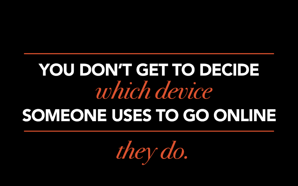
You don’t get to decide which device somebody uses to go on the internet. They get to decide that. It’s our mission, it’s our responsibility to provide a great experience to people on whatever device or platform they choose to use rather than trying to guess what someone wants.
-
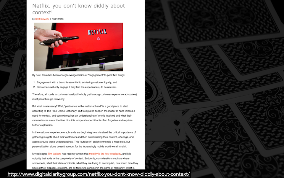
Scott Liewehr is a CMS consultant, he’s based in New York, he’s a really great guy. I gave him some crap for this article that he wrote recently called, “Netflix, You Don’t Know Diddly About Context!” So in this post, Scott hypothesizes that Netflix, they of the personalization engine, are failing to take customer context into account when providing recommendations.
-
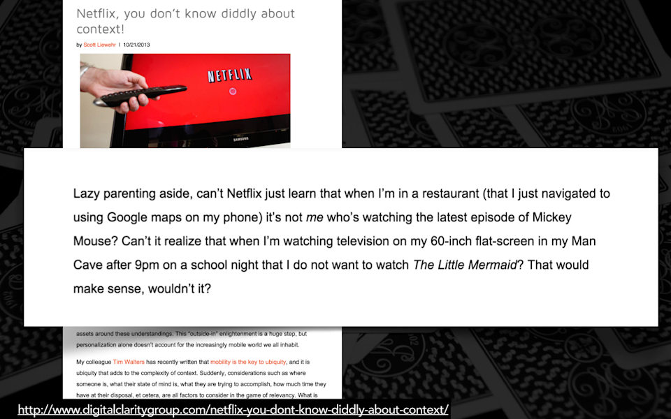
And he outlines a scenario that I think is probably very familiar to some parents out there, in which he says that he has three children, age two, four, and six, and when he takes them out to a restaurant, he likes to give them his phone in order to entertain them. So, Scott says, “Hey, why can’t Google know, why can’t my phone know that when I’m in a restaurant, it should serve up the latest episode of Mickey Mouse. I got there using Google Maps on my phone, you know where I am. Why can’t Netflix know that later that night, after nine p.m., when I’m back in my man cave, that I don’t want to watch The Little Mermaid?” He’s hypothesizing that Netflix should invest in doing contextual targeting, so, location and time of day-based targeting in order to dynamically serve up recommendations or suggest ideas.
-
I think that this is a solved problem, and it is called User Accounts. Why, why would Netflix invest in expensive and complicated and risky contextual targeting to try to assume what Scott wants to watch on his phone based on where he is or what time of day it is, when he can avoid ever having to see The Little Mermaid simply by setting up a separate account for his kids?
-

So, device. Devices is always, always going to be the least accurate proxy for context. If you want to tailor the experience to someone, you are much better off using contextual cues that you can glean from the device. But, just to put a little damper on that, even that I think is often unnecessary.
-
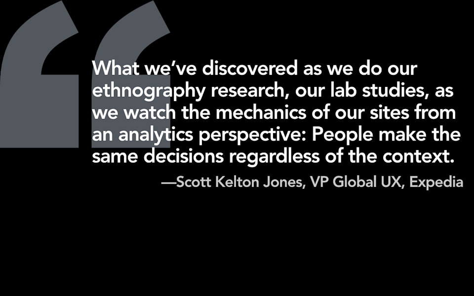
Scott Kelton Jones is the VP of Global UX for travel brand Expedia, and they have been experimenting and doing a lot of A/B tests on their responsive platform, and he said, “What we’ve discovered as we do our ethnography research, our lab studies, as we watch the mechanics of our sites from an analytics perspective: People make the same decisions regardless of the context.” This is a travel brand, y’all. Like, this is the most specific example of a scenario in which people think you need to do contextual targeting, and even they have come back and said, “You know what? We are going all-in on responsive design. It is simply not worth it.”
-

I will leave you with this: Most of the time you will be better off serving the same information to everyone. I’m going to call it, like ninety-five percent of the time responsive design will solve your problem. And so I think the best thing that organizations can do before they jump down this path of needing to dynamically target information to the user based on context, or the device, is to get a really solid responsive design working. I mean, build it from the ground up, get it coded really well, make it lightning fast, and that’s going to solve ninety-five percent of your problems.
-
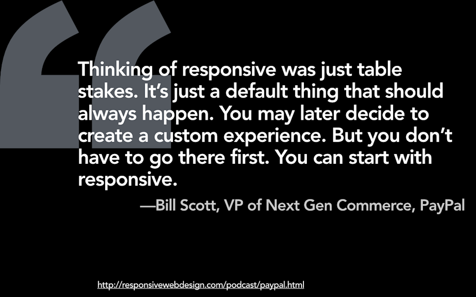
Bill Scott, who is the VP of Next Gen Commerce of PayPal said, “Thinking of responsive was just table stakes. It’s just a default thing that should always happen. You may later decide to create a custom experience. But you don’t have to go there first. You can start with responsive.”
-

And the thing is that adaptive solutions, whether that’s adapting design or adapting content, that isn’t some magical panacea for all of the problems that you might encounter with responsive design. Adaptive isn’t a better solution. It’s just a different set of problems. And so, rather than touting the idea that you should jump to adaptive solutions when you run into issues with responsive, I would encourage people, if you’re in meetings trying to debate this, to say, “You should always, always try to solve your problems using responsive design first.” You should always try to solve the problem on the client-side first rather than getting into what will, frankly, be a more complex and more costly route if you don’t need to.
-
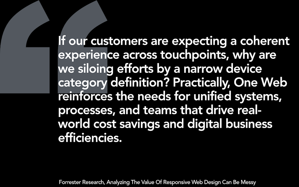
Forrester brings this back to the One Web issue by saying, “If your customers are expecting a coherent experience across touchpoints, why are we siloing our efforts by a narrow device category definition? Practically, One Web reinforces the needs for unified systems, processes, and teams that drive real-world cost savings and digital business efficiencies.”
-
And finally… Okay, so let’s say two years from now you come back to me and you’re like, “Karen, we did it! We rebuilt our site, it’s completely responsive, it’s lightning fast, it solved ninety-five percent of our problems! Yay, we did it! It solved ninety-five percent of our problems! …We still have five percent of our problems…” Well, fine. Now you’re in a position to be able to, in a selected, limited, and targeted way, try to solve for problems that you think are literally device-specific or literally contextual solutions. You don’t have to jump into solving those problems immediately from the get-go. Get the responsive solution working first and then realize that the adaptive solutions will be a complement to responsive design.
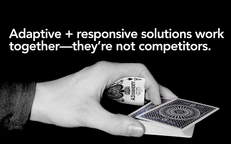
I often hear people talk about adaptive and responsive as if they are in competition. They are not. They work together. If we are going to deal with all of the challenges that we will face in this crazy multi-device future we are all living in, we need every tool in our arsenal.
-
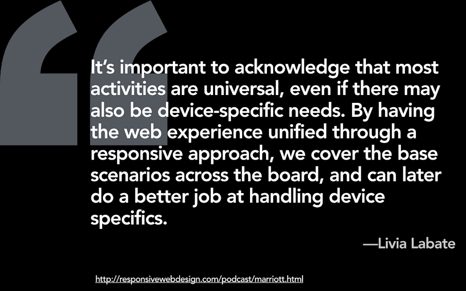
I will leave you last with this quote, again, from Lívia Labate from Marriott, in which she says, “It’s important to acknowledge that most activities are universal, even if there may also be device-specific needs. By having the web experience unified through a responsive approach, we cover the base scenarios across the board, and can later do a better job at handling device specifics.”
-
Thank you all. Thank you all so much for coming out. If you liked this talk you are going to love my new book Going Responsive. If you didn't like this talk, well, the book has a lot of other good things in it.