Video
Slides
Transcript
-

Hey, you guys want to know what I think is awesome? Beyond Tellerrand, come on! Give it up! I speak at about a million of these things and this is one of the nicest, best organized, and also the most attractive audiences I think I’ve seen.
You want to know what else I think is amazing? Print! Print is a fantastic technology. I mean, you put the words on the paper and they stay there. You don’t have to worry about keeping it updated all the time—man, print was fantastic. When you take a look at the history of human communication and you realize that we’ve had hundreds of years of the printing press and nearly thousands of years of communicating in written documents, that the history and the values and the culture of print and how you get ink on paper is so deeply intertwined with what it means to communicate priority or hierarchy or relationships of information, that those cues are so deeply ingrained in how human beings think about communication that it’s really hard to get away from the
-
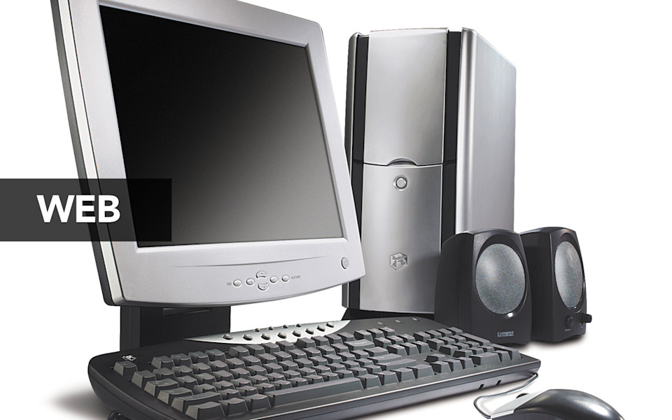
Then we had to go and invent the web. Which, on balance, I think has been totally worth it. But man, is it a pain in the ass. So, the web, as you all know just turned 25. Twenty-five years of the web. Look, I’m a huge nerd for computing history and I love understanding the underpinnings of our field or the generations that came before us. So when you look at the web, you look at the very foundations of this tool—Hyper Text Markup Language, HTML, and the Uniform Resource Locator, the URL—those technologies were designed with the explicit intent that anyone, anywhere, could create a document that could be updated instantaneously and accessible globally. When you take a step back from the day-to-day stuff that we’re all doing and trying to figure out, and really just appreciate how transformational that is in the history of human communication, just how different that is from everything that has come before, twenty-five years is not nearly enough time for us to have truly wrapped our head around the way that the web is different.
As a result, for the last twenty-five years or so, we’ve been kind of bandaid-ing ourselves along by imagining that “Well, I mean, a web page, it’s really just like a piece of paper, right? It’s not really all that different from a piece of paper.” To me, now with the rise of mobile devices, this is what is forcing us to acknowledge for the first time, to really come to terms with the way that the web is different.
Let me be clear about this: the web has always been different. It’s just that we’ve been able to kind of treat the web page like a crutch. But with the rise of mobile devices and now tablets, we have to give up this shared hallucination that we have all been operating under, that we have any control over the presentation. That we have any control over the size of somebody’s screen or the layout that they have or the input mechanism that they’re going to be using. That’s gone. And it’s not coming back.
-
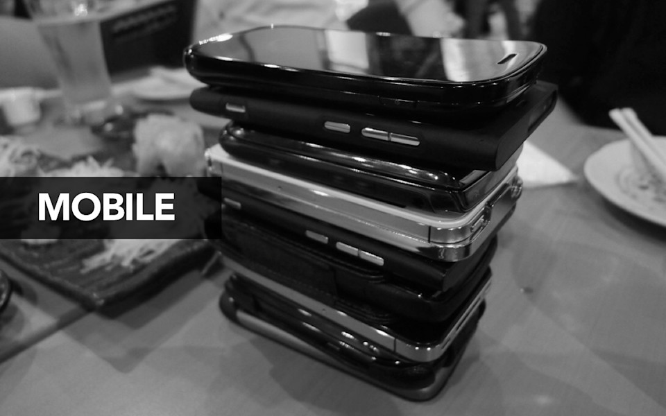
This, to me, is the real transformation of mobile. When I talk about content strategy for mobile or publishing to mobile, I don’t mean publishing on smartphones or different devices. I mean how do we, as human beings, wrap our heads around the idea that no longer can we treat whatever we want to publish as if it is locked to any one particular output format?
-
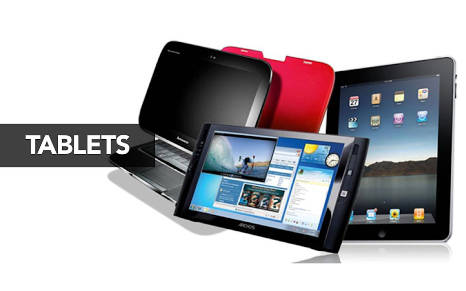
You might look here at the whole "desktop computer and smartphones and tablets" and kind of go “Well, you know, that’s already a pain in the ass to deal with.” But the problem here is it’s not going to stop. I want to be clear about this: I am not a futurist. I am not here to predict for you what I think the next big thing is going to be. If I could do that, I’d be making a fortune. But what I am here to do is explain that something else is going to come along. There will be some new device, some new platform, some new communication technology. And whatever that is, we’re going to have to find a way to publish to it. We’re going to have to find a way that we can get our content onto it.
-

So maybe that next new thing is smart TV. A lot of people are hypothesizing is that the next great wave is fighting over the living room. I think when you look at the smart TV interface, I think that really starts to drive away any lingering hope that you might have, that you can make assumptions about the size of somebody’s screen or what type of device they’re using to interact with it. Just the sheer range and diversity of different platforms and different input mechanisms that we have to deal with is so great, that the idea that we’re still trying to design for any particular one—it’s like, at what point do you start to say “Wait a minute, we just can’t do that anymore.” Is it the point where we’re trying to figure out how we can design for the smallest smartphone screen, all the way up through the largest 60–inch giant living room screen? Recognizing that that’s the leap we have to make will make this challenge easier.
-
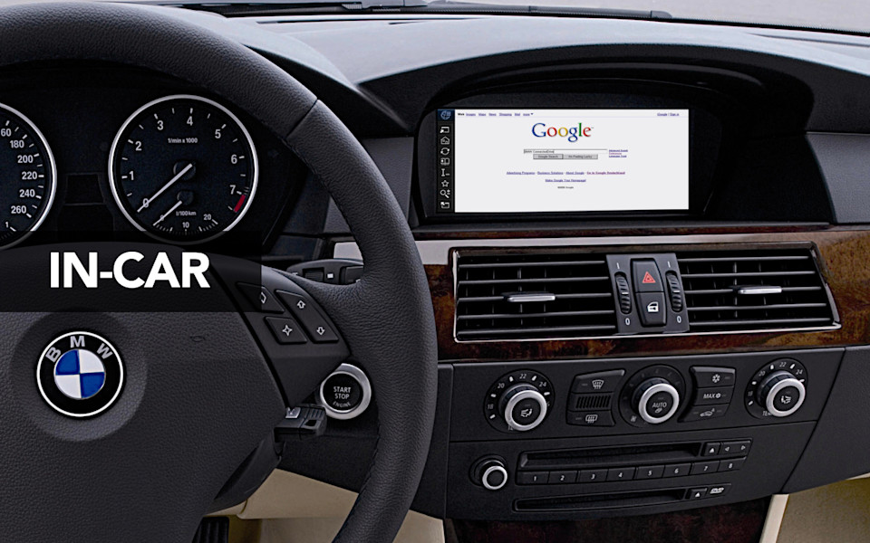
Maybe it’s not smart TV. Maybe it’s in-car systems. A lot of automobile manufacturers are already embedding sensors and screens into their automobiles. For me, when I look at this, what I don’t see is people trying to use a touchscreen while they’re driving. What I see is an integrated system in which there will be both a touchscreen and an audio component. When you realize this, it’s like “Oh, right.” The opportunity here is going to be around combined systems where people are interacting both with screens and through audio interfaces.
-
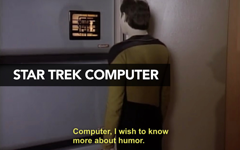
I know there’s this sense that audio interfaces just aren’t quite ready for prime time yet. You talk to Siri and she makes a bunch of mistakes and it’s not a very great experience. You know what else didn’t work very well for, like, forever? Touchscreens. Touchscreens were terrible. You’d go to the ATM and you’d have to figure out how to angle your finger just exactly right in order to get your button to push. For decades, touchscreens were seen as this also-ran technology that was never really going to quite make the prime time. Then one day, touchscreens worked. They worked perfectly. And it transformed our entire industry in the space of five years.
I don’t know when audio interfaces are really going to become a reality, if it’s 5 years, 15 years, 50 years, but I know that one day the Star Trek computer is going to become a reality. And I gotta tell you, when I go up and I ask the Star Trek computer a question, the last thing I want to hear it read back to me is “http colon slash slash.” When you start peeling back—“Oh right, what does that mean for how we construct relationships between the content and our code?”
I’ve had developers ask me sometimes “Oh, Karen, why do you insist that we even bother trying to parse out the difference between what should be rendered as italics and what should be rendered as emphasis when every major browser since the dawn of time has rendered emphasis as italics?” Not in an audio interface they don’t. One of those things conveys visual styling. The other conveys semantic meaning. In an audio interface, emphasis is going to be rendered as tone of voice. When you start peeling back all those challenges, how they work even at the tiniest little HTML tag, you start to realize that our ability to start encoding the meaning of what we publish in ways that are not entirely dependent on the way that they look is what’s going to help us survive the future. I hope it should also make clear that doing the right thing for the future means doing the right thing for accessibility today.
-
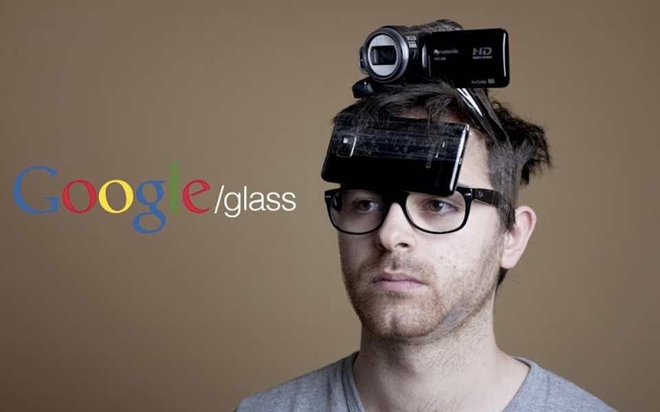
I don’t know, maybe the next big thing is going to be… Google Glass. I don’t really think Google Glass is going to be the next big thing. I think Google Glass like the Segway of mobile. It’s like a Segway, but for your face. But I will say, I agree with Robert Christopherson, that the idea of wearable technology is a very real prospect. I worked with a client recently that publishes a giant print catalog and the products that they make are industrial products, they are intended to be used in factories. I had a conversation with them where I’m like “Look guys, we all know that a day is going to come, at some point in the future, where you will no longer publish this print catalog.” I don’t know when that’s going to be. I’m not going to say if it’s 5 years or 10 years from now. But at some point you’re going to say “This world that we live in no longer needs a 2-inch thick print catalog of all of our products.” So what happens when that day comes and wearable heads-up displays are a reality on the factory floor? What happens when the type of audience that you want to communicate with, working in these industrial environments, needs the ability to get information in a hands-free environment. What if that’s the next platform that you need to publish to? Is your content going to be ready to go there? Or, maybe a better question is, you need to start acting now to figure out how you’re going to get your content into a format so that it is not locked up, intended to be printed only in this one document, but rather it has the flexibility so that you can get it onto another platform.
-
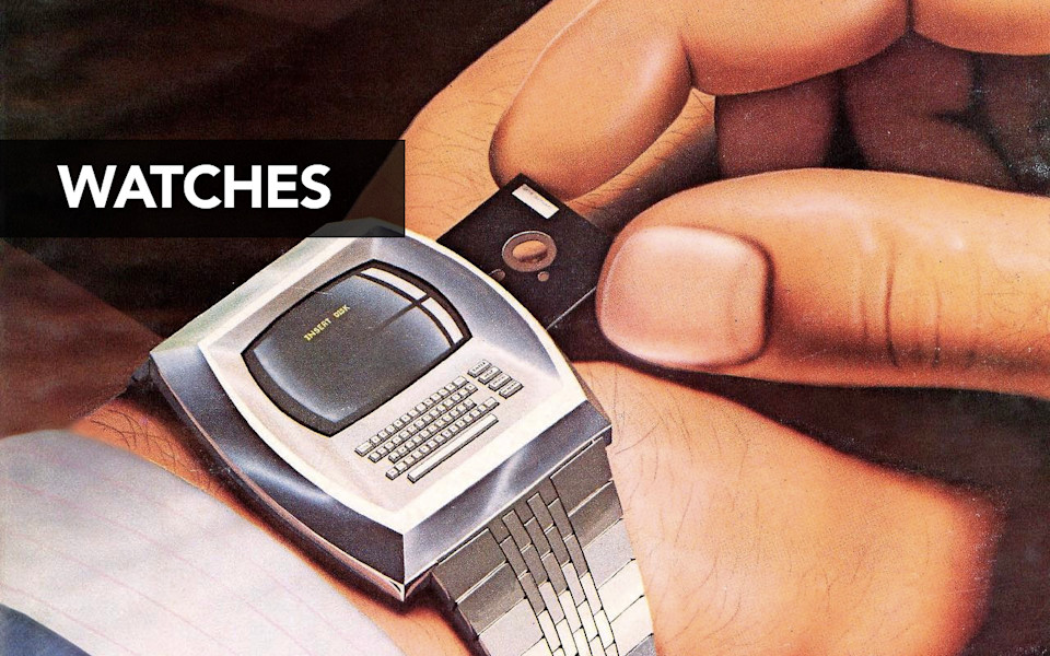
So if Google Glass isn’t the next big thing, maybe the next big thing is going to be… watches. Right? Everybody is talking about watches—the Galaxy Gear, the Pebble, maybe an Apple watch. Again, people are sometimes like “Well Karen, why do you care about watches? No one is ever going to want to read a long document on their watch.” And that may be true. But when you think of a watch as existing in a larger ecosystem of devices, when you imagine that that watch is a controller for a smart TV or provides notification from a smartphone or can be a small touchscreen interface that would allow someone to interact with an audio interface that they engage with their headphones, now you start to see—right, it’s not just that my content needs to live on that platform, but it might need to be accessible and navigable on that platform and we might have to find ways to represent it on ever-smaller or different screen sizes.
-
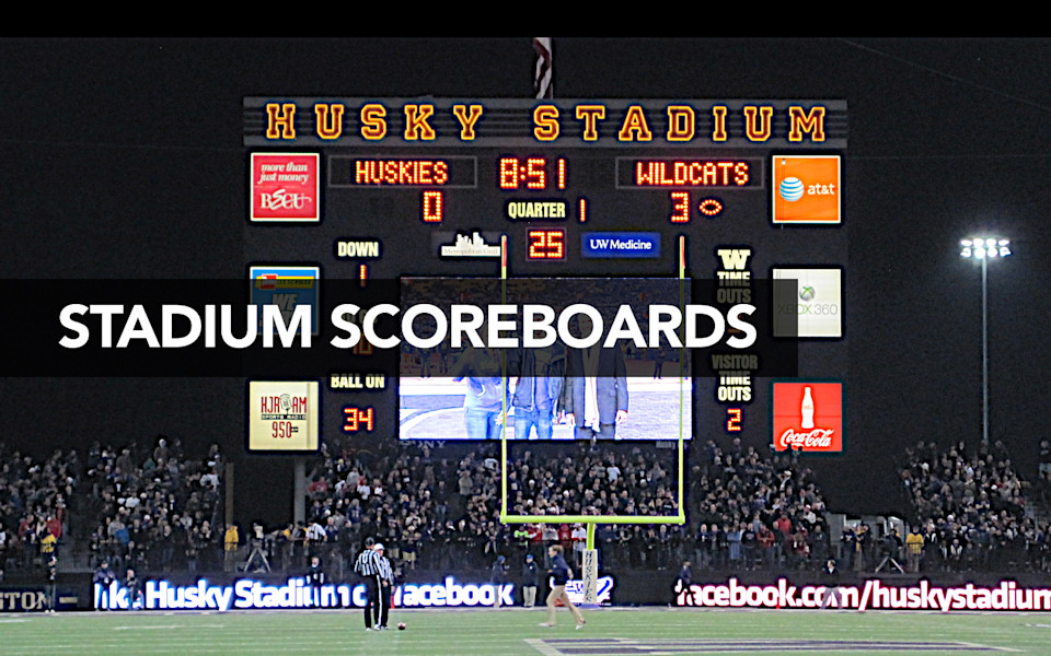
But you know, okay, watches, so tiny, maybe not the next big thing, right? Maybe the next big thing is going to be stadium scoreboards, woo-hoo! Let’s get our content where everybody can see it guys! This is a joke. I’m funny, aren’t I? I put this in here as a joke, because I thought it would be funny because the watches are so tiny and then the scoreboards are so big and then I turned around and I had a client tell me that the biggest problem that they’re trying to solve right now is digital signage.
-
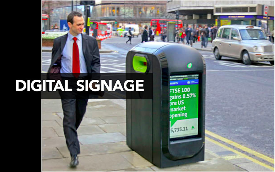
I worked with a university and they said “Karen, we have a mobile website, we have an app and we just bought these digital signs that we want to put up all over campus. What we want to do is we want to have one central place where we can manage and maintain all of our content. And then we want to be able to send things like events listings or campus alerts to students or information about what’s going on on campus to these three very different platforms and we want to be able to do it automatically.” I was like “Mm… have you thought about treating the digital signs like they’re a completely separate workflow and just having someone manage those like they’re a silo?” They were like “Karen, ain’t nobody got time for that! No. This is the whole reason we’re talking to you, is we want a way to manage and maintain our content in one place and have the right information go to three very different platforms.” This is not some crazy futuristic dystopia that these people are living in. This is right now, a problem we have to solve today.
-

And so, if you have to solve digital signage problems in the enterprise, maybe we all will be facing the same problems in our homes. Can’t talk about the future without talking about the internet refrigerator. Again, I don’t really think the internet refrigerator is going to be the technology of the future but the idea that our homes will eventually have a network of connected devices and sensors and maybe smaller screens. Heck, maybe instead of the internet refrigerator, maybe a better idea is that one day your glass cooktop will have a giant iPad screen embedded into it and on the glass you will be able to watch videos or look at recipes or the news while you’re cooking.
-
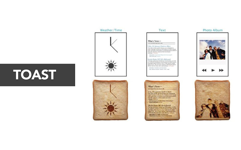
Or—and I want to say I do think that this is the biggest problem that we are facing as a society today—what happens when toaster printers become a reality? Is your content ready to be burned onto delicious toast? These are the problems that we’re here to solve together.
-
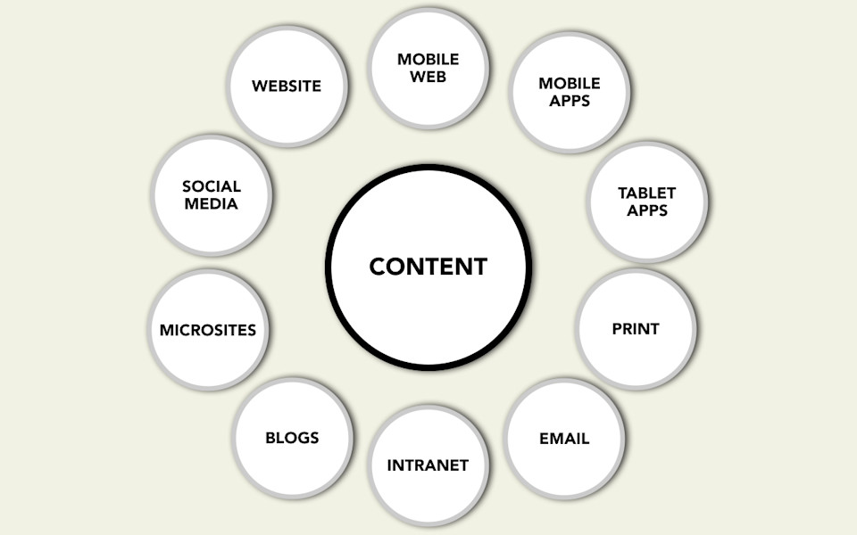
Right now, today, organizations already face the challenge of how do they publish to a variety of different platforms and screen sizes. They’ve got content that needs to exist on the web, and it already has to exist in social channels, or in blogs, or in microsites, maybe in email. And now they’re wrestling with “Well, how do we publish to the mobile web? How do we deal with apps on smartphone platforms and on tablets? Heck, is this the opportunity for us to actually wrangle what we’re publishing in print versus what we publish in digital channels?”
-
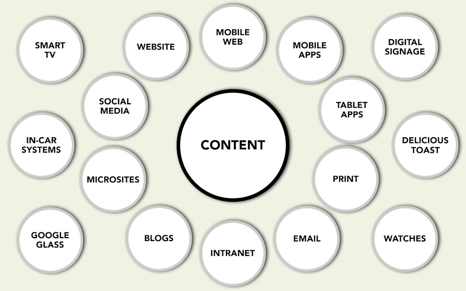
Tomorrow, there will be an ever-greater number of new devices and platforms and screen sizes. It is a veritable zombie apocalypse of new devices and platforms. There’s too many of them for us to battle by treating every single one of them as if they’re an independent platform.
-
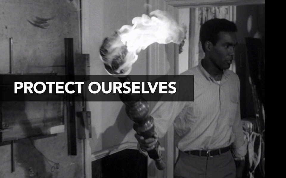
How are we going to protect ourselves from the zombie apocalypse?
-

Well the answer I think lies deeply in something that I know pretty much everybody on the web has spent some time thinking about, which is: How do we achieve the idea of having true separation of content from form? I feel like this is one of these subjects that everybody who works on the web has an opinion about. I sometimes will ask people “What do you think that means?” and people are like “CSS!” But in reality, what this means—it goes so much deeper than just any one person’s or just any one point of view’s window on what this means. It goes all the way through what every single person who is responsible for the website does.
The idea that we now have so many different output formats that we have to publish to, that we can no longer imagine that any one of those outputs is primary. Or that we can intend the meaning that we’re trying to communicate, to be communicated for only the visual language or the styling of that one platform. Do you have any idea just how transformational that is in the history of communication—just how different that is from everything that’s come before? When you imagine this monk here, sitting, laboriously hand-scribing documents, the very notion that you would say: Let’s think about the meaning of what you are trying to communicate separate from the actual physical form of this document, let’s talk about how you might communicate structure or priority or relationships or hierarchy in this document, separate from any one particular instance of this physical form—it wouldn’t make any sense. Throughout most of human history, there was no reason why we would even talk about this.
-
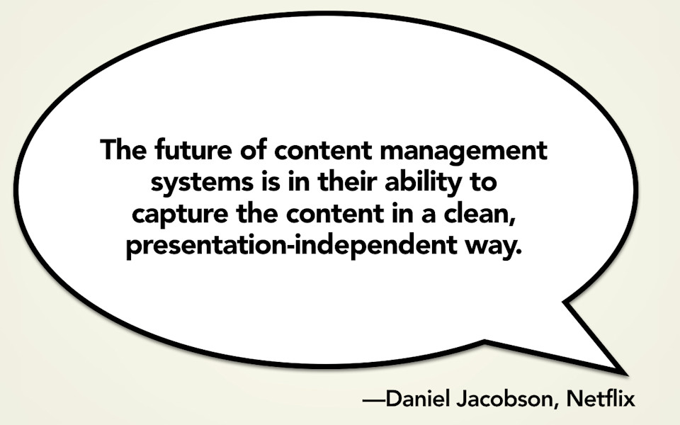
And now, with the web and mobile devices and different platforms and the whole zombie apocalypse, I think that this is the real challenge that we are facing. We need new tools, we need new processes in order to make this happen. When Dan Jacobson here—he’s the API guy from Netflix and he’s formerly from NPR—when he says that “the future of content management systems is in their ability to capture the content in a clean, presentation-independent way,” it’s real tempting to reduce that to a problem with markup, to think that we can get rid of this just by getting rid of rich text editors.
-
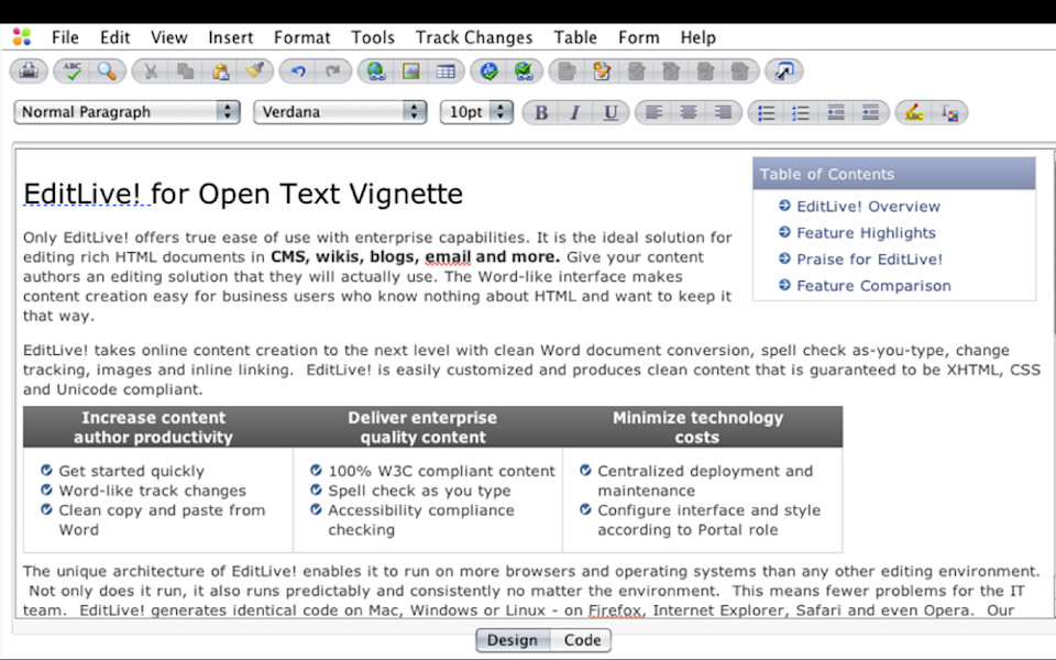
I really hate rich text editors on the web and I rail and shake my fist at the limitations of these things that I call “blobs.” Which is this big, messy bucket, where we give a content creator a big field and just tell them “Oh, dump whatever you want in there. If you want to add a table and drop in some custom bullets (which are not using SVG) and you want to take a table of contents box and float that over to the right, you just go right ahead. You just make this look exactly like a Word document.” This even says: The Word-like interface makes content creation easy for business users who know nothing about HTML and want to keep it that way. The challenge here, the problem here, is that the styling information that this content creator embedded in this blob, that has meaning attached to it. Sometimes developers will say “Oh yeah, you’ve got to go in and strip all that out when you want to take it to another platform.” Strip all that out? That content creator intended something when she took that table of contents box and floated it to the right. She wanted that to convey that this was an aside or some sort of information that was set off from the document. But unfortunately the only tools that she had to communicate that came through what she wanted that document to look like rather than what that actually meant. I rail against the idea that we treat publishing on the web as if it’s “just like Microsoft Word” and we give content creators this WYSIWYG—what you see is what you get—toolbar at the top and let them just style that stuff any way they want it.
-

I’ve gotten the reputation as being the president of the WYSIWYG haters club and I want you guys to know: it’s fun to come and talk to people at meetings like this, but my graffiti crime spree is also going exceptionally well. It’s really getting the message out. When I talk about why I think WYSIWYG is so bad, sometimes people come up to me and it’s like they assume I’m some kind of markdown evangelist. They’re just like “Yeah, markdown all the way!” I’m like, “Well the problem is not the toolbar.” I kind of don’t care if somebody gets a button at the top of their screen that they can use to actually add some truly semantic formatting. No, the problem with WYSIWYG is that we are giving content creators an antiquated metaphor from the desktop publishing era to communicate to them what it means to publish on the web.
-
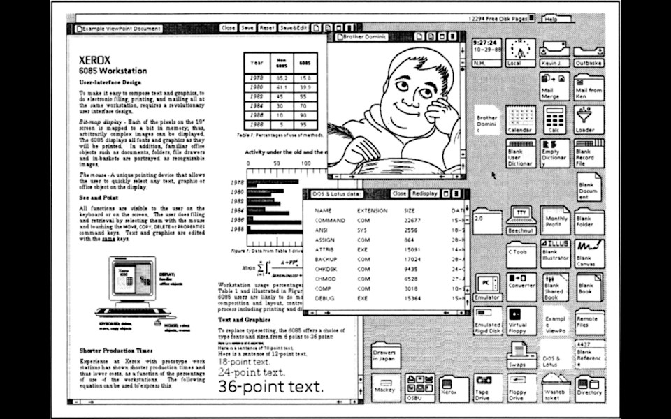
Do you guys know where WYSIWYG came from? It came from Xerox, the research group, Xerox PARC. Because they invented the laser printer. Think about that for a minute. Up until this point, a Xerox machine could only make a copy of a document that already existed. Xerox invented a way that you could print out whatever you wanted. Except they needed a way for you to be able to actually create that document. And so they invented the entire concept of what you see is what you get, invented the entire concept of the graphical user interface, so that they could sell laser printers.
-
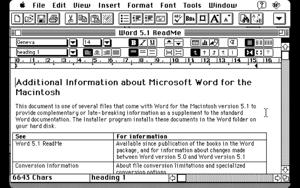
Arguably, the laser printer is the most important component of the entire personal computing revolution. Demand for laser printers, demand for desktop publishing, is what drove people to start buying Apple computers and to start buying PCs, and to buy laser printers, and to print out really badly formatted newsletters and to use too many fonts. As a result, directly coming out of that personal computer revolution, it led directly to the web and the demand for personal computers to run the web.
-
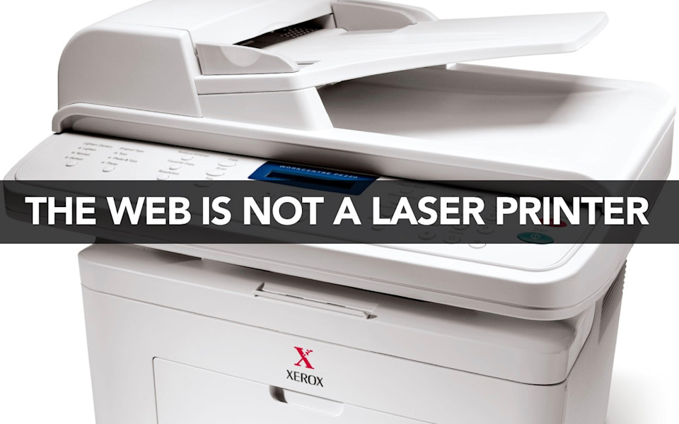
I think all of us here actually probably have jobs today because of the personal computing revolution that was sparked by the laser printer. I think it’s with a great deal of respect for the history of how we have been using these tools over the last thirty years or so when I tell you that the web is not a laser printer. There is nothing about the web that is anything like a laser printer. The very notion that we are using this metaphor of a printed page or “what you see is what you get” to communicate to content creators what it means to publish on the web is an outdated mental model where we’re basically giving them a crutch and saying “think of this just like a Word document.”
-
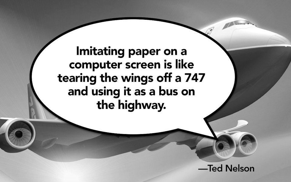
Ted Nelson says that “imitating paper on a computer screen is like tearing the wings off a 747 and using it as a bus on the highway.” The web is better than print. The web can do so much more than print. The idea that we have dynamically published information that can be sent, can be targeted, can be sent all over the globe—that is why I say that we are fighting a war, a war between blobs and chunks.
-
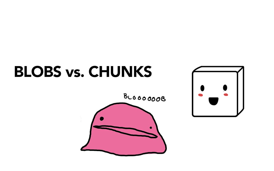
Blobs are these messy formatting rich globs of stuff where we’ve dumped content and markup and everything and the kitchen sink into one big messy blob of a field. When it comes time to take that information to another platform or target little bits of that information, you can’t do it. Chunks are clean, well-formatted, presentation-independent bits of content that are intended, from the start, that they can and will live on a variety of different platforms, in a variety of different ways. We are fighting a war, people. We cannot let the blobs win.
-
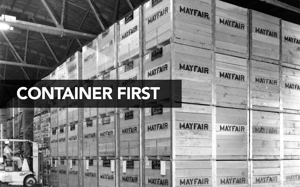
What this means—if we talk about what it really means to truly separate content from form, I think the real limitation here, the thing that we all just stumble back into, no matter that you might say yes, the page is dead, but we are still, as an industry and as humanity, rife with what I think of as “container-first thinking.” Our goal is to say “Okay, first thing I’m going to do is I’m going to figure out what the box is that I’m going to fill and then afterwards I’ll figure out what I’ll put in it.” You see it over and over again.
-
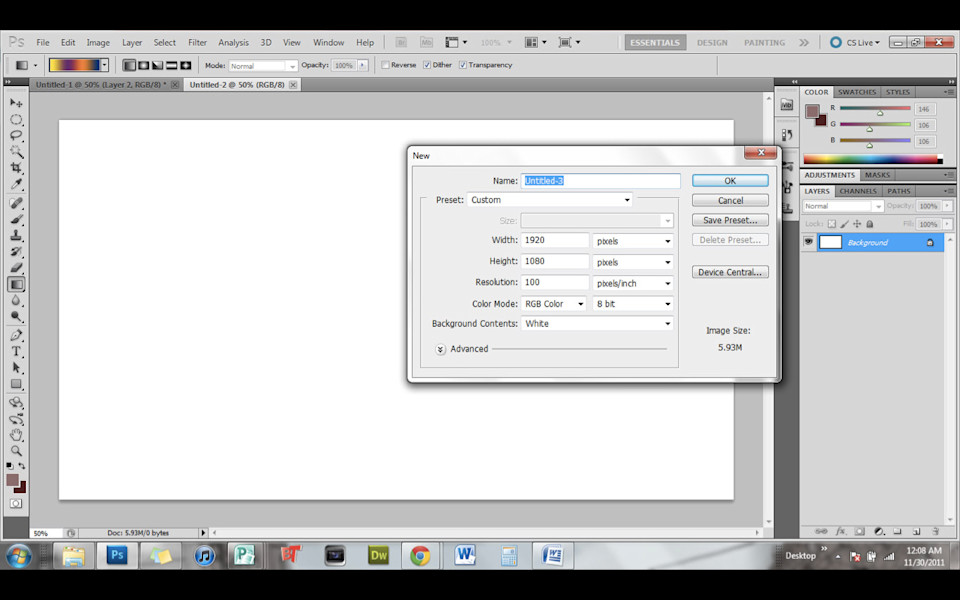
What does Photoshop do the first time you open it up? The first thing it asks you is how big do you want that canvas to be. Sure, you can change it, but it’s like the primary decision that you are making is how big do I want my thing to be?
-
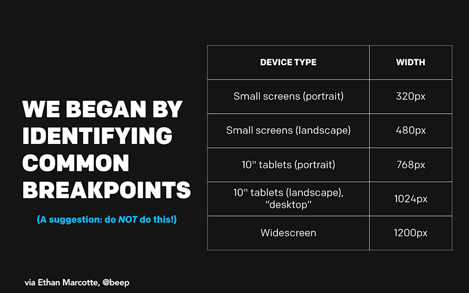
The great Ethan Marcotte describes his initial process for doing the Boston Globe redesign. He says “We began by identifying some common breakpoints.” By saying “Okay, well let’s figure out what the different containers are that we’re going to fill.” To his credit, he also will tell you “Don’t do this.”
-
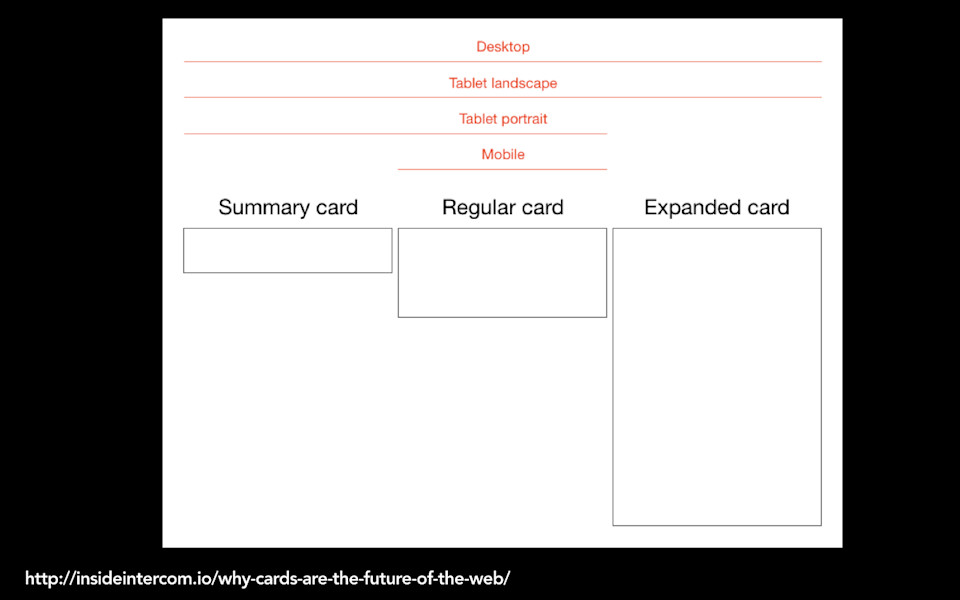
Or, lately we’ve been told that cards are the future of the web. Cards. They’re like pages, but tiny. This certainly is a principle that comes from a design perspective. I can very easily see how, if you’re a designer, it is very hard to imagine what it is that you’re going to be designing unless you put some kind—you want to draw a box around something, right? Maybe ever-smaller little boxes of things but you’re still trying to bound that in some way.
-
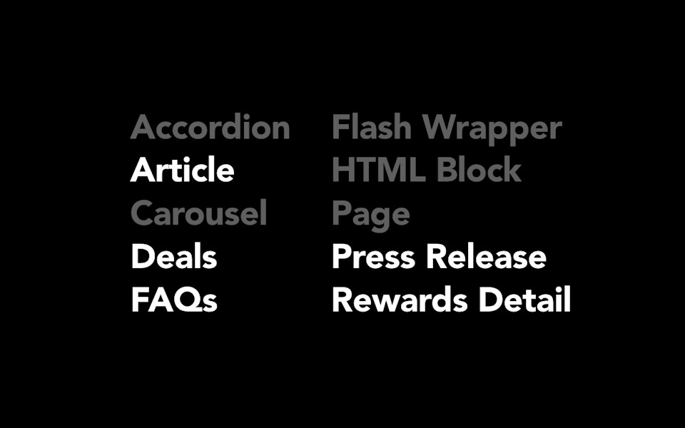
But this isn’t just a problem for design. It is also a problem in the very architectures of our systems. I’m working with a client right now and… I get to see a lot of companies’ content management underpants. So I’m like rooting around in their system, they’ve given me a list of all of the content types that they publish and this is what it says. And I’m like “Oh... oh, that’s interesting. Some of these things are not like the others.” Even baked into the very architecture of the content management system, they are saying “Oh, here are some of the actual pieces of content that we publish. We publish articles and press releases and FAQs, but we also have this notion that the container of the content—a carousel or a wrapper or an accordion—those are content types too.” But they’re not.
-
This idea that we are still struggling with: How do we make choices about what we do and what we design, how we publish separate from what it should look like or what the little box should be around it? The technique that we use to do this is something called content modeling. Content modeling is essentially the process of starting with your content and figuring out from the start what are all the little bits and pieces that you’re working with. Content modeling is what makes lots of things possible.
-
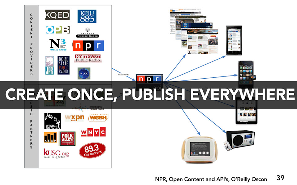
It makes possible the NPR Create Once Publish Everywhere (COPE) model. This is a very much talked about case study, I’ve talked about it many times in my talks. But what it means is that they have a flexible set of content that then they can dynamically target to whatever platform or screen size or device they want to. Because they know the underlying content structure before they start designing, they are more able to make good decisions about how they should style and interact with that content for any given platform.
-
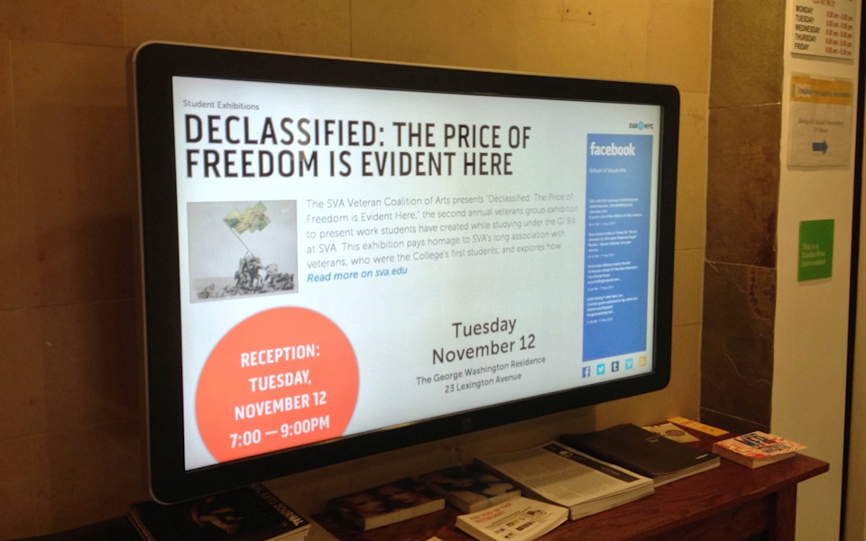
It’s also what makes possible this digital signage project that I’ve talked about. I teach at the School of Visual Arts in Manhattan. They have these digital signs, they also have a website. I could look at a webpage like this and see that it was entirely published as one big blob. Everything on that page could just be one big Wordpress field. And somebody is like “Oh, I’ll put a picture in there and then I’ll put in all of the text about the event.”
-
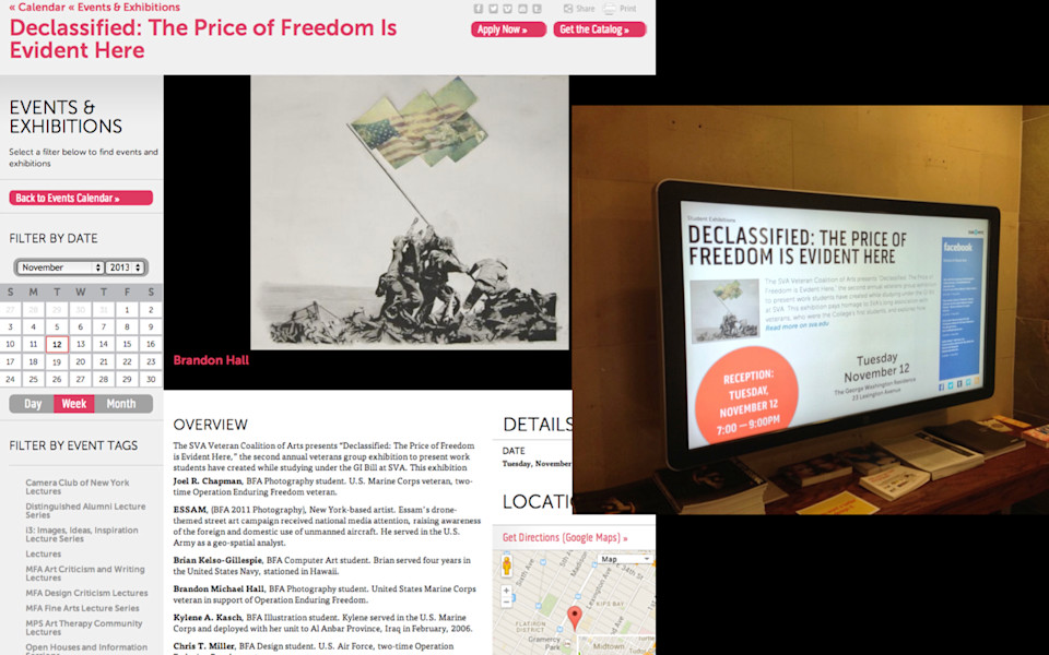
The problem is if that event listing isn’t properly structured, there’s not underlying chunks of data behind it, then their ability to target the right bits of that content for their digital screens wouldn’t be possible. They need that image, they need that overview paragraph, they need the date and time of the event all separated out as separate fields so that they can target them dynamically.
-
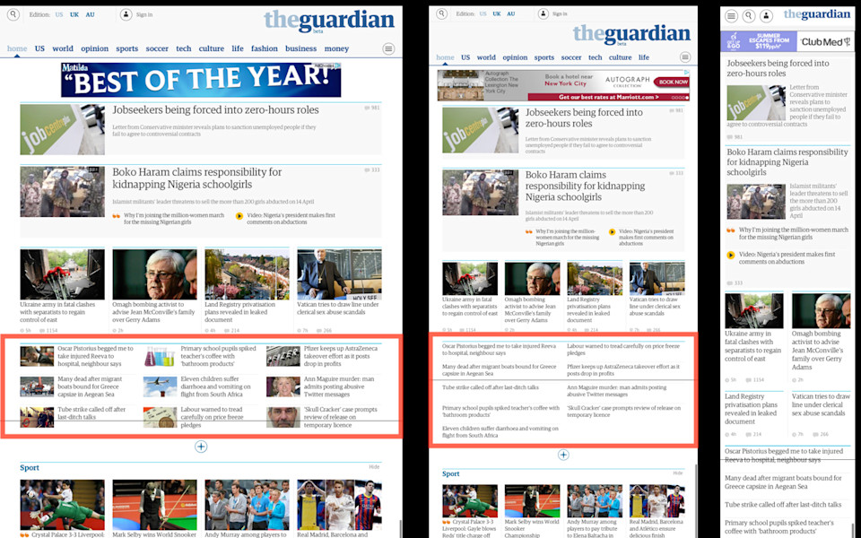
And it’s even what makes possible I think some of the things we’re going to be able to do in responsive design. This is an example of The Guardian’s beta site and you can see, okay, here’s a block of headlines that have an image. At a smaller breakpoint, they’ve decided to drop the image out. Similarly, headlines and images, and at a smaller breakpoint, only for the priority stories. Only for the first, most popular stories, the hierarchy of stories, do they include the image, for the stories that drop the image out.
-
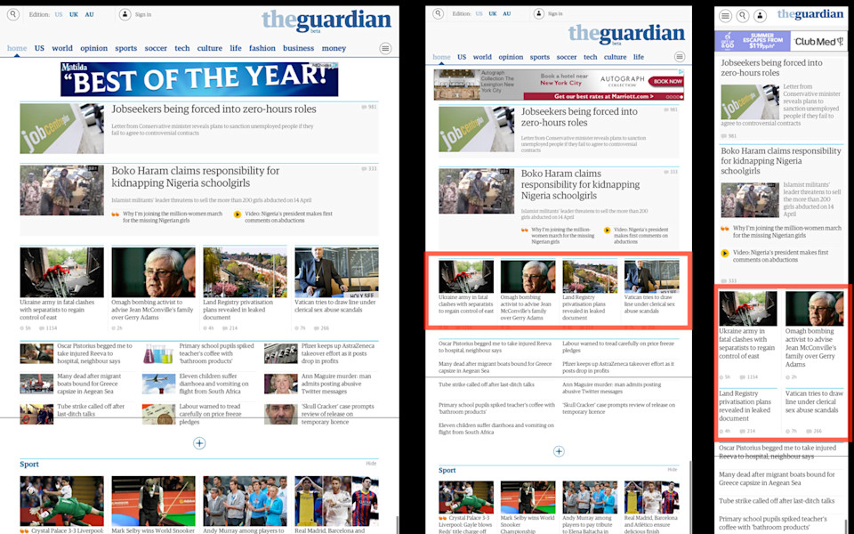
Now, this is a pretty simple example, right? We could do this today. But when you start thinking: Oh right, our job should be to have the right granularity in our content so that, as we are thinking about “what’s the most important or appropriate presentation at different breakpoints?” we can actually target the content at more and more fine grains of granularity. The ability to do that is going to be content modeling.
-
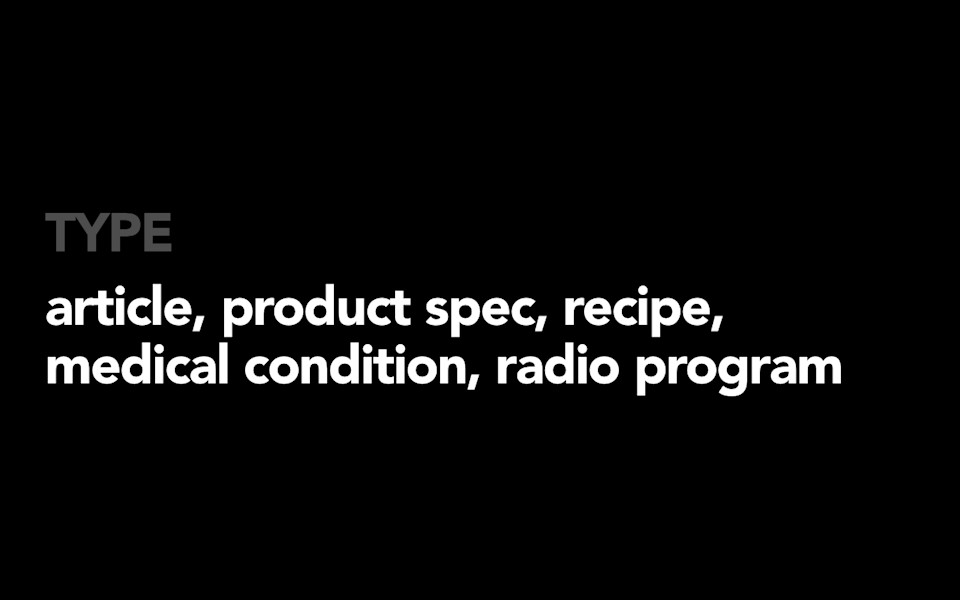
Content modeling essentially means that you sit down and the first thing you figure out is: What type of content do you have? It might be an article or a product spec or a recipe or maybe it’s a medical condition. You sit down and you figure out: What are these things?
-
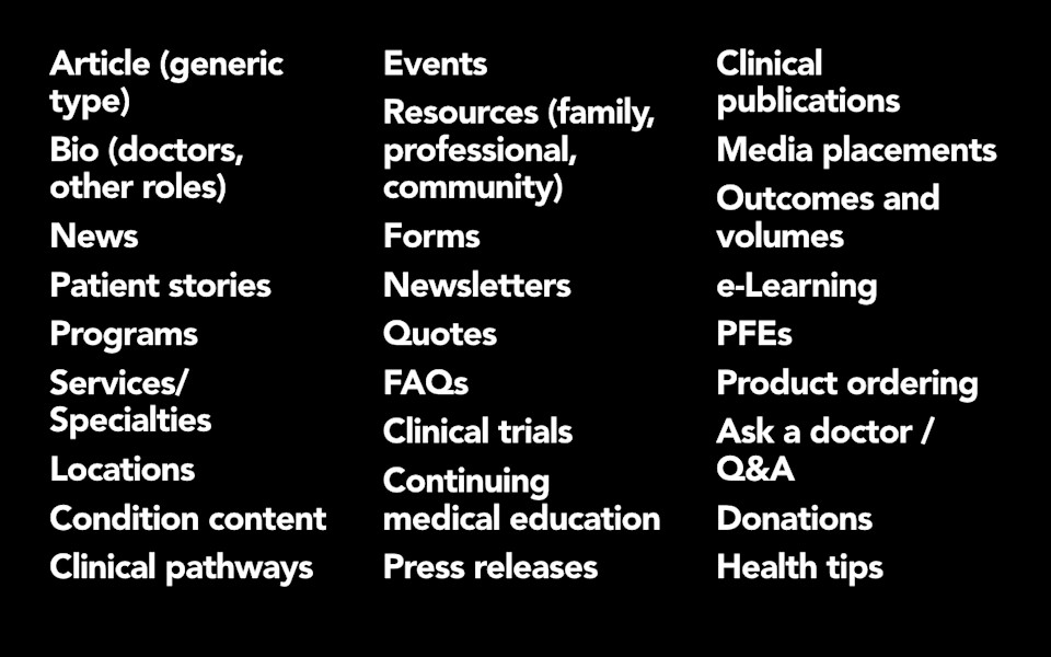
I’m going to tell you something. Doing this, for many people, is actually very easy. I worked with a hospital this summer and we sat down and in a half-day brainstorming session, we went through and we listed out every content type that they thought they could publish. And you know what? They did it. They did it really quickly and easily. They understood their content. In fact, they were actually really excited about the opportunity to talk about what their content was separate from what template it should run in. They were tired of doing web redesigns where people would come in and be like “Okay, well here’s the six templates you’re going to get.” What they wanted to do is they wanted to sit down and say “What do these content types mean to us? What do we think they consist of?” For example, they had something called a Patient Story. What they were able to do is break down that patient story, so instead of being a big blob, they said “Oh, well it’s going to have the information about the condition, and the doctor who treated the patient, and how old the patient was, and where the patient came from.” And so having all of that information structured allowed them to do more with those patient stories. They were able to target them and search them and present them in more fluid ways because they weren’t treating a patient story as if it were just one big article blob.
-
What that is, that process that I’m talking about, is that we are trying to figure out what the attributes of the content are. When I talk about chunks, sometimes I call them “Fields” or “Content Objects.” I say “Fields” in quotes because I want to be real clear, I don’t necessarily always mean that an attribute of the content is going to be stored as a separate field in the CMS—that way lies madness—it’s a combination of fields and markup that allow us to truly communicate the semantic meaning of what these attributes are.
-

But the content attributes are things that… a recipe is a super-easy one to explain. I worked on a product called Food and Wine this past year. They’re a big recipe site and magazine based in New York. We sat down and we did a massive content modeling of their recipe content type. I think sometimes people are like “Well recipes, that’s pretty simple right? The name of the recipe and a picture of the recipe and the steps and the ingredients.” Well, it’s true.
-
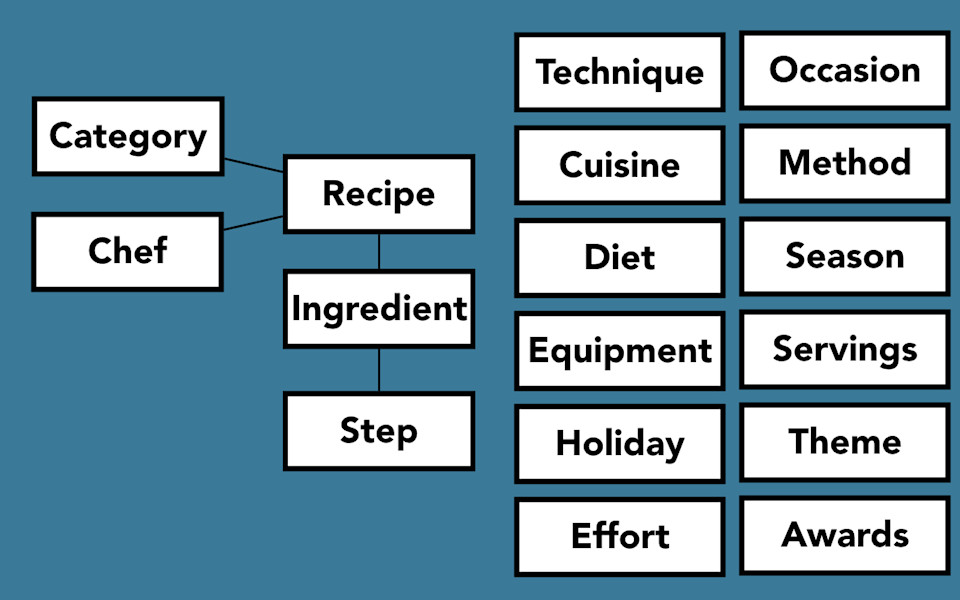
Recipe is the core content type and, yes, there are ingredients and steps that come off of that. But honestly, to make it actually useful, there’s so much more. For Food and Wine, their primary organizing schemas were the category and the chef. They focus really heavily on people for their recipes, so having the chef as a major organizing principle worked for them. Off of that, there were a whole bunch of facets that we would use to categorize the recipes. So, we had cuisine and culture and diet and equipment, holiday. All of those things were things that they could encode to say: Oh, this is great for a brunch, this is great for people who eat gluten-free, this is German food. That process of defining what that taxonomy was, what that model was and what all those facets were, made it possible for them to do more with their recipes.
-
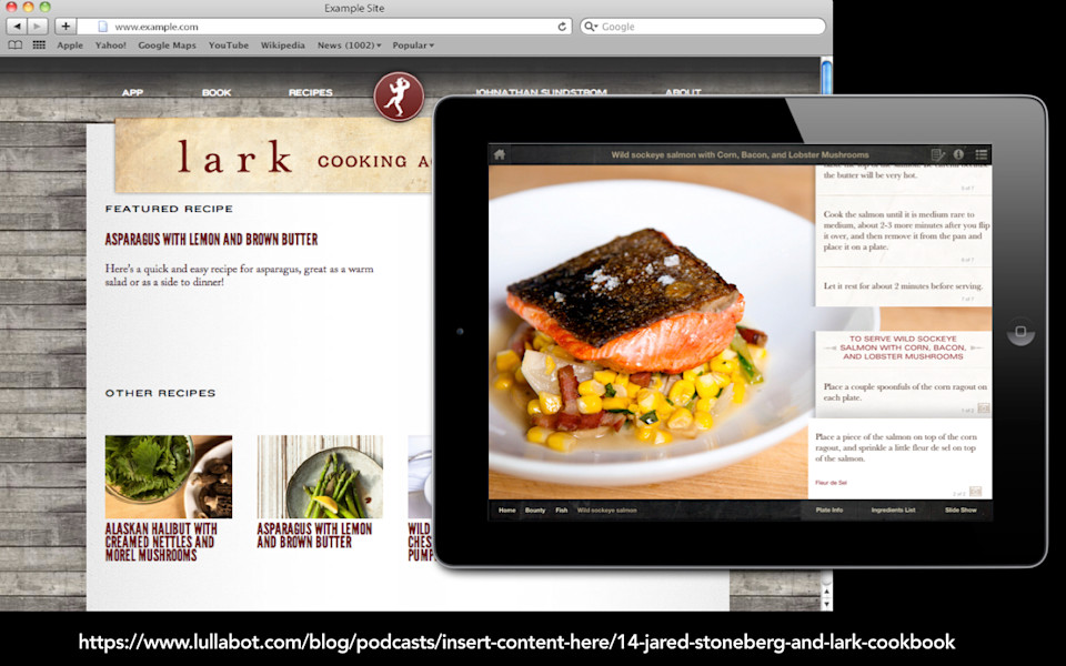
You might think “Well, okay, great Karen! You’ve figured it out. That’s what recipes are.” But it’s not. The thing is, this content modeling exercise is different for everybody. Even a format that you might thing is as codified as a recipe. My friend Jeff Eaton has a case study of the Lark Cookbook. This is a Kickstarter-funded campaign that has a website, it has a variety of mobile apps and—not only that—it has a print cookbook.
-

If you’re the kind of nerd that I am, the super-interesting thing about this is that all of these platforms, even the print cookbook, are all being sourced from the same Drupal CMS. So they had Drupal outputting to the print version as well.
-
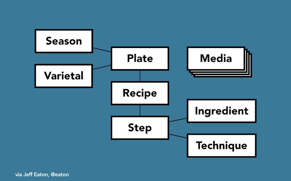
So they also had to go through a process of content modeling. You guess “Yes, okay, great. Well they started with a recipe, right?” And you might say “Well Karen, at least recipes and steps, those are the most important thing.” But no. For this product their primary organizing principle was a plate. They didn’t want to just have recipes. What they wanted to have was a plate of recipes that you would serve together as part of a meal. The chef had very well-considered opinions about what he thought those plates should be. They were categorized by season, so what would be fresh during that time. Interestingly enough, the chef also had a point of view that there were only three seasons, so right there that’s a content modeling issue. And there were different varietals of wine that you would serve with that plate. Then beyond that, step was actually the way they primarily hung both ingredients and then techniques. What they wanted to do for this product was they wanted to store a whole bunch of examples of how you would perform a particular cooking technique and they had a whole media library of videos of the chef actually doing those particular techniques. So if you didn’t know how to whip or you didn’t know how to bread, you could watch a little video of the chef doing that. Two very different products, two very different content models.
-
This is top of mind for me right now because recently, just within the last couple of days, The New York Times Innovation Report about their digital strategy on the web was leaked. If you have any interest in publishing or how people communicate on the web, get your hands on this. This version was actually like a faxed copy that somebody leaked to BuzzFeed. For me, this was like Deep Throat.
-
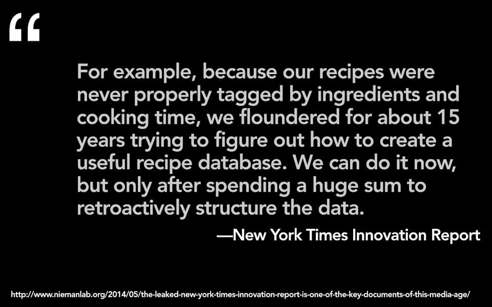
In this innovation report, one of the things that they said was “Here’s the ugly truth about this kind of structured data. There are substantial costs to waiting.” They go on to say: “For example, because our recipes were never properly tagged by ingredients and cooking time, we floundered for about 15 years trying to figure out how to create a useful recipe database. We can do it now, but only after spending a huge sum to retroactively structure the data.”
-
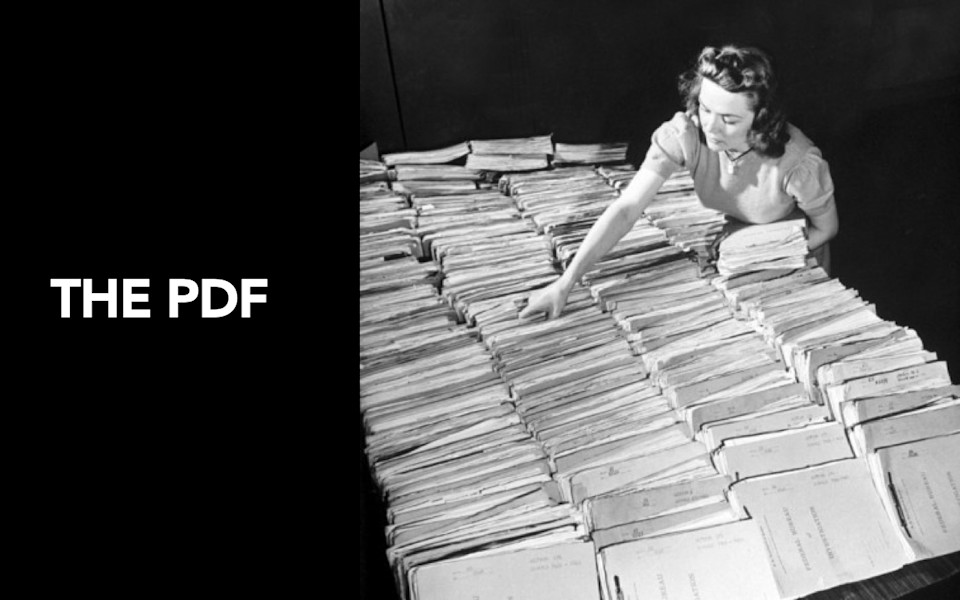
There is a huge cost associated to this. I want to give you a little bit of an example from what I think of as the blobbiest blob that we have ever blobbed onto the web. Oh yes, the PDF. Sorry Adobe. But honestly, I feel like there’s going to come a point in the history of the web where we’re all going to look back on the fact that we let ourselves band-aid along on the web using a piece of paper. It’s literally a piece of paper. It’s because we still haven’t worked out how to support a true print to digital publishing model. Instead, we’re letting people get by by treating the web like it’s paper.
-
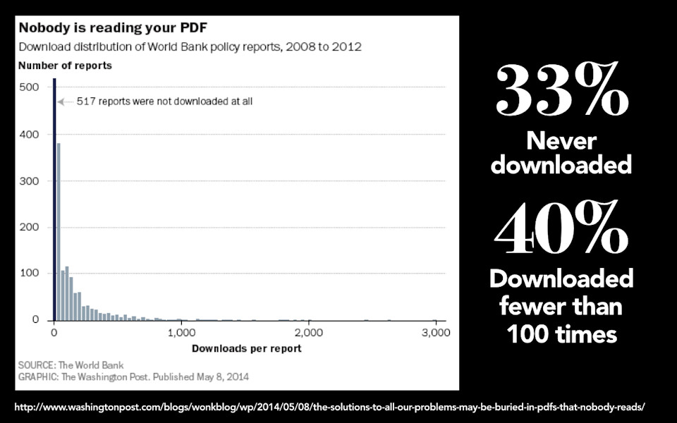
Please, allow me to make one thing before I go on: Nobody is reading your PDF. The World Bank recently did a study in which they looked from 2008 to 2012 at all of the PDFs that they have put online and what they found was 33 percent of them, a third of them, never downloaded at all. What’s worse: 40 percent of them were downloaded fewer than 100 times. I’ll be fair, this is the World Bank. They’re not BuzzFeed, they’re not going viral. But the fact is PDFs lock valuable content up in a format that makes it inaccessible for most people. Most people just don’t go through the trouble of downloading a printed document so that they can read it on their screen.
-
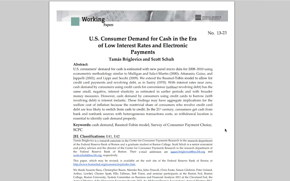
Ethan and I just recently went and talked to the Federal Reserve Bank of Boston, so that’s the United States Central Bank. This place is like a PDF farm. They’re just harvesting PDFs, planting and growing and harvesting them. When you look at the kind of document that the World Bank or a Central Bank might publish—what sticks out to me when I look at a document like this is all of the different charts and tables and equations and graphs that need to get embedded inside of a larger narrative flow.
The challenge that an organization like the bank faces is that their ability to do the kind of content modeling that I’m describing is extremely limited. What they are doing is they are publishing things that aren’t truly digital. They’re not digital-native texts. These things aren’t responsive.
-
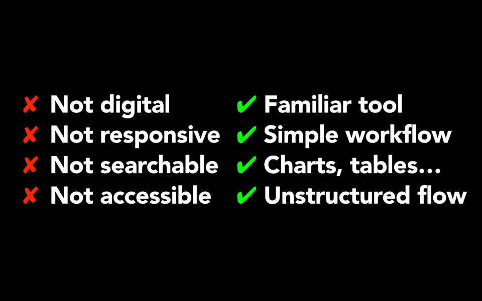
Watch me go talk to a bank about the number of things that they are publishing in PDFs that just aren’t going to be really appropriately rendered on any size screen other than the desktop. They’re not really searchable. They can be, but a lot of times they’re not. They’re not searchable in the same way that web pages are. Similarly, they’re not really accessible. They can be. I think there’s people doing some interesting work in PDF accessibility but this is—come on guys, there’s got to be a better way. Why are we doing this? Why are we still relying on what is clearly a completely antiquated model of how we publish to the web?
Well, I’ll tell you. It’s because it’s a familiar tool. It’s because the tools that we have for publishing simply aren’t sufficient for the kind of people who work at a central bank to go in and actually mock up their articles. Like these bankers, they can use Microsoft Word, they can go in and they can make their charts and their graphs and they can put in their equations. Ask them to do that in any HTML editor, any content management system today, it’s just not good enough. It also gives them a very simple workflow. The publishing process for these organizations is: write something in word, export it as a PDF, put the PDF on the web. The publishing process for how you would take that on if you actually wanted this to be properly structured and modeled digital content would likely require three or four people to do it. So this enables them to get their charts and tables in. But I think most important, what the real challenge here is, that it allows them to support what is a truly unstructured flow in the document. They’re not publishing recipes or product specifications or documents that inherently have a very regular structure to them. They are publishing documents that by their very definition, do not have a structure.
-
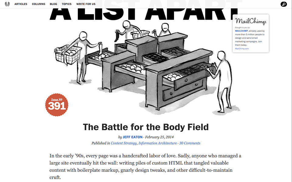
My friend Jeff Eaton published an article on A List Apart called The Battle for the Body Field, where he talks about what he calls “responsible blobbing.” So what do we need to do as an industry to support content creators who need the tools and the flexibility to embed some content types inside of other content types to support a truly unstructured narrative flow without getting caught up in a thicket of fields in the CMS or markup that then starts to introduce presentation-dependent cruft into the field.
-
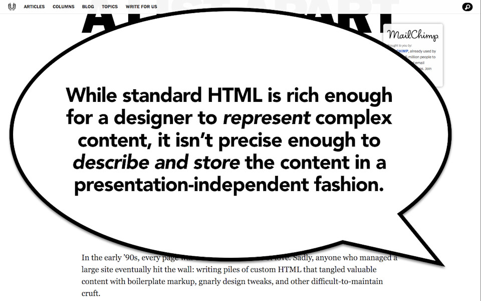
What he says is: “Standard HTML is rich enough for a designer to represent complex content. It isn’t precise enough to describe and store that content in a presentation-independent format.”
-
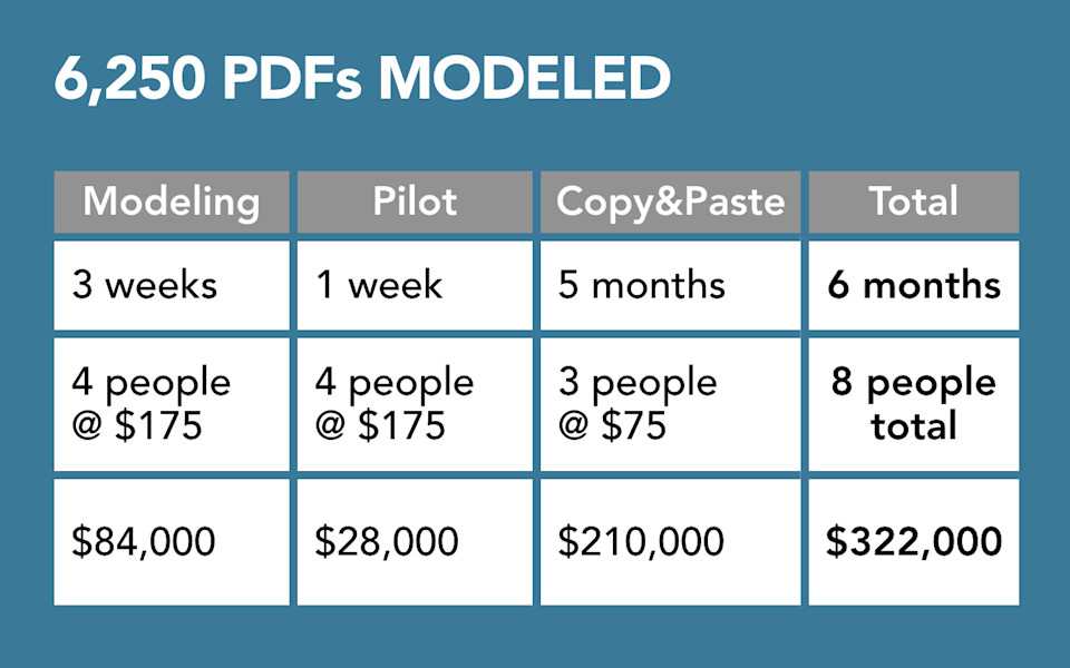
And so as we are wrestling with this, I think the challenge that we all have to try to solve here is: How do we figure out, how do we get all those blobs of stuff that are stored in PDFs or stored in big blobby WordPress fields, and how do we pull all of that out and actually make it properly structured?
Well let me give you a little example of what’s required for that. So I talked to a large professional services organization in New York. They just went through a mobile first responsive redesign where they went through and they said: Let’s dig into the massive PDF farm that we have and figure out what valuable content we want in there that we can then publish to the web. And so they found 6,250 PDFs that they wanted to go in and properly model and structure so they could have true digital native text. So here’s what it took, they did a modeling exercise, which is basically what I described earlier. So they had people like me go in, figure out what their content types were, what the attributes of those content types were. It took four people three weeks to do this, and they paid those four people about 130 euro. They paid them in U.S dollars but I did the math for you. So it was about 175 dollars an hour, which is a pretty good mid-senior hourly rate. So this task cost about 62,000 euro for them to complete.
And then second, they did a pilot project that took a week. So what they did is, based on the model that they created, they went in and got new PDFs and they piloted those new PDFs to make sure that the model actually accounted for all the things that those PDFs had in store. So that took a week, cost them 20,000 euro.
Then, they did a process that I call “copy and pasting.” So this was the restructuring process where human beings had to actually sit there, go through all of those PDFs, copy and paste and restructure that content into a content management system. That took them five months to do. Now the people who did it, it took them three people, those people were paid a little bit less, so they made 55 euro. It still cost them 150,000 euro to do it. So as a result, for them to get the value out of these six thousand PDFs: six months, eight people, cost them 230,000 euro.
-
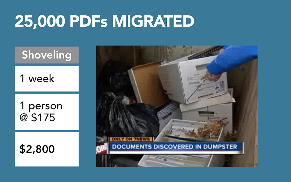
In contrast, they had 25,000 PDFs that they said: Just punt on it, let’s just migrate those over and if anyone really wants them they can get at them. That process, that I call “shoveling,” took one week, took one developer, they paid him 130 euro, cost 2,000 euro to do it. As a result they now have a giant dumpster of documents that are technically on the web but yet the true value of them can’t be realized because they are all in fact locked up in those PDFs.
-
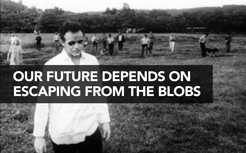
I make this point, I want to leave you with this. Our future depends on us being able to get away from blobs. I pick on PDFs because they’re such an obvious case, but the truth is our content on the web is pretty blobby. Most web pages today suffer from the fact that the content is not appropriately structured, and I mean structured from the modeling perspective that I take on it, that we have appropriate content types and appropriate attributes attached to that content.
-
We have to get away from this if we’re actually going to be able to truly be platform-agnostic. Our future is going to depend on having the kind of structured content that will allow us to target content to different platforms or devices, to know what the actual semantic meaning of that content is. Our future depends on fighting off the zombies. We are, today, living in this veritable zombie apocalypse of new devices and platforms and screen sizes and resolutions and input mechanisms and they just keep coming and they’re never going to stop.
-
The organizations that take this as their inflection point, that take the opportunity of mobile, to not just figure out how to publish to a mobile app but rather figure out what happens if tomorrow I have to publish to a watch or a smartphone screen or a smart TV or an audio interface, the organizations that take that as their challenge and make their content future-friendly, accessible, clean and presentation-independent and start doing that now, those are the ones that are going to survive the zombie apocalypse. Thank you.
-
