Video
Slides
Transcript
-
Back in the late 1980s, Digital Equipment Corporation, DEC, was the world’s second largest computer manufacturer, behind only the 500-pound gorilla of the industry, IBM.
-
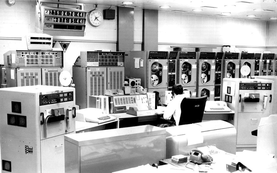
See, back in those days, if you wanted to use a computer, you first would have to clean out your basement. You would have to install this giant monolithic machine. You would have to hire this team of acolytes to run it for you. And if you wanted to use the computer, you would have to get in line behind all of the other people who have more important business tasks to do. You'd have to get in line with the people who are running payroll and calculating insurance premiums. You’d have to come in the middle of the night to run your job. Back in those days computing power was really expensive, it was really scarce, so it was reserved for only the most high-value of business tasks.
-

DEC made its mark on the field with what it called minicomputers. So instead of being the size of your basement they would be the size of a large refrigerator. So with the successful line of PDP minicomputers, DEC was able to bring the power of computing to people who had never had access to it before. They innovated this throughout the 60s and 70s before coming out with their wildly successful PDP-8.
-
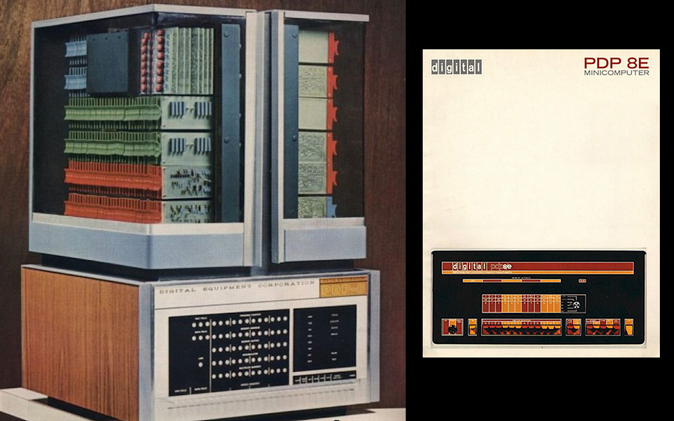
Look at this sexy bad ass right here. The PDP-8 was at the time the world’s most popular computer. What it meant was that people, say, in an engineering department or say, in an individual academic department, maybe even a theatre troupe might be able to buy one of these things and use it to run the lights for their shows. I have this fantastic photograph—it's a super grainy black and white photo in a book that wouldn’t reproduce very well or I would show it to you, but it shows a picture of a farmer who has loaded one of these things onto the back of his tractor so that he can do computerized operations of his potato picking. Which is insane. But as far as I am concerned what that says, is the PDP-8 here is the world’s first mobile computer.
-

This is Ken Olsen. He's their CEO. Look at how happy he is, doesn’t he look happy? Why wouldn’t he be happy? He is the CEO of the world’s second largest computer manufacturer. He has a track record of research and innovation. He has his finger on the pulse of the marketplace. He knows what it is that his customers want and are looking for.
-
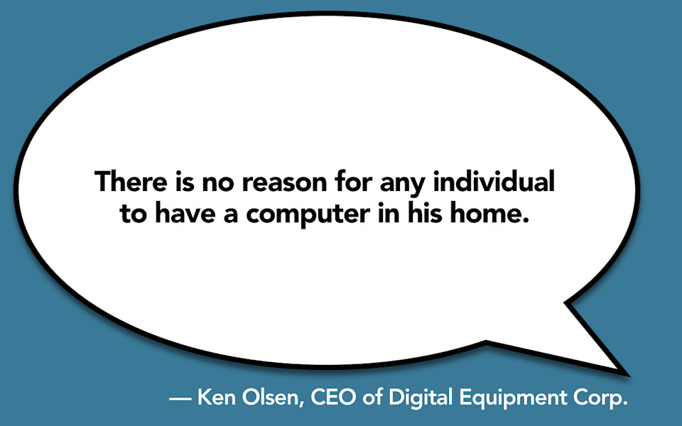
And he feels confident that there is no reason why anyone would need a computer in their home. I mean why would you want that? It doesn’t make sense. It doesn’t square with anything that Ken Olsen knows about the computing industry and Ken knows a lot about the computing industry. This isn’t how people use computers. This isn’t why people use computers. He has done research and innovation and testing and this doesn’t make any sense.
-
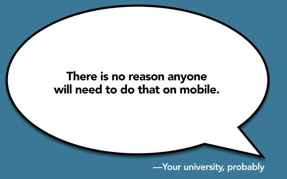
I’m pretty sure that there is somebody in your organization that is saying "There is no reason why someone is going to need to do that on mobile." I mean why would you do that on mobile? That doesn’t make any sense. That doesn’t square with anything you know about how people use mobile devices. It doesn’t make any sense as to how people use computers. There’s just no good reason why people would want to do that.
-
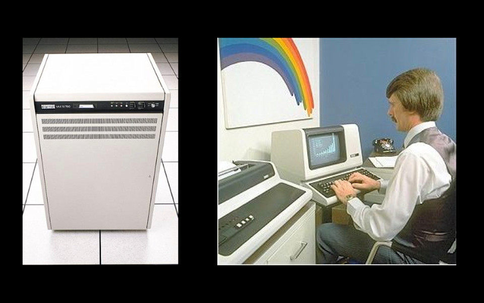
Let me take you ahead. It is 1988, DEC is the world’s second largest computer manufacturer. They have moved on from their wildly successful PDP line of mini-computers to their even more wildly successful of VAX mini-computers. I bet some of you are still running these things today. This is the VAX11. It is the first mini computer with a 32-bit architecture. They sold 400,000 of these things when they came out. These were the most popular computer DEC had ever made. They were also selling the VT125 integrated graphics terminal and this thing, this thing was the most powerful terminal on the market. They were selling this thing like hotcakes, not just to people who were buying their own mainframes but to people who were buying mainframes from every other manufacturer. This terminal was so great. It could do charts and graphs. It had custom fonts. It could show the text in reverse. Rainbows shoot out of these things.
Look how happy this guy is here. Doesn't he look happy? Okay, you can't actually tell how happy he is because of the big Magnum PI mustache but I can assure you that this guy is completely satisfied with his use of the VT125 integrated graphics terminal. DEC is at the top of their game. This is the peak of their business. They are selling more computers than they have ever sold before. They have successfully met demand. They have successfully innovated. These products, they know, are completely what the industry wants.
-
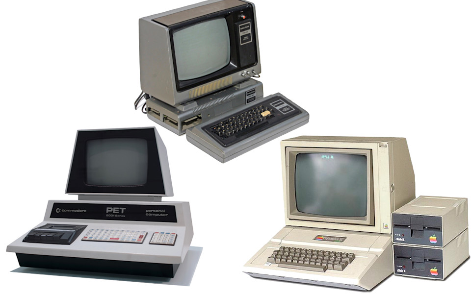
And they have no reason to believe that their entire industry is going to be destroyed by one of these cheap pieces of crap. I mean look at them. This is not the VAX11 32-bit mainframe architecture. This is a cassette tape. It stores its memory on a cassette tape. This is not the VT125 integrated graphics terminal. This is a black and white television set from Radio Shack. It's only got the one dumb little rainbow on it. Rainbows don't even shoot out of these things.
-
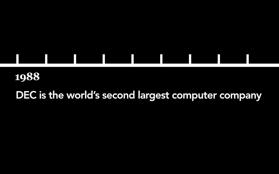
It's 1988. DEC is the world's second largest computer manufacturer. They are the second largest employer in the state of Massachusetts, behind only the state government.
-
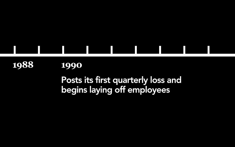
1990, just two years later, they post their first quarterly loss and they start laying people off.
-
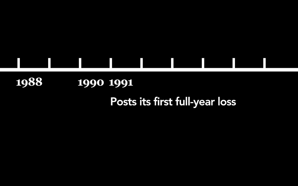
1991, the year after that, they post their first full year loss. They would lose money in five out of the next seven years.
-
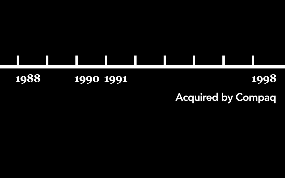
And in 1998, just a decade later, DEC is gone. Out of business. Acquired by the manufacturer of one of those cheap pieces of crap.
-
This has got to be some kind of crazy fluke, right? This has got to be something so unprecedented in the history of American business that there's just no way that Ken Olsen could have ever anticipated that something like this could happen. I mean no one could ever imagine something like this happening. Right?
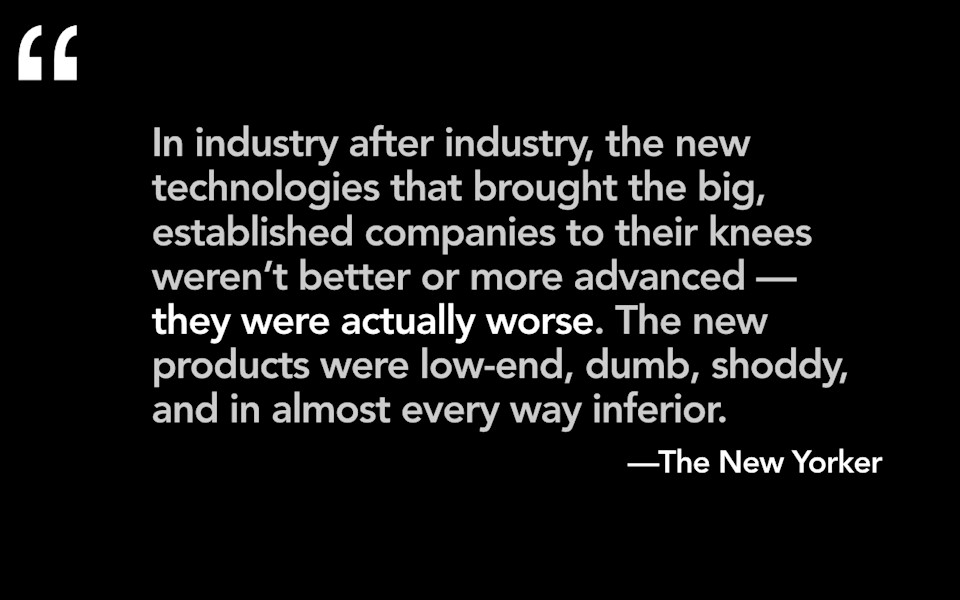
Wrong. In industry after industry, the new technologies that brought the big established companies to their knees, they weren't better. They weren't more advanced. They were actually worse. The new products were low end, dumb, shoddy, and in almost every way inferior. Almost.
-
Clayton Christiansen had a theory and he called it disruptive innovation. What this theory states is that disruption happens from the low end. New products come on the marketplace and even though they're not better, even though they don't work as well as their high-end predecessors, even though they are made of cheaper materials and they are, pound for pound, more expensive in a sense for what you get, they do one thing and they do that one thing really well. They do that one thing better than anything else on the marketplace. They create an entirely new market for that technology, for people who could never have had access to it before. Because there are so many more of these people who now have access to this technology, eventually, the technology gets good enough, and it disrupts the market for the higher-end products. It wipes away their larger competitors.
-

And this has happened time and time again. Imagine it's the 1930s or 40s, and you've invested in one of these gorgeous furniture radios. It's a piece of craftsmanship. Rich, hand-tooled wood. It has rich resonant sound. You imagine that you're going to gather the family around it in the evenings and you're going to listen to music or radio programs. It's something you're going to lovingly maintain. You're going to send it for repairs because you want it to be an heirloom that you will pass down to one of your children. Except, your teenager buys one of these cheap pieces of plastic so she can take it to the beach. Transistor radios weren't better. They were cheap. They were plastic. The sound was tinny. You couldn't tune them. But transistor radios created an entirely new market for access to radios. Teenagers in the 1950s and 60s, these were people who, previously, could never have had access to a radio, and the power for them of having music or sports programs of their very own, it made it worth it. It made it so worth it that they were willing to sacrifice sound quality. I mean, isn't that the whole point of a radio? Isn't that why you have a radio, is that it will sound good? Isn't that the primary reason why you would choose to buy a radio? No. It's not. For these teenagers, the power of having a radio of their very own was so meaningful that, eventually, within a decade or so, transistor radios got good enough that nobody needed to buy one of those big, bulky, furniture radios any more. The names of the people, the craftsmen, the companies that constructed those furniture radios, they're lost to time. We don't know who they are. The name of the company that made the first transistor radio? They were called Sony.
-
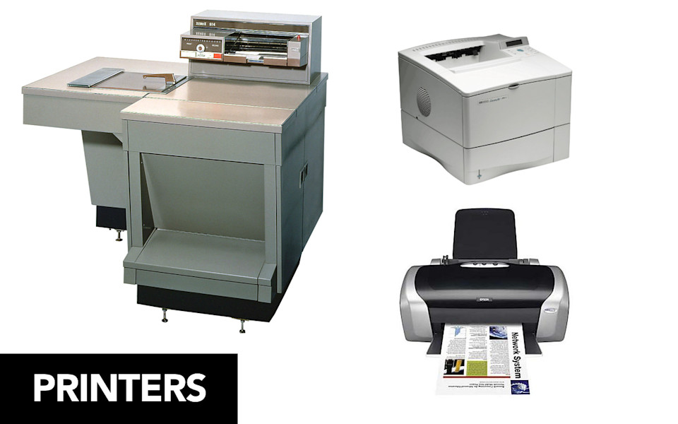
What about printers? Think about having an offset printer in your office. Doesn't that sound great? Doesn't everybody want to have an offset printer? Why, offset printers are better! You get a higher-quality printout at a lower cost. It's more expensive to buy up front, but then, once you have the offset printer, you can produce a printout that works much better than anything else on the market. Isn't that a great reason for you to have an offset printer? Well, apparently not, because all of you people went out and bought these cheap inkjet printers that made really crappy printouts. The ink is really expensive. The per-unit cost for these things is really high. The only value that you get out of that inkjet is that you can be like "MINE, MY PRINTER, IT'S MINE, YOU CAN'T USE IT. IT'S MINE." You don't want to walk down the hall and have to stand and talk to your co-workers while waiting in line to use the printer, and so you are willing to sacrifice printout quality, you are willing to pay more for a less-good printout, so that you can have a printer of your very own.
-
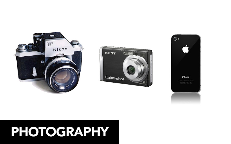
And, we've all seen this happen with photography, right? So, the market, everybody knew when digital technology, when digital film came on the marketplace, everybody knew that digital photography was going to disrupt the market for film. Okay? Everybody saw that coming. What people didn't recognize was that digital photography was going to disrupt the market for cameras themselves. Nobody buys a point-and-shoot camera anymore. Why would you? You are willing to satisfice with the camera that you have with you all of the time, which is your mobile phone. Are the prints as good, are the images as good, does it work as well as a higher-end camera? No, probably not. But you're willing to make do. Kodak is bankrupt. Instagram is worth a billion dollars. That is disruptive innovation.
-
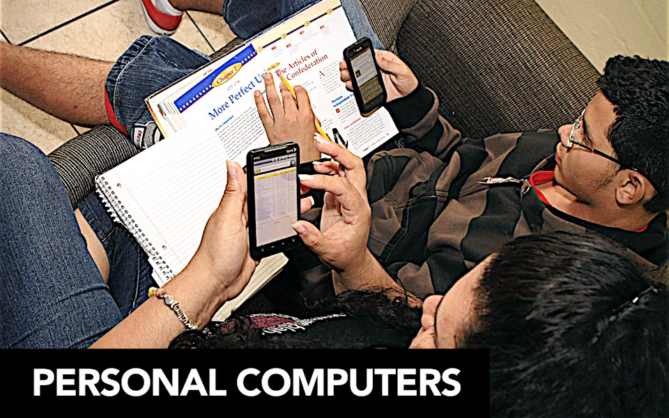
So, you can kind of see where I'm going with this one, right? In the same way that DEC minicomputers disrupted the market for larger mainframes, and in the same way that personal computers disrupted the market for DEC minicomputers, today, we are witnessing the latest wave of disruptive innovation, and it is coming for the form of mobile devices that put the power of the internet into the hands of people who previously could not access it. And, like with all of these technology innovations and waves that have come before it, mobile will disrupt the market for personal computers. There will come a point at which no one will need to ask "Why would somebody want to do that on mobile?" It will simply be assumed that that's how everybody wants to do it. And the people who will make that happen are the people who are adopting mobile devices to use as their primary way of accessing the internet because they do not have access to a personal computer.
-
The digital divide in this country is real. It is easy to assume that the digital divide is limited to people in the developing world. Millions of Americans do not have access to a personal computer at all. And, so, they are the ones who are adopting mobile devices at a fast clip.
-
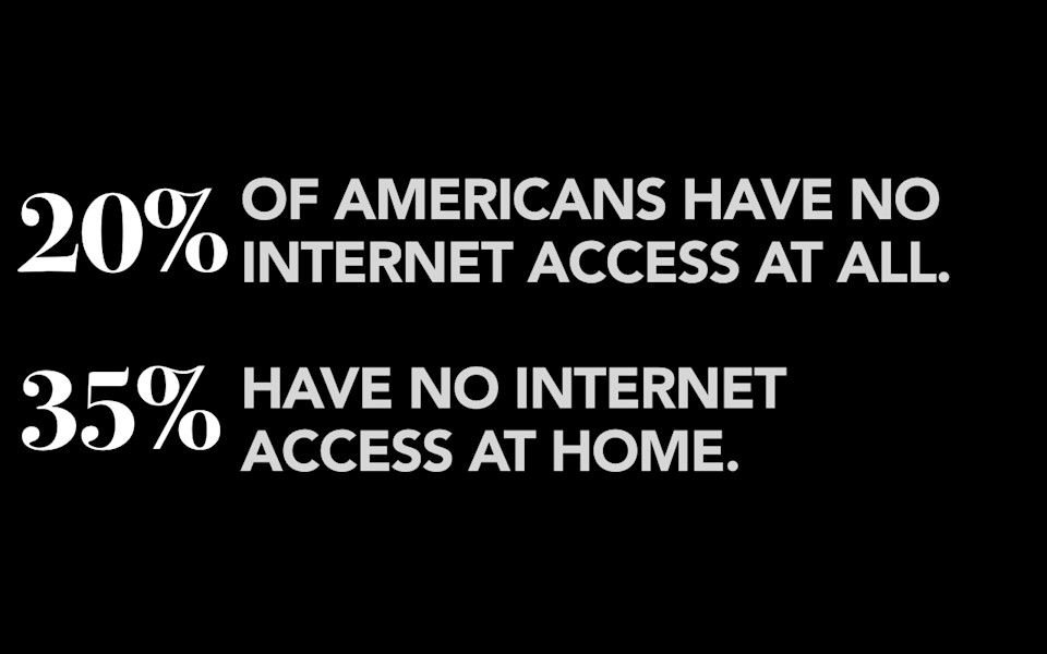
Right now, in America, 20% of people don't have internet access at all. That's an interesting number, but it's not nearly as interesting to me as the second number, which is that 35% of people, more than a third, don't have internet connectivity at home. Think about all the things that you do on your personal computer, in the privacy of your own home, that you might not want the prying eyes of a boss or a co-worker or some stranger in the library watching you while you're doing it. I don't know what you're thinking about, but I'm thinking about: Checking your bank statements. Maybe researching a personal medical condition. Applying for a new job. Heck, even shopping for Christmas presents. These are all things that we take for granted, that we can do from the power of a personal internet connection, in our homes, that we can do whatever we want with, whenever we want.
-
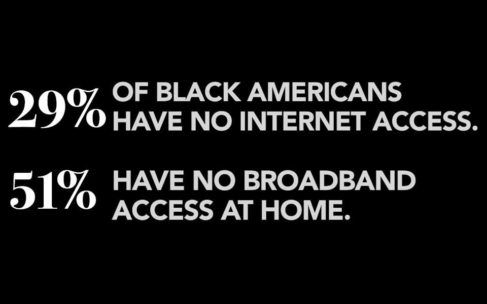
For more than a third of Americans, they don't have that luxury. And, so these numbers look at all Americans. As you might imagine, the populations of people who are less likely to have internet connectivity at home, are much higher for groups that you might consider to be traditionally-disadvantaged. If you're a black American, almost a third have no internet access at all, and a whopping 51%, more than half, don't have a connection at home.
-
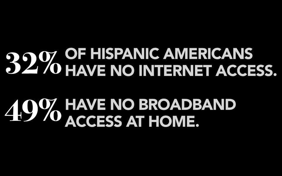
Numbers are about the same for Hispanic Americans, about a third with no connectivity at all and about half without a connection at home.
-
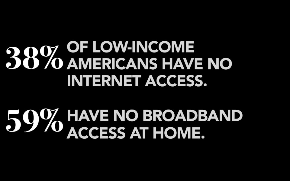
If you're a low-income American, you make less than $30k a year, nearly 40% have no internet access at all and almost 60% don't have a broadband connection. Now, the problem here is, if you're a low-income American and you're struggling to put food on the table, pay the rent, put gas in the car, pay your insurance, the internet might seem like a far-off luxury. But low-income Americans without internet access are finding the tools for escaping poverty increasingly out of reach. 80% of Fortune 500 companies only advertise their job listings online. And, you might ask yourselves, "What percentage of universities allow potential low-income students to apply for school from their mobile device?"
-
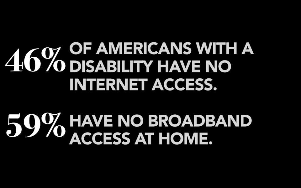
For people who have a disability, 46% have no internet access at all, and again, almost 60% don't have connectivity at home. Think of how much bigger your world would be if you had a disability, if you had a hearing loss or a motion disability or were blind, and could connect with a community and the resources and the services that are only available through the internet. For way too many of these people, the internet is cut off from them.
-
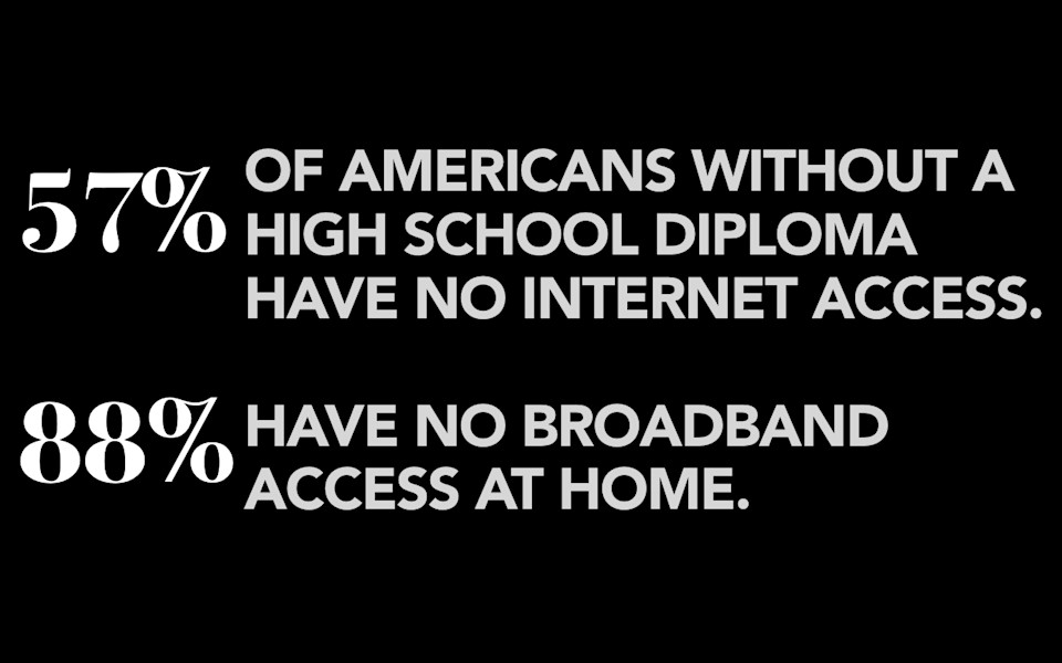
And, if you're an American without a high school diploma, 57% have no internet access and a whopping 88% don't have internet access at home. 88%! I mean, think about it. You don't have a high school diploma, so that means you don't have a job, so that means you don't have any money, so that means you don't have any internet. And that leaves… crystal meth! You guys laugh now. If I took your home internet connection away you would be stockpiling cold medicine in two weeks. You know, it would be like an episode of Breaking Bad in here.
-
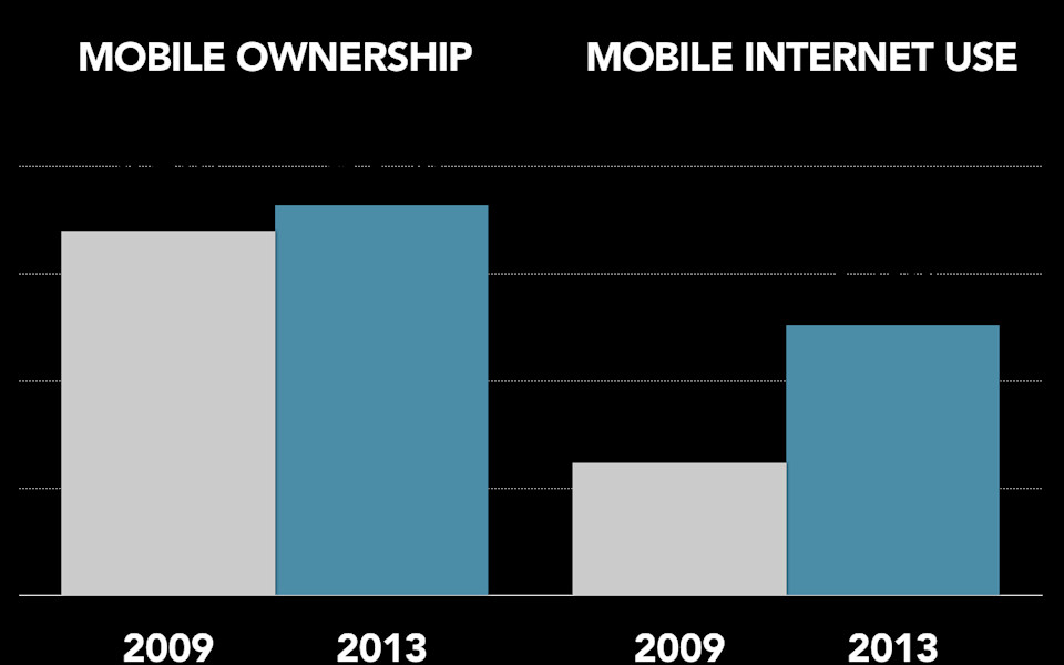
Okay, so not everybody has internet at home. You want to know what everybody has? Everybody has a phone. Everybody has a phone. Mobile phone ownership in this country is not seen as a luxury. It is seen as a basic staple of human life. 91% of Americans have a mobile device. That number, I believe, you will see that tick up by small percentage points in the next few years, until it hits something like 95%, 97% penetration, and then, that will never go down for the rest of our lives. Mobile phone ownership in this country, right now, is a basic staple, not a luxury, the way that a landline used to be back in the day, or a television set is today. There is no sense that anyone out there will not have a phone.
Here's what number is interesting: the number of people, the percentage of people who say that they have ever accessed the internet from a mobile device. That number has skyrocketed in the last four years, to what is now 63% of Americans who say that they have gone online using their phone. Doesn't take a rocket scientist to figure out why this is, right? It's smartphones. Smartphones make it possible for people to use the internet on their phone, and so they go do that.
We are at a moment, an inflection point, where there is a gap between these two numbers, and it is tempting to look at these numbers and say "okay, well, that represents smartphone penetration." But, in the same way that there was a point in history where some people had black and white television sets and other people had color television sets, it's not that there was a market for black and white television sets. It wasn't that there was a competition to see whether black and white television sets or color television sets would win out. Everybody realized that, as people replaced their television sets, they would get color TVs. As these people replace their feature phones, they will get smartphones. And, at a certain point, there will be no distinction between these two numbers. Everyone in the country will have a phone, and everyone's phone will be a smartphone that they can use to access the internet.
-
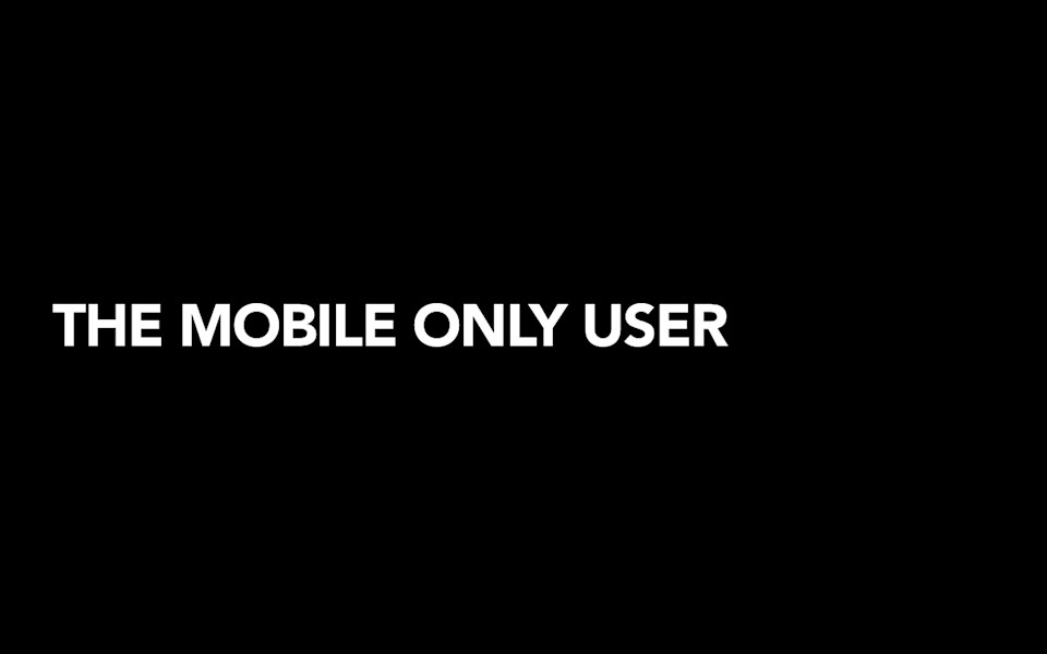
And so, what that means is that we are seeing now and we will continue to see the rise of what I like to call The Mobile-Only User. So, the mobile-only user is the population of people who say that they rely on their mobile device for access. They say that they only or mostly go online using their phone. So, of that 63% of people who have ever gone online using their phones in the US today, 34% of them, more than a third, say that that's the way they only or mostly use the internet. This is millions of people. Tens of millions of people. How many conversations have you had about how to provide a good experience for the users who are browsing on IE? How many conversations have you had about how to provide a good experience for the 2% of users who browse with Javascript turned off? How many conversations have you had about how to reach the population of people who will never, ever, see your website except through the window of their tiny, little mobile phone?
-
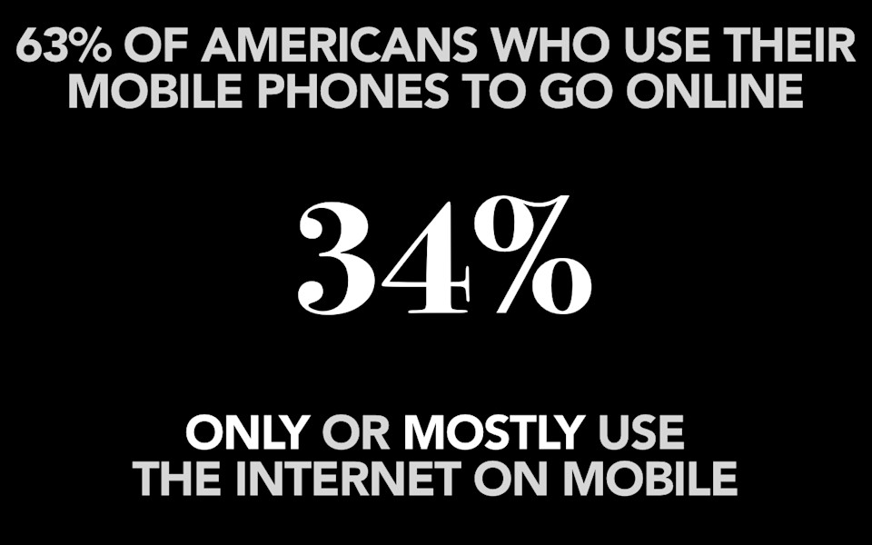
So right now, this number is 34% of people, who say that they only or mostly use their mobile device to access the internet.
-
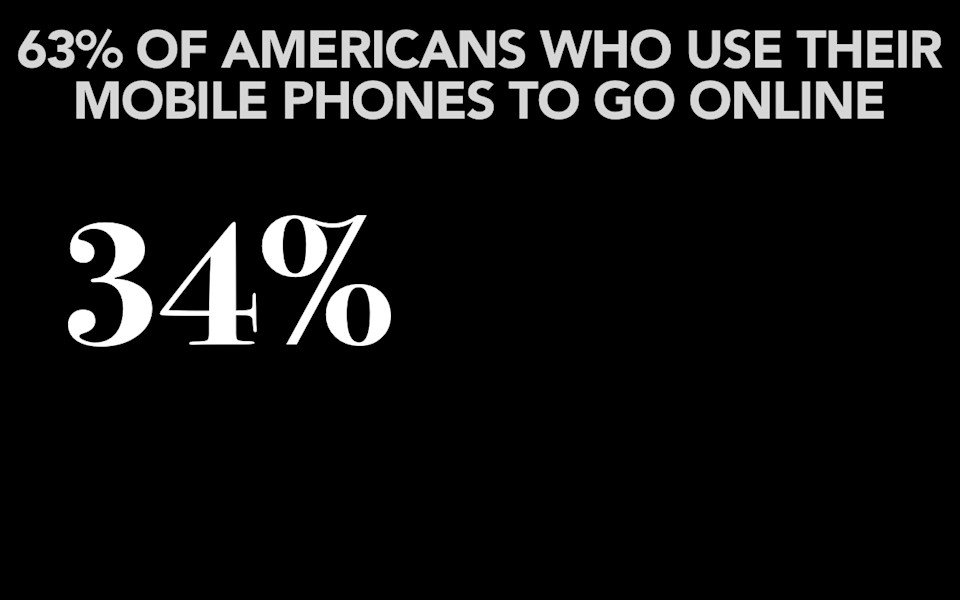
If you combine that number, that 34%…
-
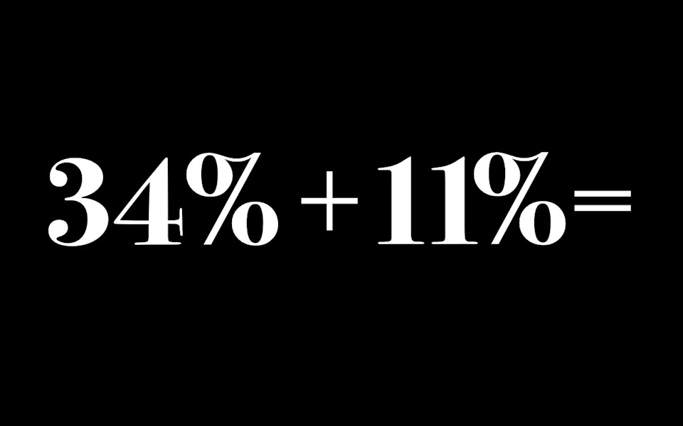
…with the 11% of people who say that they use their mobile device at least half the time…
-
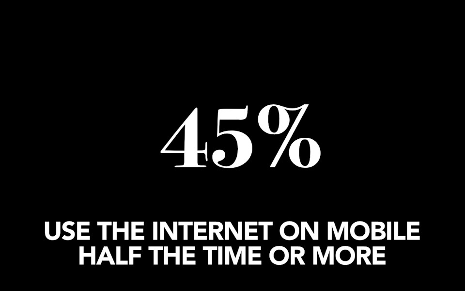
…you now have 45% of Americans saying that they use the internet on mobile at least half the time. When is this number going to be big enough for you to move? If it's not half, when will it be?
-
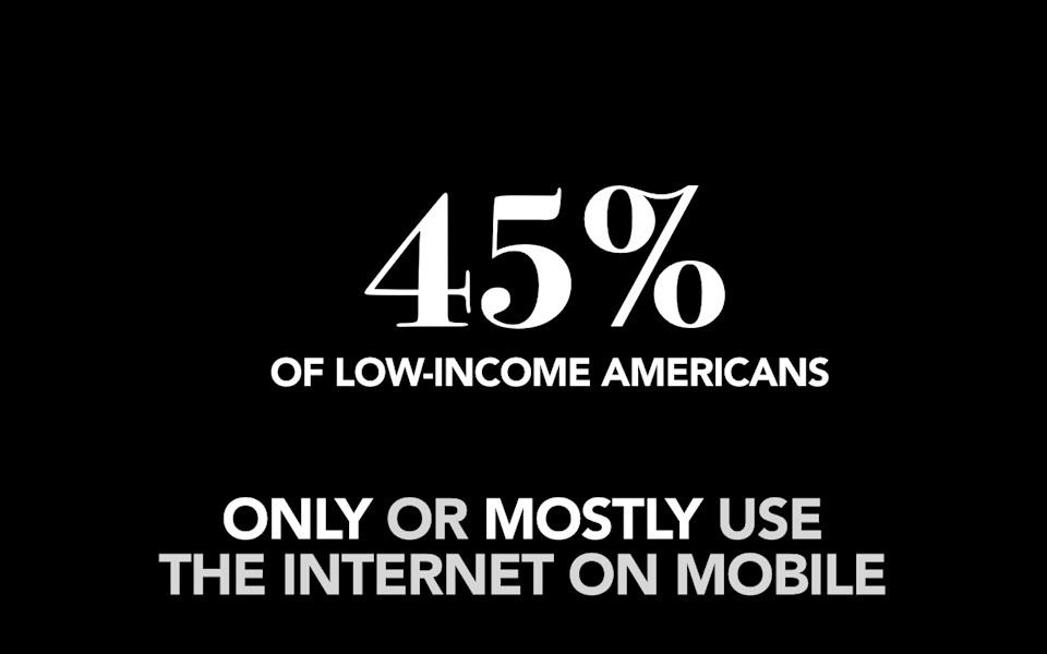
So, going back to people who said that they only or mostly use the internet on mobile, as you might imagine, that population of people maps pretty neatly to the people who don't have a broadband connection at home. So, 45% of low-income Americans say that they only or mostly use the internet on mobile. If education is a powerful tool for helping people to escape poverty, then connecting with these people on their mobile devices should be your top priority.
-
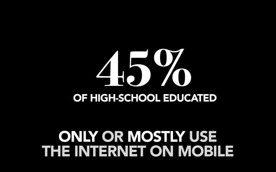
Again, 45% of people with only a high school education say that they rely on their mobile devices for access. These are the people who you want to reach, and even if this isn't high school students, it may be less-educated parents who you most need to connect with on a device that they are comfortable with.
-
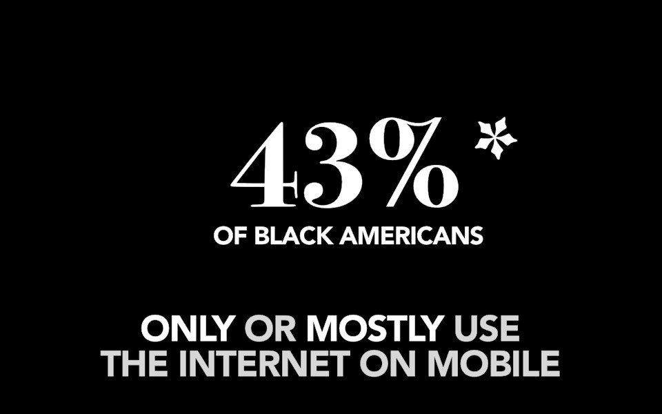
The number is 43% of black Americans—now, I've put an asterisk here simply because… This data comes from Pew Internet. They reported 43% of black Americans this year. Last year, they reported it was 51% of black Americans. That number did not go down. I think sometimes survey data gets a little wonky. I think this number is low, and I'm going to predict that when they come out with this number next year, it's going to be a lot higher.
-
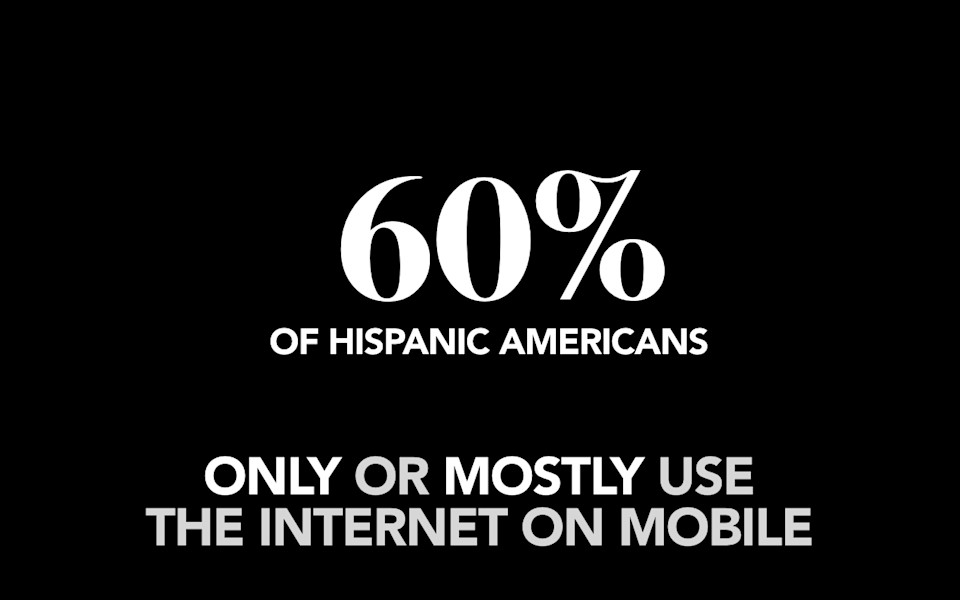
I'm pretty sure that this number maps more closely to the 60% of Hispanic-Americans who say that they rely on their mobile device for access. You think that you are an equal-opportunity university that is making connections to students equally? You’re not, if you’re not connecting with them where they are. Which is mobile.
-
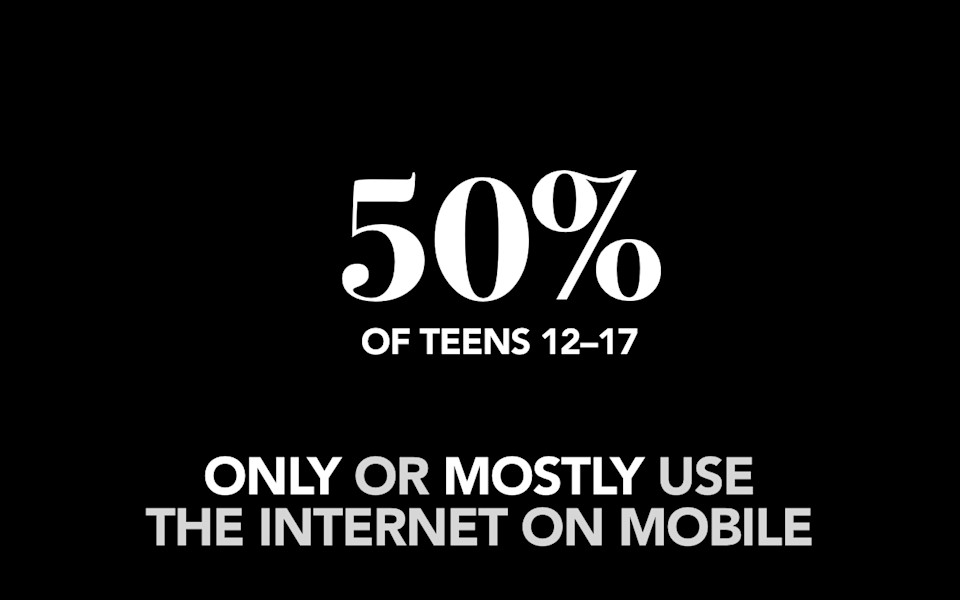
Beyond these populations of people who have been historically and traditionally disadvantaged. The kids these days and their phones, right? 50% of teens, 12 to 17, that’s your target right there, they say they only or mostly use the internet on mobile.
-
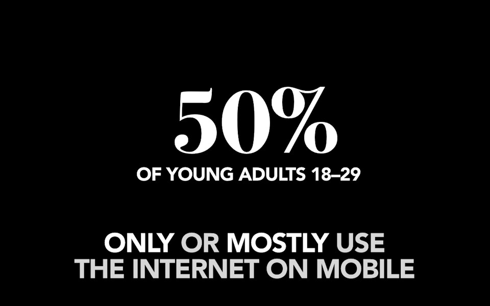
Same deal with older teens: 50% again of young adults, 18 to 29, say that their mobile device is the primary way that they access the internet. If you aren’t reaching these students on the device that is most powerful, most personal, most intensely "theirs" you’re not reaching them.
-
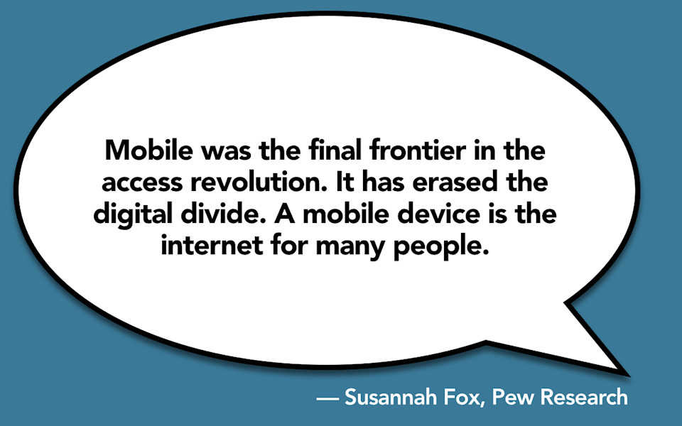
Mobile was the final frontier in the access revolution. Mobile is what has erased the digital divide. A mobile device is the internet for many people. Which is why it’s great we’re doing such a great job on mobile guys, right? No, sadly we are not.
-
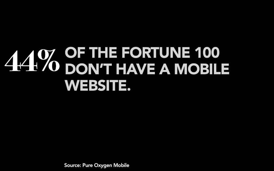
44% of the Fortune 100—and I’ll let you do the math on that one yourself—44% say that they do not have a mobile website; this data also showed that only six companies, six companies in the Fortune 100 actually met all of Google’s best practice standards for mobile websites. Six of them are doing a good job according to Google on mobile.
-
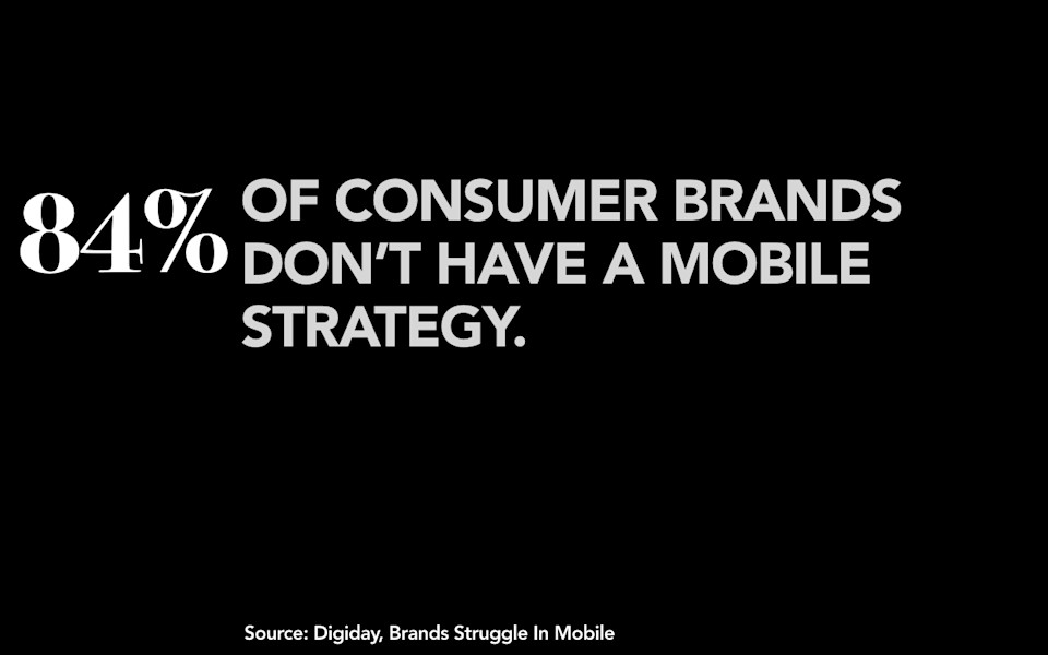
Same deal, 84% of consumer brands say they don’t have a mobile strategy in place at all. Presumably that’s why only 14% of them they say that they’re actually happy with the results that they’re seeing on mobile.
-
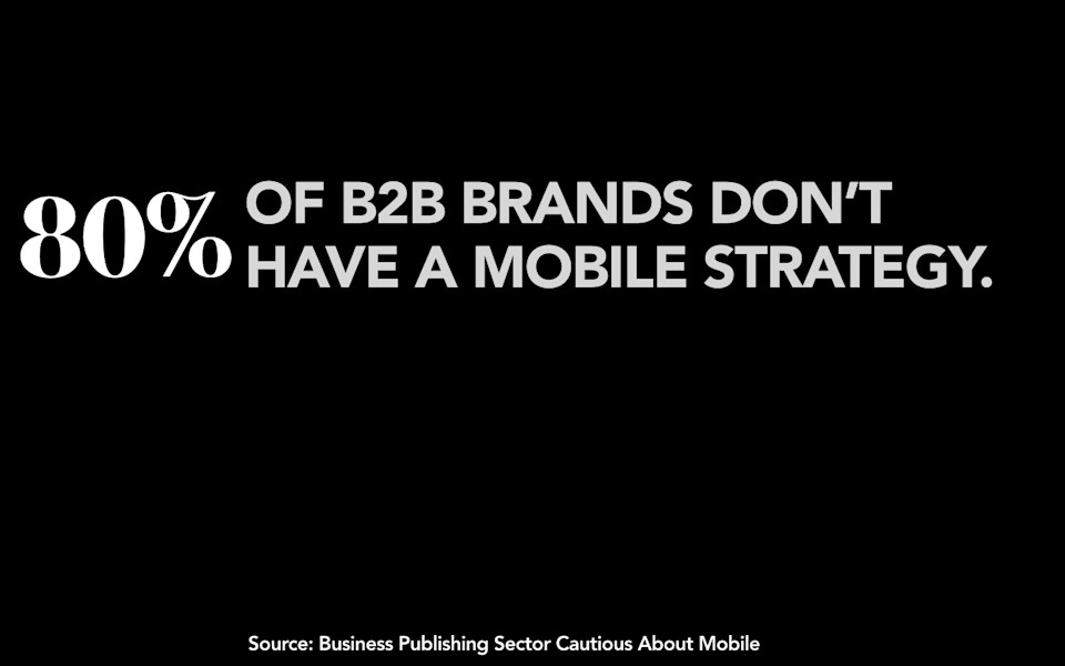
The numbers are about the same for B2B brands; 80% of B2B brands don’t have a mobile strategy. If I can hypothesize here, I don’t have any data to back this up, but I’m going to say these numbers are probably about the same for universities. I’m going to say 80% don’t even have a mobile strategy in place, much less a plan for how they’re going to get there.
-
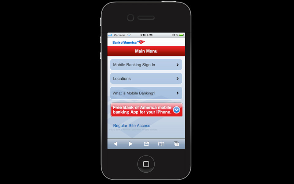
So what does this mean? It means we provide experiences for people on mobile that are subpar. We tell them, Hey! Look at these nice, big tappable buttons here. Don’t they look great? Oh, snap, I’m sorry. You actually wanted to do something on our mobile website? You can’t actually do that.
-
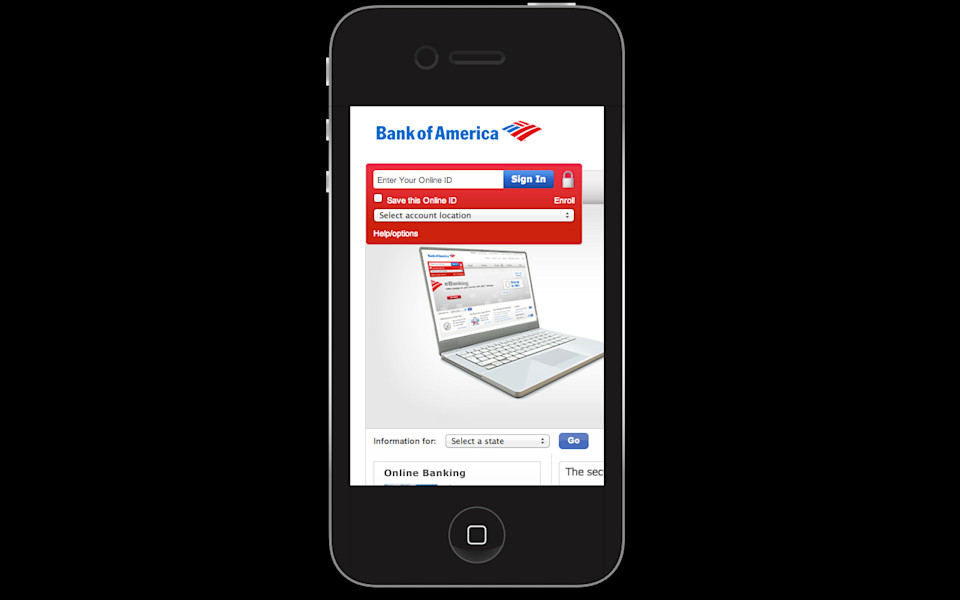
If you want to do something you’re going to have to tap on this link that says "go to the real website," and then you’re going to have to pinch and zoom your way around this screen that was designed for a monitor that’s five times the size. It’s like trying to read the newspaper through a toilet paper tube.
-
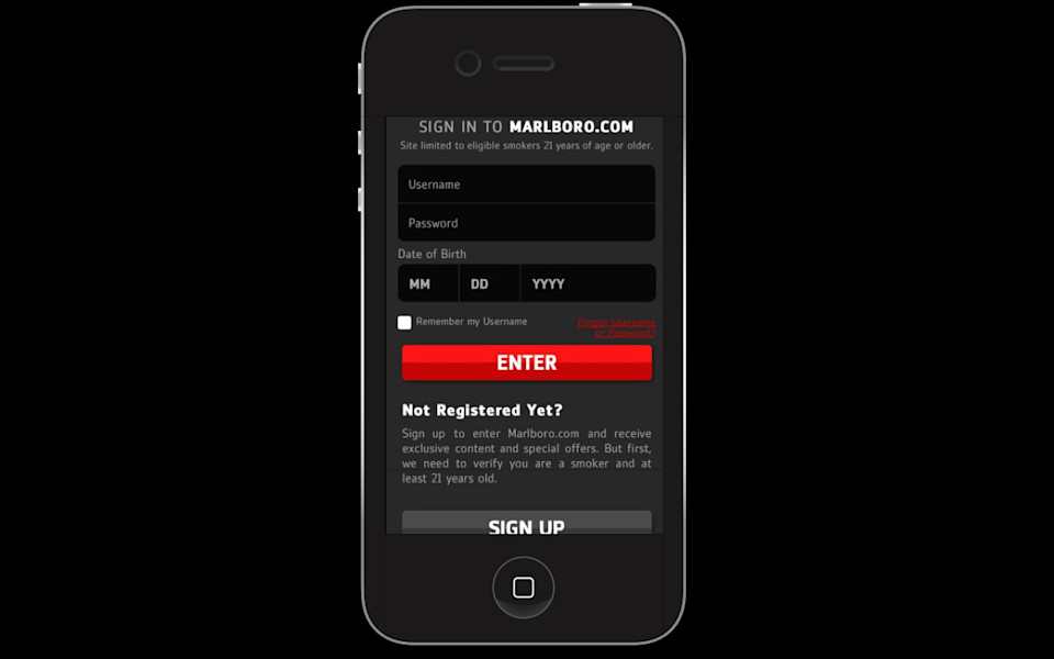
Or we say, Hey! You want to buy some cigarettes? Cigarettes are delicious. You should totally try cigarettes. We’re going to make it super easy for you as an adult smoker to try some cigarettes by giving you nice, big Fisher Price buttons; it’s going to be super easy for you to fill out this form. Just sign up. It takes three taps and then we’re just going to start sending you cigarette marketing.
-
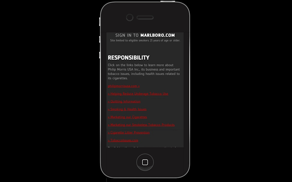
Except I’m sorry, there’s the one thing, and it’s that cigarettes might kill you. We’re kind of mandated by law to tell you that. But we don’t really have to make that quite as easy for you, right? Sure, okay, if you want to find the information about quitting smoking or the dangers of smoking you can squint and tap on that link and...yeah.
-
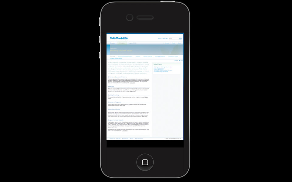
You can read that, right? Sure. I think sending users to the desktop website to get valuable information about the fact that cigarettes will kill you is probably the best indication of what an organization values that I’ve ever seen.
-
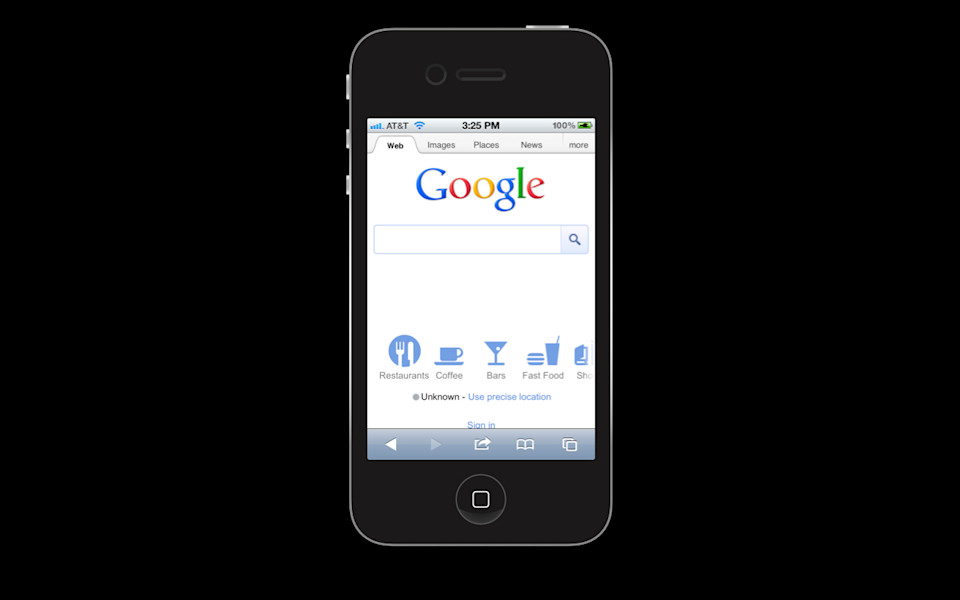
Or have you ever tried to search for anything on Google on your phone? Of course you have.
-
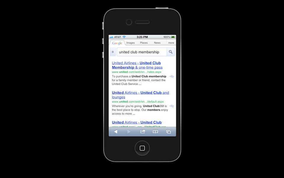
You type in what you want and then you see a link and it’s the story that you’re looking for, it’s the article you want. You tap on that link and go.
-
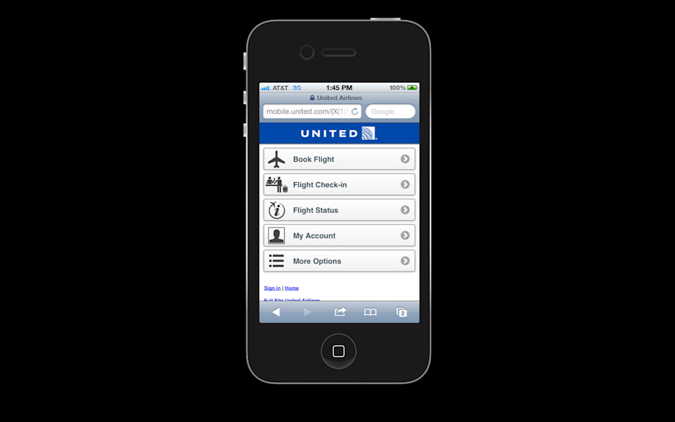
What? How did I end up here? I don’t understand. That wasn’t the page I was looking for. Should I go back and tap on it again? Will it give me something different? What do I do now? Do I go tapping around on this site looking for the content I wanted? Do I have to click the full site link? But then I’ll just wind up on the homepage of the desktop site. That’s not the article I wanted. Something that should take one tap from the search results in Google becomes a frustrating hunt and peck through two separate websites trying to find an article, a piece of content that you know exists, Google can see it, it’s there. And yet you can’t get it. We broke Google for these people.
-
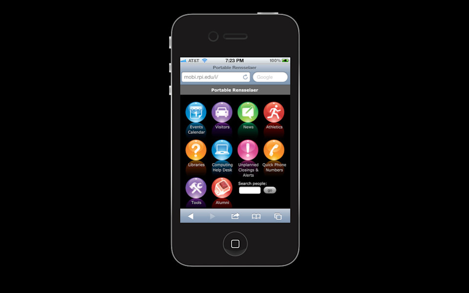
Or we tell them: We’ve got awesome resources for you. If you’re a current student. If you’re a current student we’ve got library hours and what’s on the lunch menus and you can find out about the parking garages. But if you’re a prospective student, sorry. You might want to go swimming around on the desktop site for that.
-

With all of these interactions we are telling mobile only users that they are second class citizens. They don’t deserve access to the same content that everybody else gets access to. They don’t deserve access to a website where they can find what they are looking for, where they can search on Google and get access to it. We tell them that they should really be using the real website. I mean if they would just go to the real website where we wanted them to look then everything would be okay. But if they are relying on their mobile device to provide access to the internet, they are out of luck.
-
What are we gonna do? I gotta tell you I am extraordinarily sympathetic to these challenges. All of this rhetoric aside there is probably no one out there who is more sympathetic than I am to the difficulty that organizations face in figuring out how they are going to restructure their content, adapt their workflow, change their technology, in order to solve this problem. I say that because my entire job right now is spending all of my time talking to organizations wrestling with these problems. I know it’s hard. I don’t want anybody to walk out of here and say "Oh, Karen said we’ve got to rush out of here right now and throw something up on the mobile web."
-
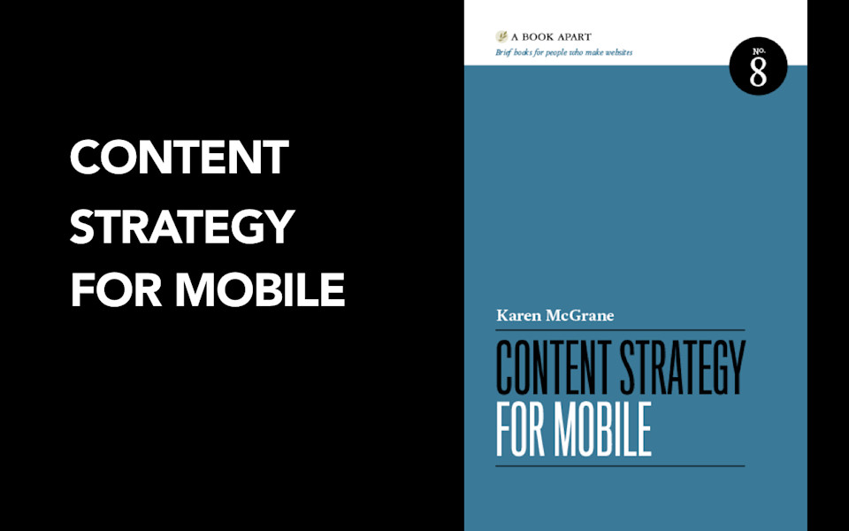
No, hold on, because this is so hard. Because this will require changes to our content, to our processes, to our people, to our technology. I don’t want anybody rushing off without a plan in place. I don’t want anybody making fast moves without actually thinking through what they are going to do. What I want everyone to put in place, is I want everybody to have a content strategy for mobile. And it's super random how these things happen, some kind of weird coincidence, I just happen to have a book by that title, it came out last year and you can buy it from A Book Apart.
-
So I want to leave you with something you can do right now, in your schools, in your organizations, to help think about what your vision, your plan, your strategy is going to be on mobile. I’m going to talk through three things that I think you can do right now that you can get started.
-
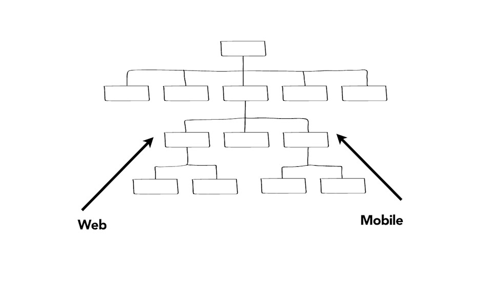
So the first one, is you need to understand what the content workflow is in your organization. Most organizations, I will come in and I will say Hey! What if we were to talk through the publishing process? Like what happens the moment somebody gets a good idea, like "Let’s post something to the internet!" all the way through to the point where that gets published, all the way through when that gets taken off the web. And people laugh and they say, Oh, Karen, we don’t know when people can publish content to the internet. We have no idea what that publishing process is. I genuinely believe that universities have the most challenging problem with decentralized publishing, fragmented tools, and a real difficult time getting their arms around the organization. The challenges that you are facing, along with everybody else, is the risk is that you will treat mobile like it is yet another silo. That you will allow fragmentation to happen now not just on the website, but with individual groups going off and spinning off their own apps and publishing processes, and you will double or triple or exponentially increase the workload with it. I see this happen all the time.
-
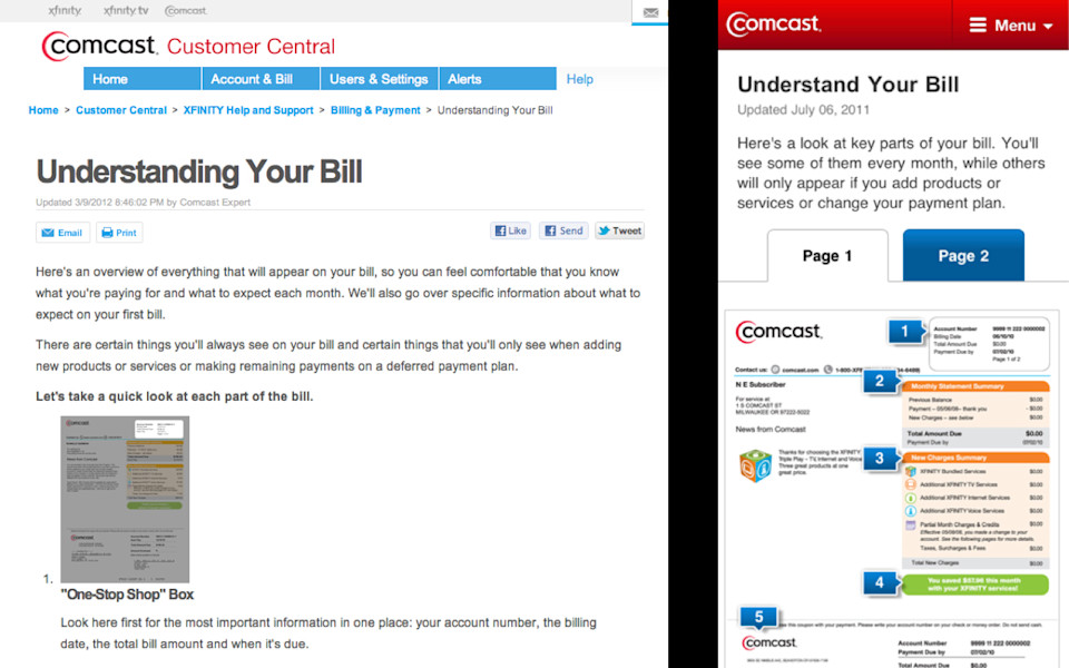
Look at an example here: Comcast. Comcast has a page on the desktop called Understanding Your Bill. Comcast realized Oh! People are looking at our website on mobile, we should develop a mobile website! So presumably there is not enough room on mobile, so mobile users instead of "understanding their bills" now just "understand their bills." And so what they did was they cleaned up their text. They took two long flabby paragraphs on the desktop and they tightened it up to one short succinct sentence. They made the mobile website easier to use, easier to read, easier to navigate. The mobile website is better. But if the mobile website is better, why isn’t that just the website? Why are they maintaining two separate versions of this content so that now they have to update them both every time there is a change? You can tell that this is happening. The mobile website was last updated July of 2011. The desktop was last updated March of 2012.
-
They forked their website into separate desktop and mobile versions. So now that means that every time they want to make a change, edit something, fix a typo, they have to do it in two separate places. There's no way that's going to be sustainable. And, so, understanding what the publishing workflow is, understanding what roles and responsibilities are involved in content, particularly means understanding what are the challenges of mobile.
-
And, my job here, if I leave you with anything, is to say "It's not a strategy if you can't maintain it." The enthusiasm that people often have for leaping in, saying "Oh, let's make a mobile app!" is often offset by the fact that they are simply not prepared to maintain that content and maintain that app or mobile website or whatever it is, over time. And, understanding that people are already operating with shoestring budgets and limited teams, my job here is to say, anything that you put in place needs to be something that you can manage and maintain over the long term.
-

So, the second thing that you can do, starting now, to build a content strategy for mobile, you could write better. Yeah. You could do what Comcast did and actually clean up some of the text and make it easier to read.
-
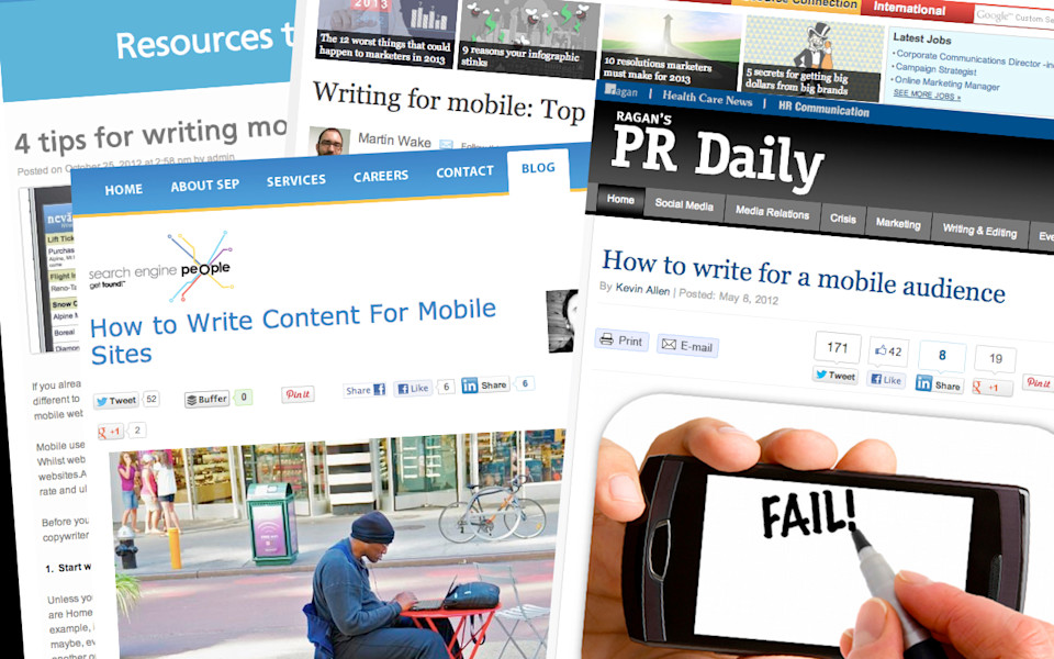
One of my least favorite, one of my pet peeves on the internet, is all of these little tropes that are like "Here's 4 tips for writing mobile website text." "Here's How to Write for Mobile, Top 10 Tips." "Here's How to Write Content for Mobile Sites"—illustrated by a picture of a man using his laptop outside. I think this one best sums up my opinion on this whole "Here's how you write for mobile websites" theme.
-

And, the root all of this is based in this notion that mobile users are always rushed and distracted and they can't concentrate long enough to pay attention to anything so they can actually read the website. It's a myth. The idea that mobile users won't focus, can't concentrate, aren't willing to read something, it's not true.
-
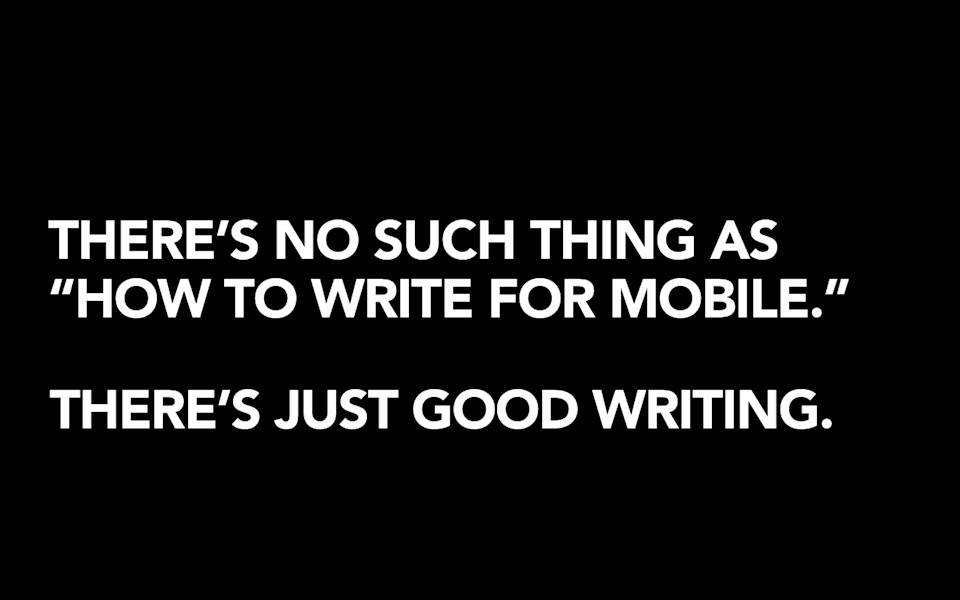
See, there's no such thing as "How to write for mobile." There's just good writing. And the same principles that these articles are telling you about tips to write for mobile, those are the exact same tips we gave to people to tell them how to write for the web, and they are the exact same tips that we have been telling people for decades about how to write good, professional communication. See, your users have always been rushed and distracted and more focused on their own needs than what you want to say. And so the same principles about writing short sentences, putting the most important ideas up front, breaking up the text with headings and bullet points, all of those principles, they work just as well on mobile as they do on every other platform. And if you have content that is good, that's valuable, that's well-written, you don't need to change it just because it's going to be read on a different-sized screen.
-

American Cancer Society asked themselves these questions as they were thinking about what their mobile strategy should be. Should they edit their content down and deliver only a subset of what they offer? Should they shorten their articles to the fun-sized candy bar version? Should they focus on the needs of the on-the-go cancer patient? Nope.
-
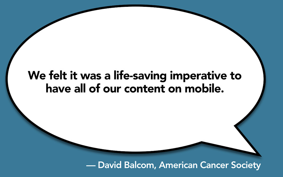
American Cancer Society, when they looked at the data, found the people who were more likely to be looking at their data on a mobile device, showed that those populations of mobile-only users matched up pretty neatly with the populations of people who were less-likely to get the preventive care and cancer screenings they needed to catch cancer in time. And so, they concluded that they had a life-saving imperative to get all of their content on mobile. All of it. And you know what? They did.
-
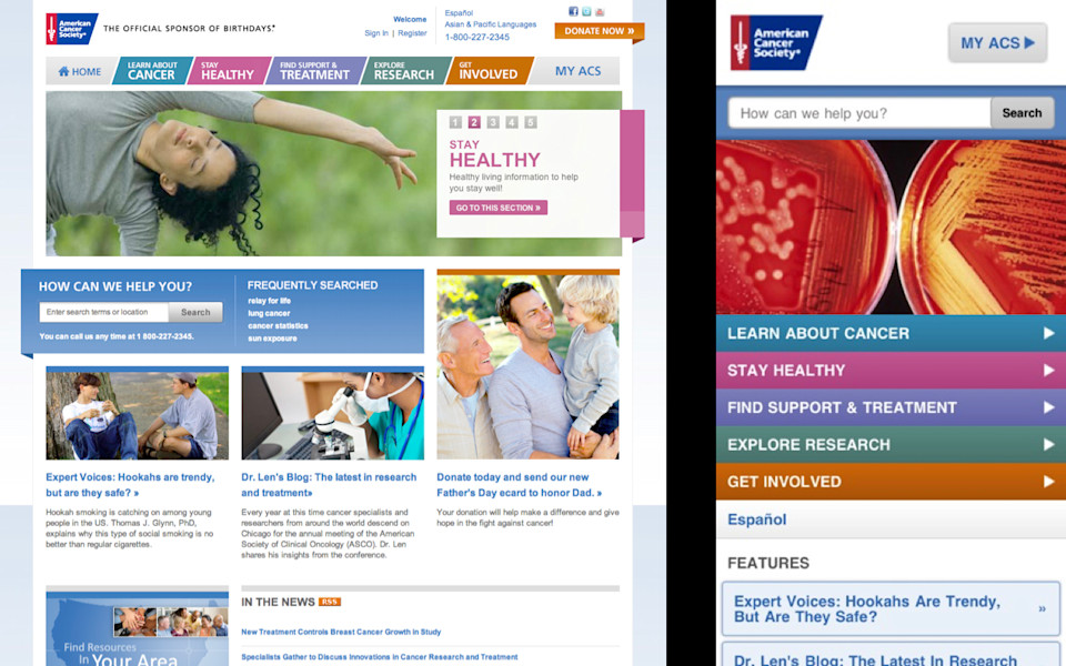
This website is, I think, a beautiful example of how it is possible to take something that is a fairly complex website—it has multiple categories, it has multiple levels of hierarchy, the sections are fairly complex, this is serious content, it requires a certain level of engagement—and to make all of that available, on a mobile device, without removing or changing a single word.
-
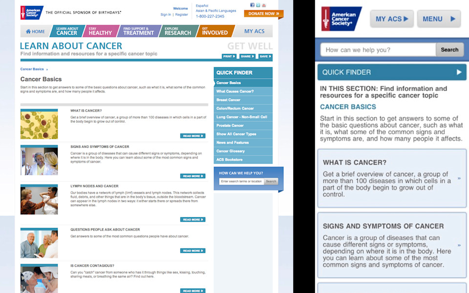
The mobile website is browsable, it is readable, it is navigable. I might even go so far as to say the mobile website is better.
-
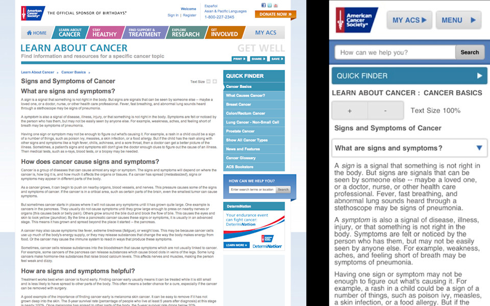
It provides a more focused reading experience to guide somebody who is wrestling with a cancer diagnosis for themselves or for a family member. It allows them to actually deeply and fully engage with that reading experience in a way that they can't do on the desktop.
-
There's no reason to take good content and edit it down to some shorter form just because you think that's all a mobile user would read. Frankly, I think it would be disrespectful to these people to say "Oh, you don't get the same information about cancer because you have a different device." Instead, I think we should take a lesson from David Balcom, who is the director of digital for the American Cancer Society where he says, "It's not that this was designed and written for mobile. It's just good content."
-
So, if you have good content, you should feel confident that you can deliver it regardless of device or platform. Good content transcends platform.
And, if you don't have good content, here's your chance to clean it up. The opportunity for you, now, to say "let's go in and edit our content; let's clean it up; let's make sure it's adding value." If mobile is the catalyst that will allow you to do this, and if it helps you in your negotiations with various stakeholders and various special interests to go up to them and wave a tiny little smartphone screen in their face and be like "Oh no, so tiny, can't possibly fit all your crappy content on there. Must clean it up." If that facilitates those conversations, then by all means, be my guest. Use mobile as the catalyst that will help you do that. But you're not just cleaning up your content for mobile users, you're cleaning it up to provide a better experience for everyone.
-

And so, what this implies, then, is that you do have to do something different with your content for mobile, okay? I don't want to leave you with the impression that you can just take everything that you have and just kind of shove it on a smaller screen. No. It is likely that you will need to put more structure into that content, to make it appropriate for mobile devices. You will have to take your flabby, gloppy blobs of content in which you have one big blob of stuff that's all mixed in with presentation formatting and whatnot, and provide additional structures that will be appropriate to appear on different devices.
-
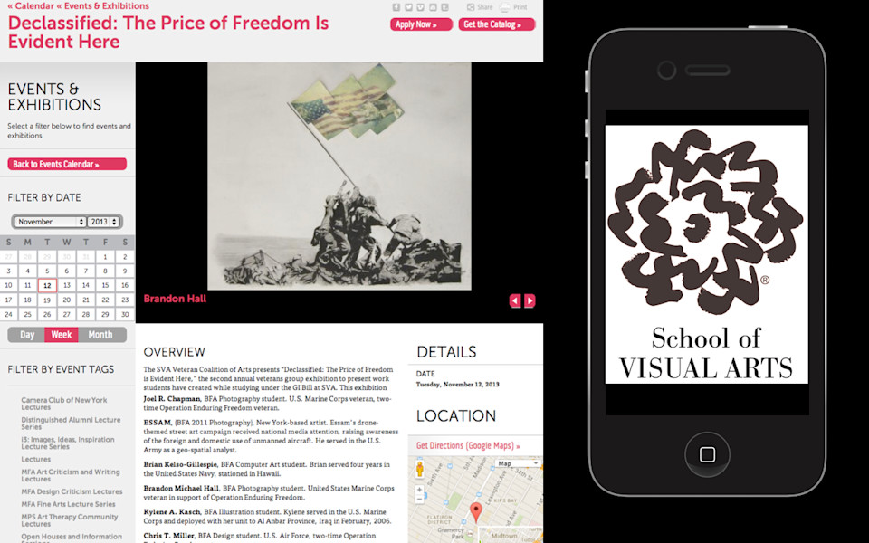
I teach at the School of Visual Arts in Manhattan, and they came to me to talk about mobile strategy. They said that one of the primary challenges that they were facing is that they had a desktop website, they had a mobile app…
-
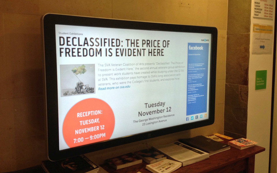
and they had just purchased these new digital signs that they were going to put up all over campus. They came to me and said "Karen, we need a way where we can manage and maintain all of our content in one place and publish that content to these three very different form factors." And I was like, "Ummm. Have you thought about treating the digital signage like it's just a completely different separate siloed workflow?" And they were like "Ain't nobody got time for that! What are you talking about, Karen? That's the whole reason we're talking to you! We need one way that we can manage and maintain all of this content in one place and send it to our desktop website, our mobile app, and these new digital signs." Three very different form factors. This is not some kind of crazy, futuristic dystopia that these people are living in. This is happening right now, today.
And so, the content that they are publishing to these digital signs, it is, in one sense, the same content that is going to the desktop. But, in another sense, it is not. It is differently-structured content that needs, they need to have different structures, different sizes of the content, different ways of guiding people to use it, because the digital signage form factor is completely different from the desktop form factor.
And what this means, when you start looking at it, is you realize, Okay, I'm looking at my desktop website and saying "How do I think about restructuring this content for other platforms, whether that platform is a mobile website, a mobile app, a digital sign, whatever, Google Glass, whatever the next big thing will be?" Some of the questions you're going to have to ask are things like "Is this content any good? Do I want to keep it?" Should I, if I'm thinking like, okay, I have my desktop website and I have my digital signs, which content am I going to send where? The ethos is that you should send all of the same stuff between desktop and mobile, but there may be scenarios, I mean, I live in the real world, where I've got a client who says "No, I only want to send a subset of that content to my digital signage. How do I do that?"
-
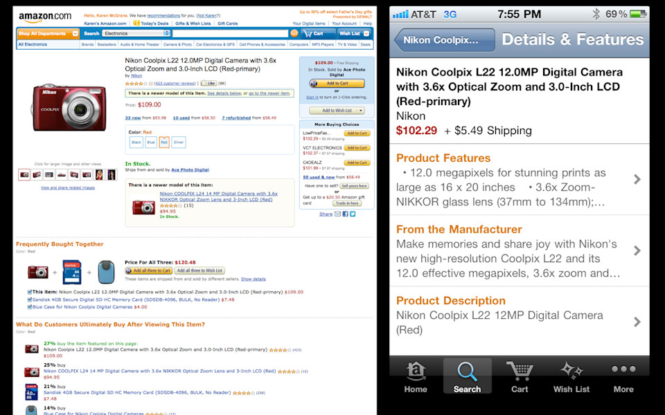
So, if I have one long page on the desktop, am I going to want to break that down into smaller pages? So, if you're thinking, like in this Amazon example here, okay, Amazon desktop page, super long, I don't want to send that one page to a mobile device. I want to break that into four or five shorter pages. Okay, great, well that's cool. I'll just break it up at these headings, here. So, Product Features, From the Manufacturer, Product Description, great, those will all be separate, smaller subpages on mobile.
So, let's say I'm coming here and I want to know how much this camera weighs, because I'm going to have to carry it around all day. I want to know how heavy is it? Which one of these sections am I going to find that information in? I don't know! Product Features, From the Manufacturer, Product Description, none of those labels is sufficiently descriptive enough to answer that question for me. I have no idea what to tap on in order to find that answer.
-
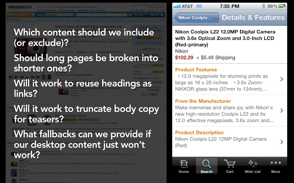
Well, that's cool because hey, there's this whole big long navigation summary here. Surely that information will communicate to me which one of those sections I should tap on. When you look at those three lines of summary that's under each one of those links, you discover something: there's actually no new information communicated on that page at all. All they do is repeat, over and over and over again, the name of the product and how many megapixels it has. The only unique content on that page is "Make memories and share joy." Is it going to work, then, to have this desktop content? Am I going to be able to provide fallbacks for some of this stuff, like, what happens if my desktop content simply won't work on my digital signage or in my mobile app. Now, what am I going to do?
-
So, I gave this talk awhile back at a company, and I kind of walked through all of these challenges that they would be facing as they tried to restructure their content for mobile, and a woman in the audience raised her hand and she said "Well, we're going to use responsive web design." And I'm like, "Responsive web design won't fix your content problem." Responsive design isn't going to answer any of these questions that you have about how you want to structure your content differently so that it's appropriate for the mobile device, the mobile app, the in-store kiosk, the digital signage, the Google Glass. It's not going to answer any of these questions for you about what you need to do to create different structures and different sizes of content.
-
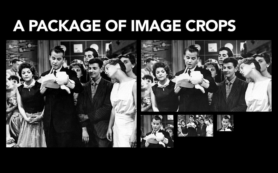
So, as Kristina mentioned, I led the redesign of the New York Times a few years back. One of the things you learn from working with publishers is that they cut a standard set of image sizes, so for every image that they are producing, their production team goes in and they cut the same exact image crops for every single one. You, as a designer, do not get to go in and be like "You know, on this page, I think what would really work well isa a 400x300 image and on this page, I've decided that a 200x300 image would fit just nicely." They're like "These are the sizes that we cut. We cut these sizes. You pick one of these sizes and you make it work." I worked on the redesign of People Magazine's mobile web and mobile apps this past year, and one of the things we learned from that process: People cuts nine different sizes of image crops. One of the things we learned is that People didn't have a large enough size for mobile. We wanted one big image that would fill the entire screen of a Retina display iPhone, and the biggest image crop that they cut wasn't big enough. And so we went to the production team, and we were like "Hey, could you cut us a bigger image size?" And they laughed and they laughed and they said no and we made do with the image sizes that we had.
So, if you can wrap your head around that. If you can wrap your head around the idea that, back in 2005, we came with a set of image sizes for the New York Times, and the New York Times is using those image sizes today as they make the leap to mobile. They're using the exact same crop sizes. Did we design those crop sizes for mobile? No, not at all. In fact, those devices didn't even exist yet. Would I possibly have cut different sizes if I knew then what I know now? Eh, sure, probably. But the fact that, by creating a flexible system of image sizes, they were able to make the leap to mobile without having to create a whole bunch of new content or new image sizes for mobile, if you can kind of wrap your head around the fact that that's possible in that context, then you can wrap your head around the fact that that's true for other things.
-
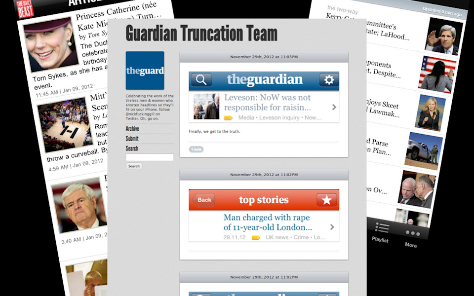
Like, say, headlines. One of the things that amuses me most about mobile is the number of publications that truncate their headlines. I mean, Daily Beast here, it's like, you have to imagine the editorial discussions that they're having. They're like, "Well, we can't possibly allocate enough room so that somebody can read the entire headline, because that might take away from our ability to have a giant glob of white space in the middle of the page, which is really important to us." NPR, NPR, my go-to example of how you do structured content right, even NPR truncates their headlines on their mobile app. The Guardian has an entire Tumblr that is dedicated to celebrating the work of the tireless men and women who shorten headlines so they'll fit on your phone. This doesn't make any sense, guys, okay? You look at this and it's like, why would you ever, as a publication, truncate your headlines? Do you not understand what business you are in? You are in the business of having people read headlines, decide that they want to read the story, and then tapping on that link to go read it. That's it. That's your whole business model right there, and you're kind of like, "Oh, right, we can't possibly allocate enough space so that somebody can read the entire thing. That would be lunacy!" So that's one solution. Just allocate enough room for it. You want to know what another solution is? Why don't you cut another version of the headline? Why don't you cut two different forms of that? Have a short form and a long form so that then you can send different versions to different platforms as needed.
-
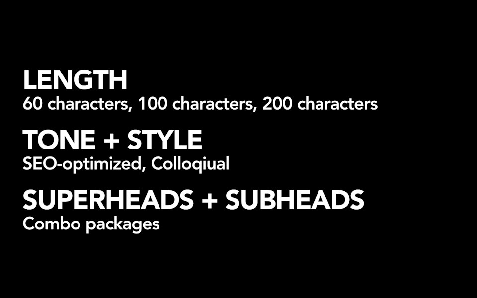
Slate just announced that they have started cutting two separate versions of their headlines: one shorter form that was sixty, seventy characters, that they could use on mobile and use in things like Twitter. They said they got 100% increase in clickthrough on having those shorter forms in contexts when they were appropriate. Gawker also recently mandated that all of their headlines had to be fewer than 70 characters because they were running into this exact same problem. Now, I'm not that draconian. I say "Hey, why don't you just cut two forms?" Have a short form that is appropriate for the context in which you need a space constraint, and then, on the desktop or in your email subject lines, you can have a longer form to take advantage of the capabilities of that medium. Think about your content like this is a system. A system of reusable pieces, is what's going to help you survive the leap to other platforms. Same thing is true for things like summaries.
-
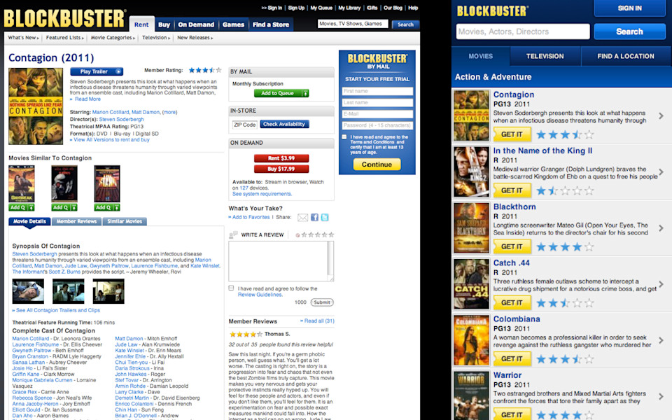
So, Blockbuster, here, you might not know what the goal of this page is for Blockbuster, but I will tell you. The goal of the page is that you will read the description of a movie and decide whether or not you want to rent it. Except, Blockbuster was like, "Oh, we can't possibly allocate enough space for you to read the entire description of a movie at once, because look at all the other stuff we want you to do on this page. So, we're going to give you three lines of text here on the desktop. We'll give you two lines on mobile. And then, if you want to actually read the full description of the movie, you can click or tap to see more." Except, sometimes, when you do that, you get like four more words. Blockbuster is bankrupt. They just announced that they're closing all of their stores. You know why? Digital native business Netflix.
-
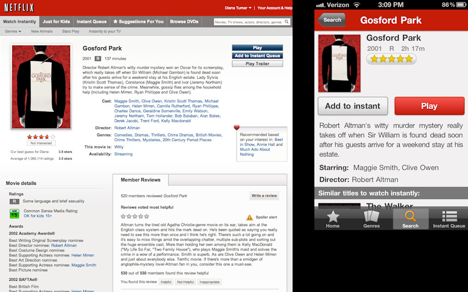
So, Netflix. Netflix is on literally every device known to mankind. Netflix is on something like 400 unique device types. You can watch Netflix on your phone, on your tablet, on your computer, on your TV, on your game box, you can watch it on your toaster. Netflix handled this problem in a different way. They write a short form of the description and they write a long form of the description, and they use those versions every single place they need to appear. They can go to their designers and say "Hey, you pick whether you have enough room to use the short form or the long form or not, and you use that wherever you can, and you never truncate the description." That's how a digital business thinks about this. They say: How can we think about creating flexible sizes of this content that we can use in a bunch of different places?
-
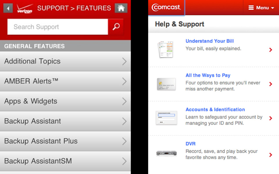
And that, we're going to need that, because the challenges of mobile mean, or the challenges of getting our content onto all these different devices mean, that we're just going to need new structures, new sizes of things. I'm pretty sure that there's somebody at Verizon who knows the difference between Backup Assistant, Backup Assistant Plus and Backup Assistant SM. I do not. So, if my job here, today, is that I want to back up my phone, I have to do this frustrating tap and back out and tap and back out. I've got to look at each page of content, read it, figure out if it's what I want. If it's not what I want, I've got to back up and start over. Jared Spool calls this "pogo-sticking" and he says it's a sign that the website isn't very well-designed, because users don't have enough context to know what they're going to get when they tap.
So, Comcast, faced with a similar problem, writes a short little navigation summary that explains to people what they're going to get when they tap. So, if my job here, today, is that I want to change my PIN, could I figure out that that lives under Accounts and Identification? Yeah, sure, probably, but the fact that they wrote a little summary that has the magic keyword PIN in it makes me feel 100% confident that I know what I'm going to get when I tap.
-
Thing is, these little summaries, they don't write themselves. You can't just take the first hundred words of your body text and cram it in there and go "Well, that'll explain to people what they're going to get." No. The first hundred words of your body text wasn't designed to be used that way. Doesn't have the right trigger words in it. You're going to need to create additional structures of content, additional structures of text. But, I don't want you to sit here, listening to me and think "Oh, Karen's saying, now I've got to go out and write special headlines for mobile and iPhone and tablet and Twitter and I've got to have a whole bunch of different little navigation summaries that will live in my mobile app." No, that's not what I'm saying at all. I'm saying don't create content for a specific context. I'm not saying go out and make an iPhone headline and a Twitter headline and an iOS summary and an Android summary and an Xbox summary. That way lies madness. In the same way that a publisher might think about creating a flexible set of different sizes of images that they can use in a variety of contexts, and that those sizes would be basically okay, would work essentially all right, as they make the leap to other platforms, that, too, can work for text. You might do a survey of all the places that your content needs to appear, and try to develop a flexible set of reusable sizes that will give you the best chance of meeting the needs of what you need to do across the whole web.
-
Let me leave you with this. You don't get to decide what device somebody uses to access the internet. They get to decide that. It's our mission, it is our responsibility, to provide a great experience to them, whatever platform or device or screen size or input mechanism they choose to use to go online. And, for so many people today, mobile-only usage is real. These people, whether it's because they have no other way to go online or whether it's their preferred device to use, they are increasingly choosing their mobile device as the primary way that they go online. If you want to reach students, teens 12-17, if you want to reach black or Hispanic Americans, if you want to reach low-income Americans or Americans whose parents only have a high school education, those people are predominantly and increasingly relying on their mobile devices for access. You don't get to tell those people "Oh, well, why don't you go to our real website, the one we care about, the one we put all our work into?" You don't get to decide that for them. They get to decide what device they use to go online.
-
And what this means, what's so exciting about this, is that this disruption, this disruption is what's going to make mobile great. These people, these people who are relying on their mobile devices for access, they are the ones that are going to usher in this great new wave of innovation on mobile. And we get to help them get there. See, if the history of disruptive technologies lets you know anything, it's that eventually, mobile's going to get good enough. It's going to get so good that nobody's ever going to ask the question "Why would somebody want to apply for college on their mobile phone?" It will be assumed that that is something you can do, because the mobile experience will be great.
-
And, the thing is, the mobile experience is going to be great in its own way. It's not going to be competing with the desktop to say "Oh, well, the desktop does this better so it should work like the desktop." No, it's going to redefine what good experiences are. And they won't be the same as the desktop. They'll be better. And, we're the ones who are going to help them get there.
-

So that, that's what is so exciting about this, is that we have a chance, right now, to do mobile right. I believe that, for many of us, this will be the last great wave of technology innovation that we see in our careers. This is going to be a decade, two-decade long wave that sweeps away the way we've always done things, and allows us to usher in an entirely new way of doing things. We have a chance, right now, to clean up our crappy, outdated, useless content. We have a chance, right now, to fix our workflow, to fix our publishing processes, to more clearly define roles and responsibilities within our organization. We have a chance, right now, to fix our underlying technology, to stop band-aiding along with tools that just don't work the way they are supposed to. We have a chance, right now, to do mobile right. Do it right, right from the start, and that, that, I think, is the opportunity. I know this is hard. I mean, I know you can just look at mobile and see it as this terrible, frightening thing. Or, you can see it as a huge opportunity, a big chance, to really do things right. And I hope you all take it. Thank you.